2025 — 2026
Head of Product Design
- Built a new visual language for the apps family — outperformed the original by ≥10pp uplift in user preference;
- Led the family-wide redesign across the apps.
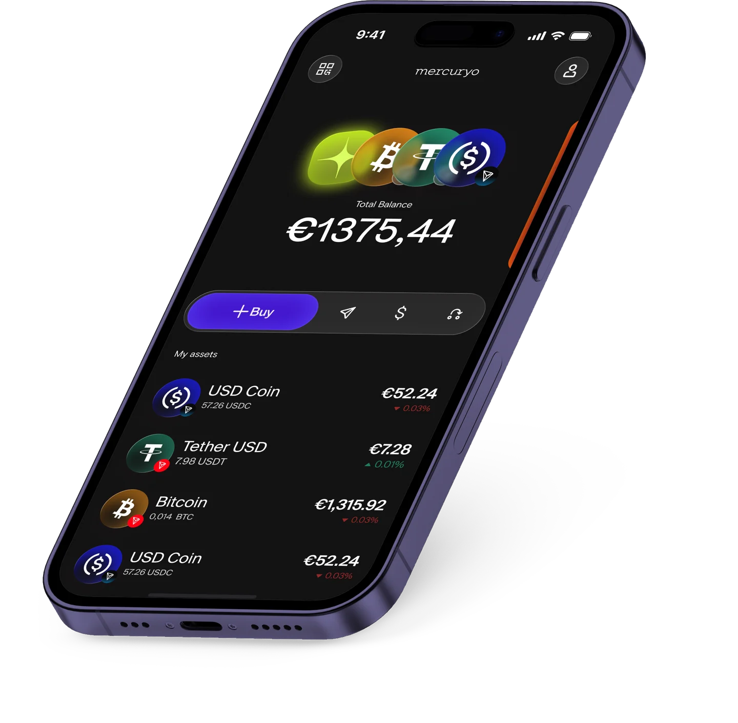
Mercuryo
Unified visual language for a family of crypto apps, created and preference tested on existing and new users
Role: Head of Product Design
Mercuryo's app had drifted from the company it belonged to. The marketing site had just been refreshed and everyone loved it; the product told a different story — most marketing assets showed the web service, functional and plain, a world away from the brand it was meant to sell.
An earlier redesign had stalled. The CPO handed me the mandate: realign the product with the brand, and ship it this time. The work ran on three fronts at once.
Let us walk you through the tool that engages users like nothing else
Simpler flows, fewer steps — with the product team.
A user-chosen system across web and native.
A durable kit the whole product builds on.
The app originally shipped light-only. The system now carries a second layer of tokens, so the dark theme is a mode away — same components, same rules.
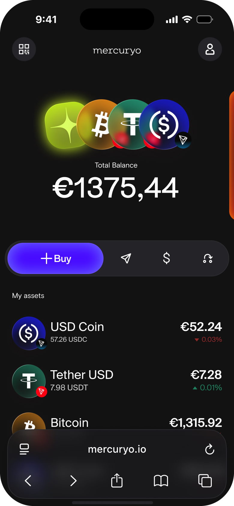
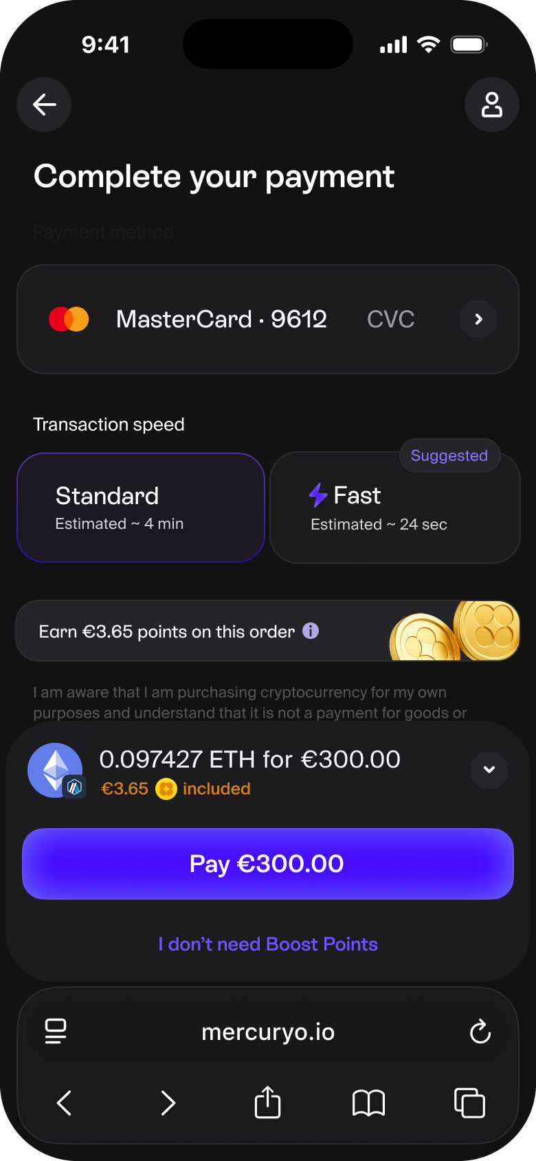
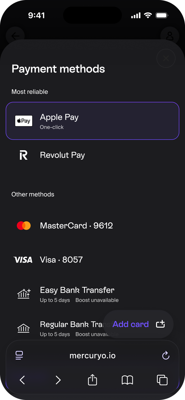
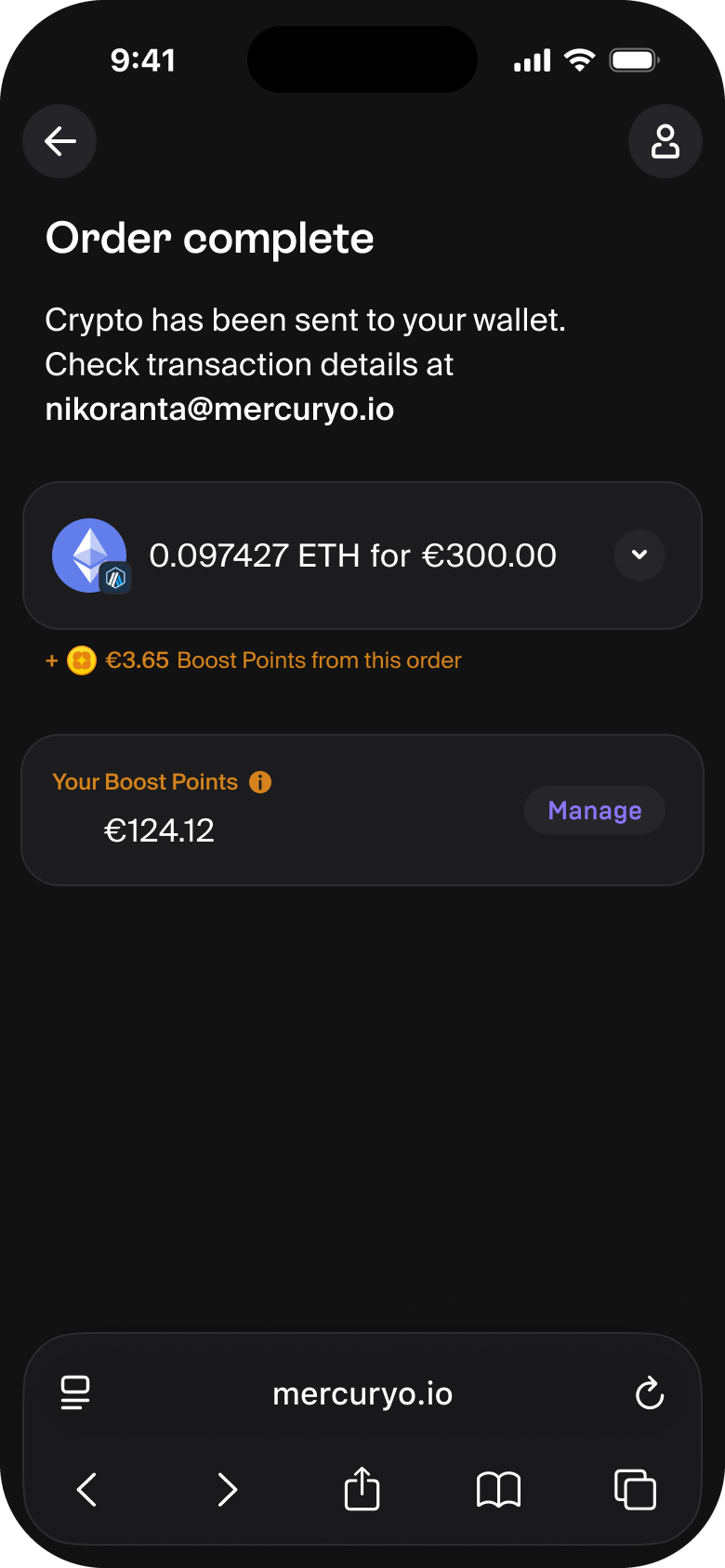
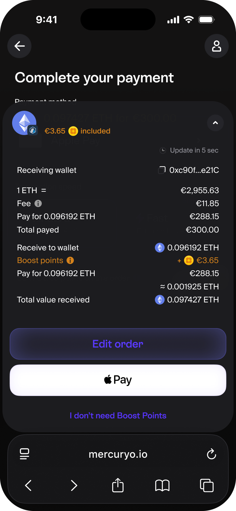
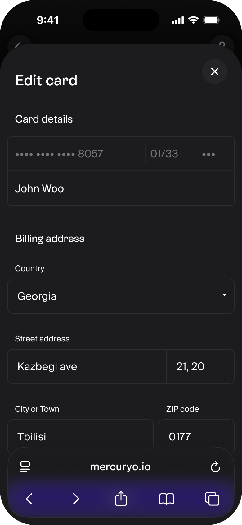
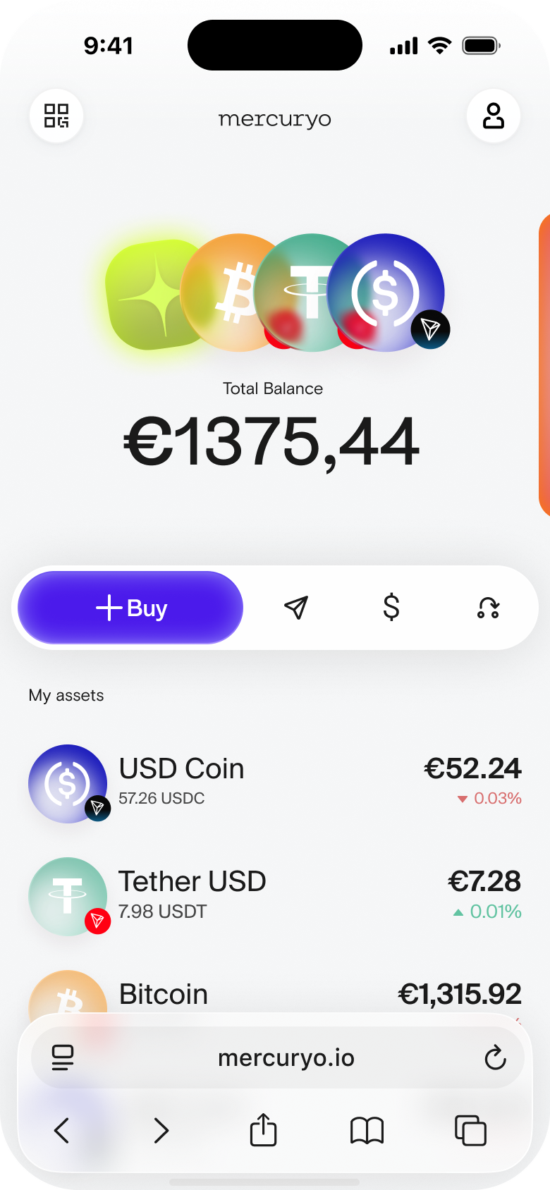
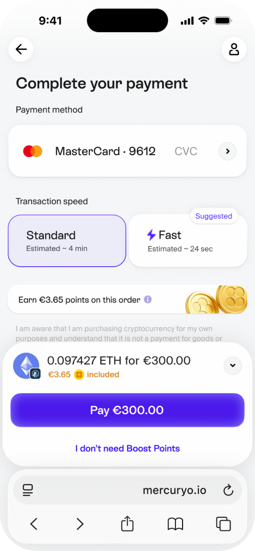
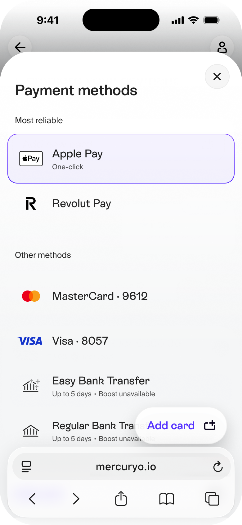
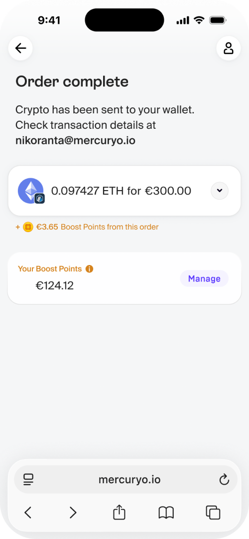
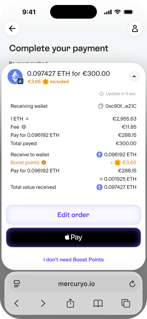
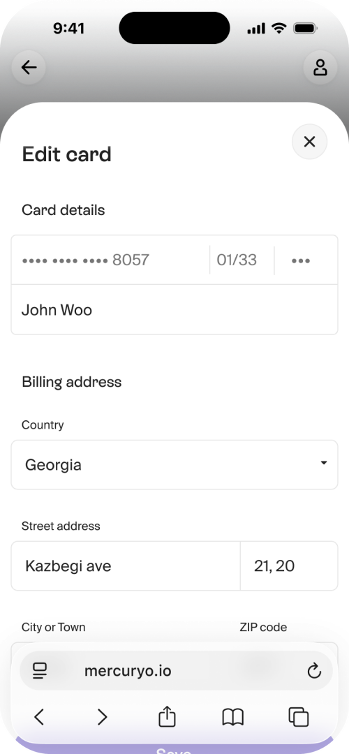
The visual language is the part of this redesign with the longest run-up: it had to be argued, tested and chosen by users before anything could ship. The rest of this case is that story.
A product's interface is a brand asset: it rides on almost every banner and deck, so a screen that drifts from the brand undermines the marketing it anchors.
How far had the product drifted? Far enough that marketing stopped showing it. When a campaign needed the product on screen, the marketing designer drew a conceptual mock-up — an idealised, on-brand product that existed only in the artwork. The real interface had become a liability the brand worked around, and that was the signal to change it fast.
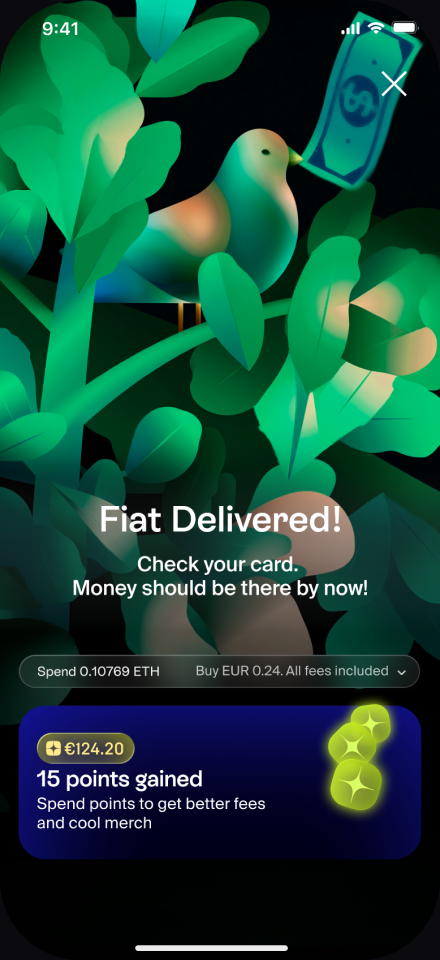
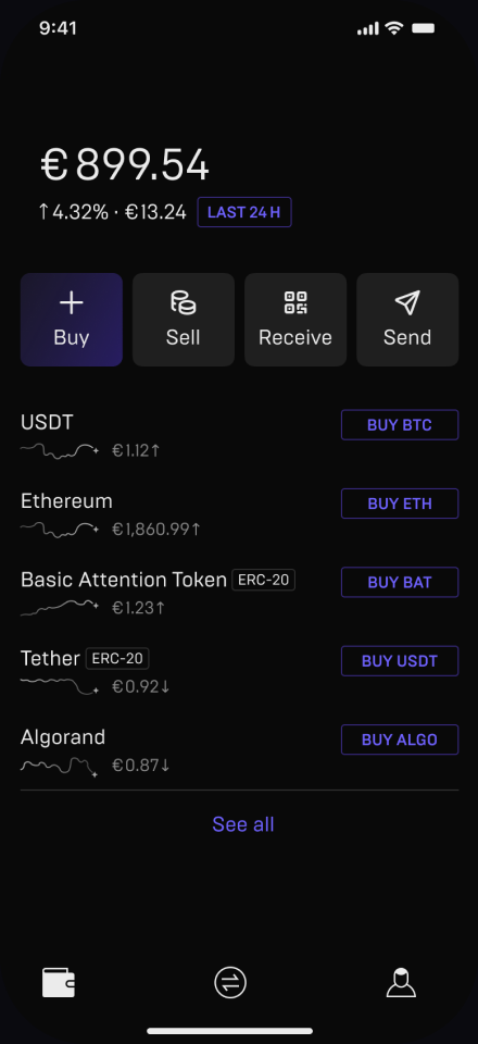
Taste in a design review is loud and unreliable, so we settled the direction with evidence: two rounds of preference testing, around three hundred participants each. We asked what matters for a crypto wallet — which feels clearest, which feels most modern, which reads as a crypto product.
The first round compared four directions; the winner went into a second round against fresh iterations and won again — a stable preference across roughly six hundred people.
One of the four directions in the first round was the product's existing native interface, and every new candidate beat it. That was our clearest signal that the redesign moved the visual language decisively forward.
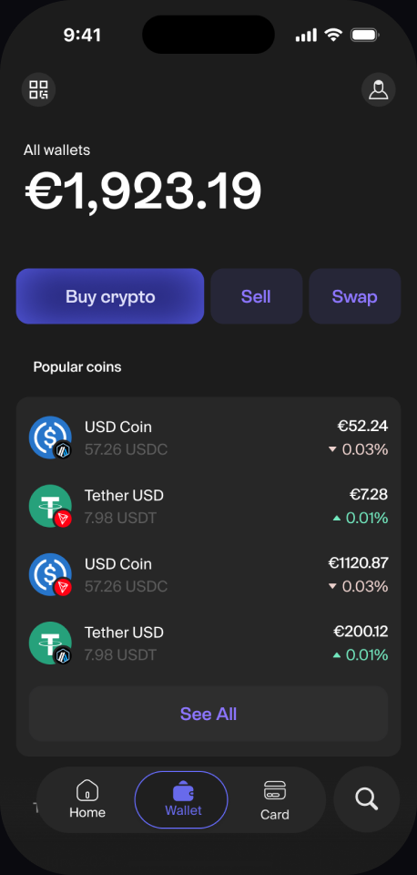
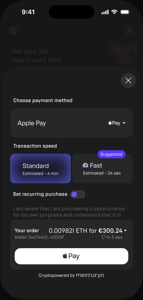
Strong Positive · rated 4.0 / 5 · won on clarity
“Feels like a classical wallet — I’d trust it with money. The abstract art was pretty but got in the way.”
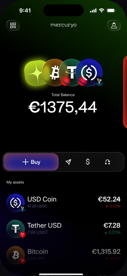
Mixed Positive · rated 3.7 / 5
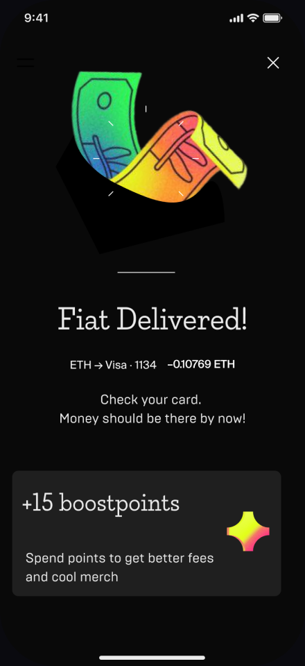
Neutral · rated 3.5 / 5 — the existing design
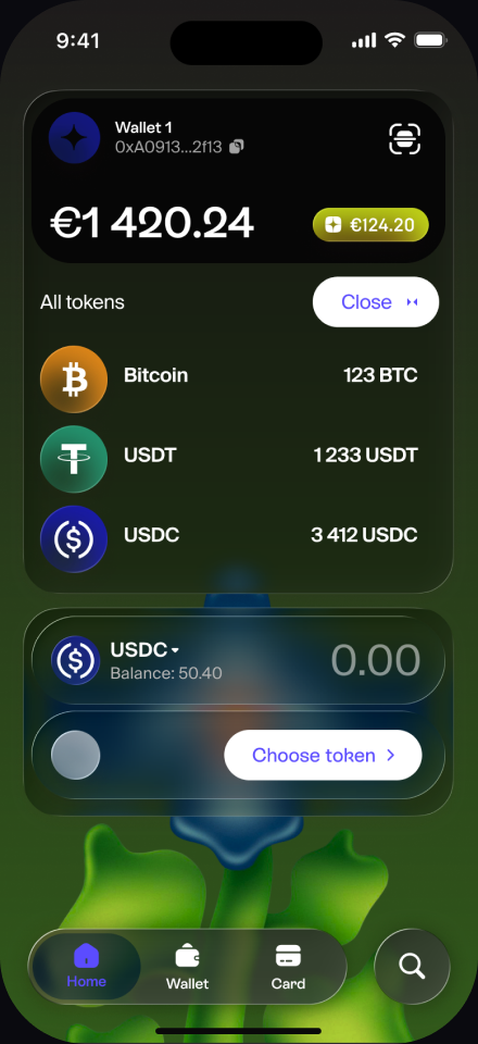
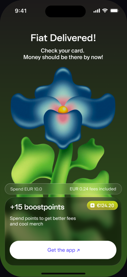
Polarized · rated 3.1 / 5
We shipped the variant that performed. Several of us preferred other directions; the users chose this one.
The same payment flow, restyled to each partner's identity — Mercuryo's violet, Trust Wallet's green, Bybit's gold. Tokens swap, the structure holds: one design system that bends to partner needs.
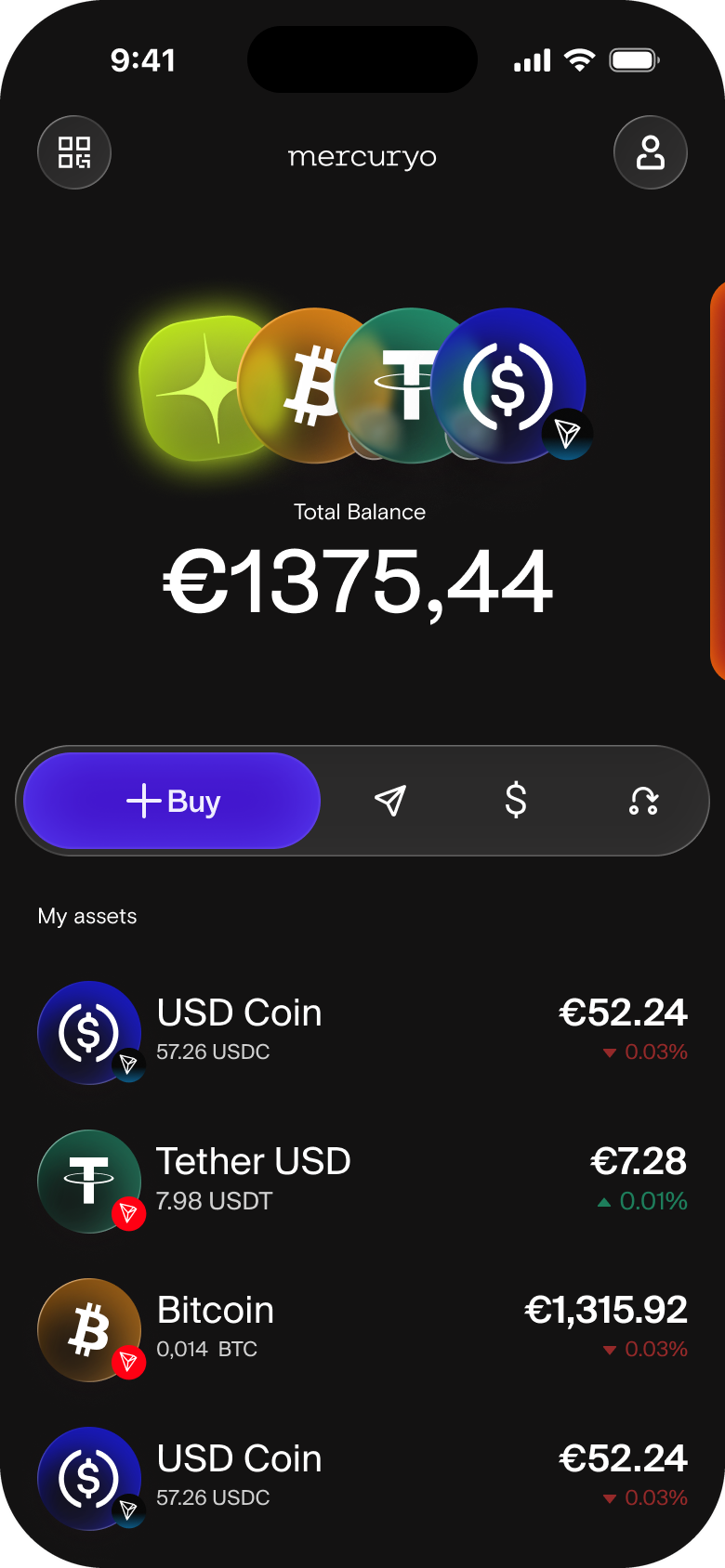
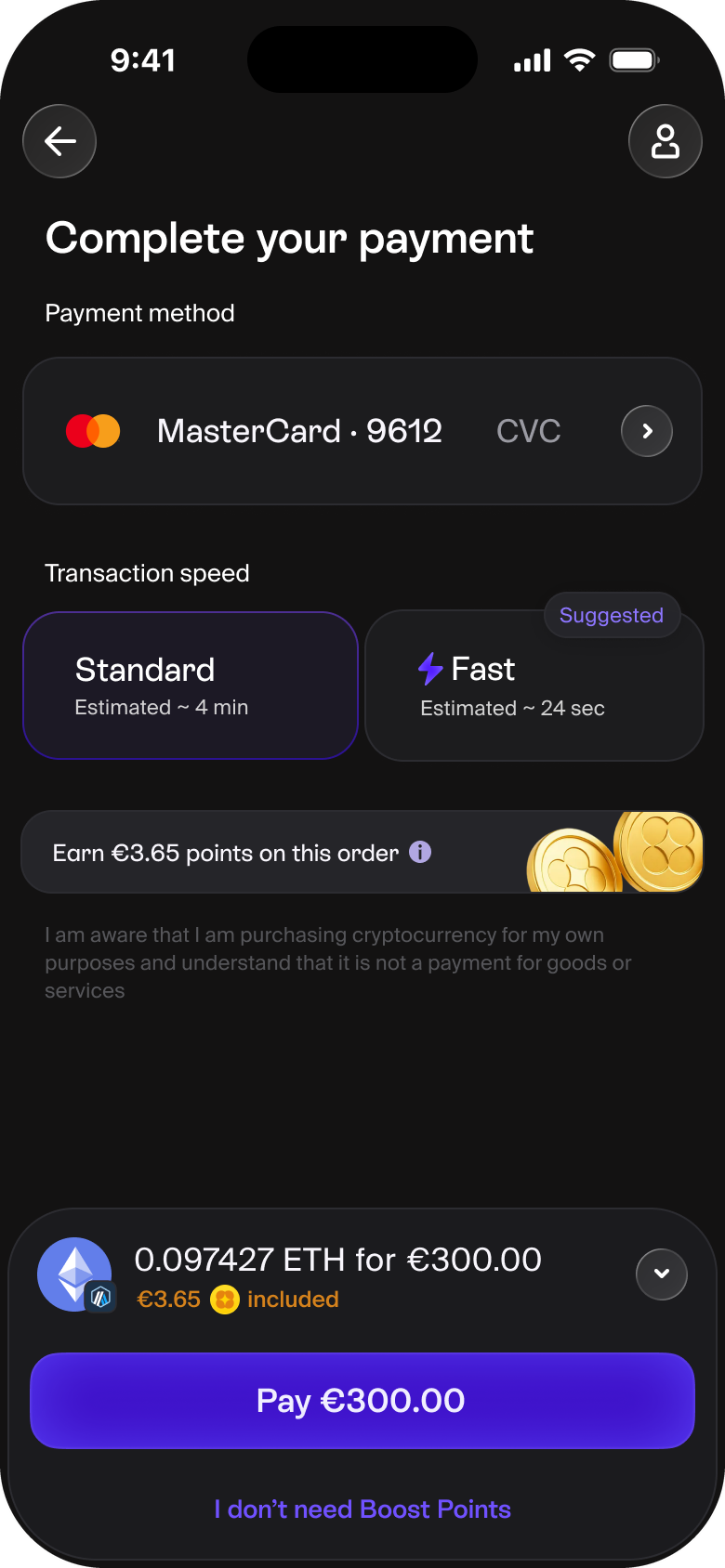
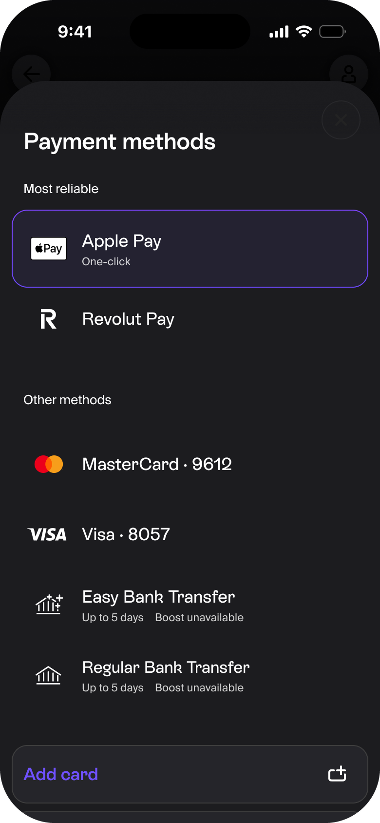
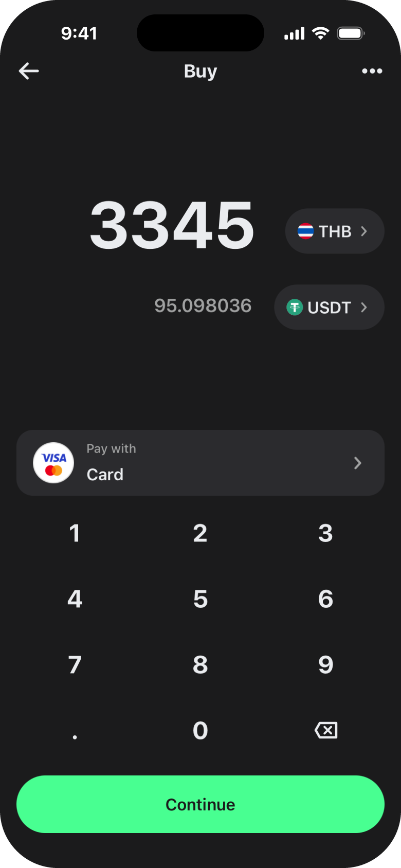
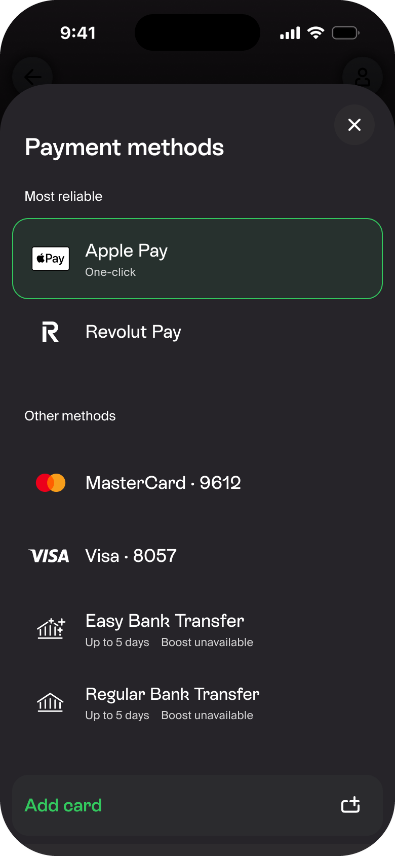
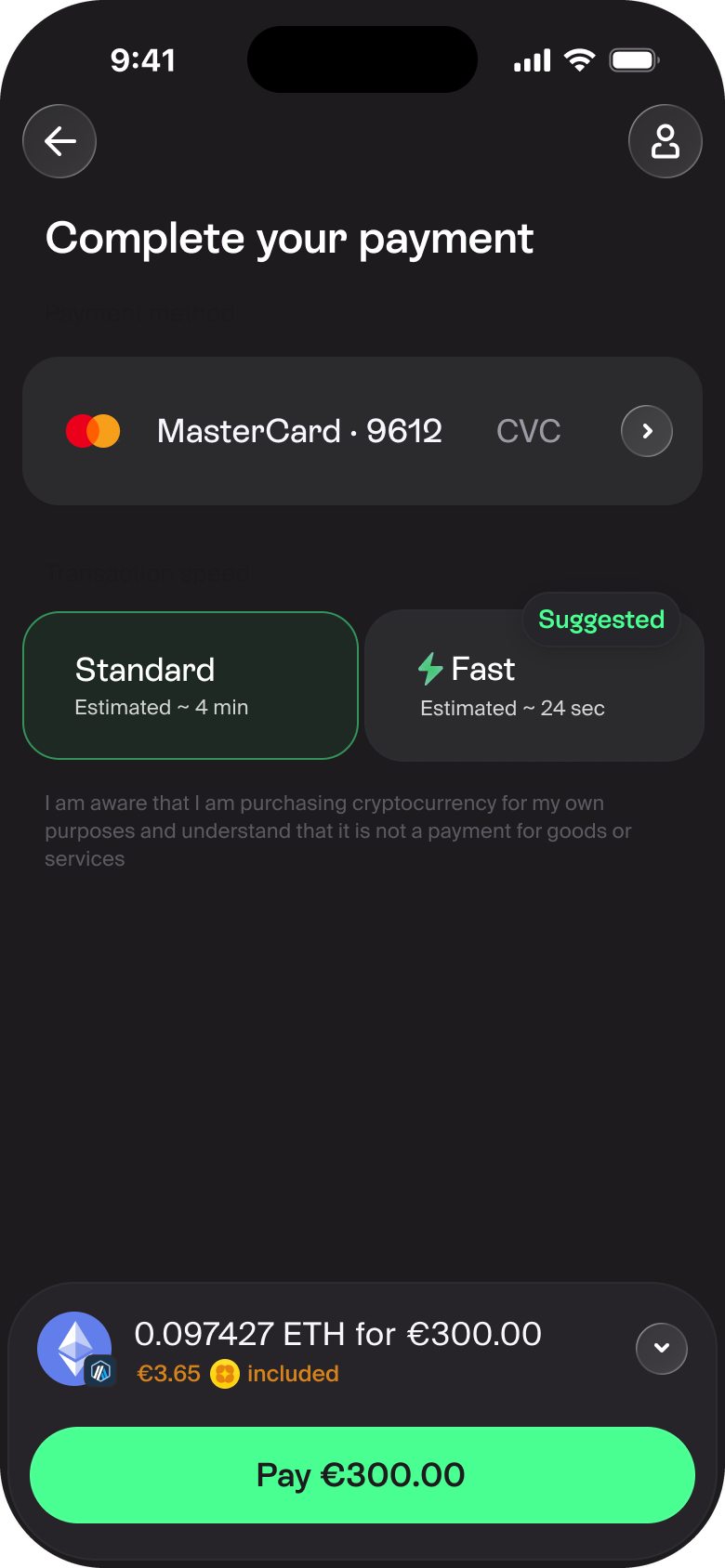
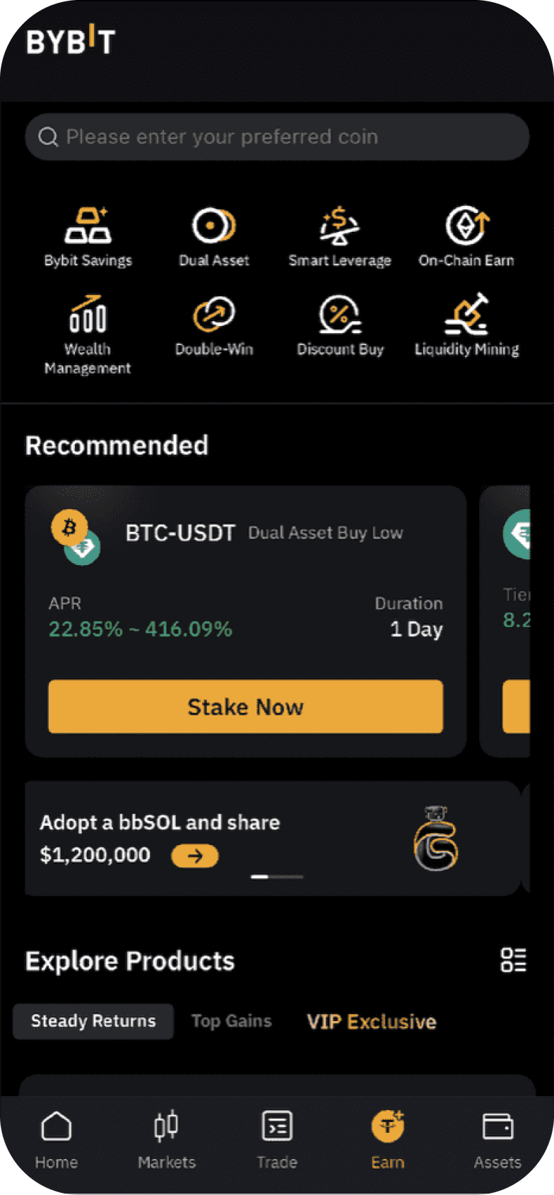
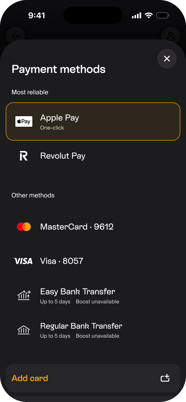
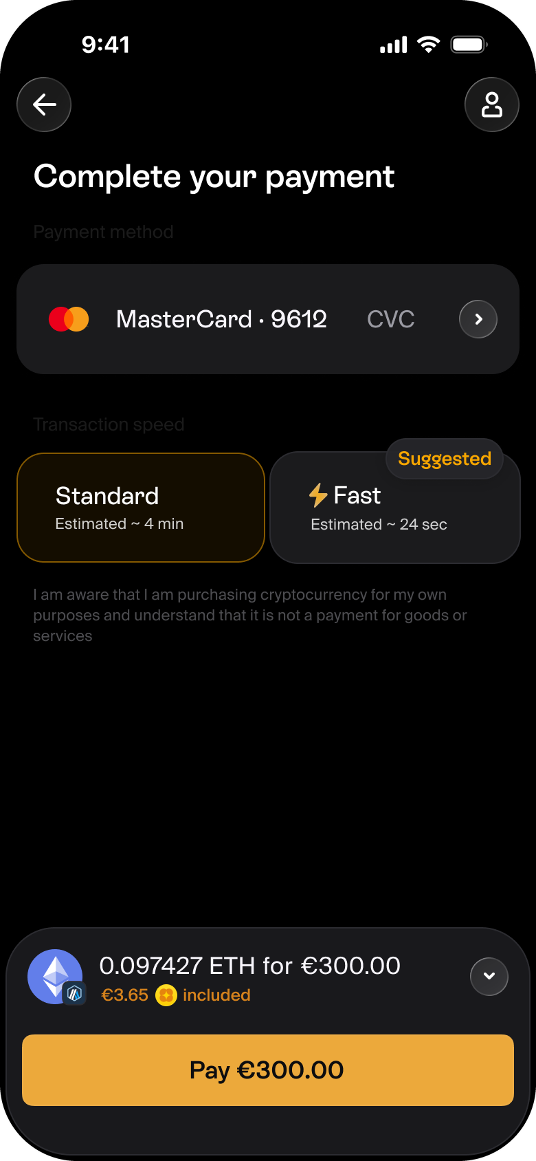
A visual language earns its place by being preferred, by shipping, and by turning many languages into one. This one did.
A visual language has no revenue number. Its honest measures are three.
Preference: do users prefer it, and does it read as the right kind of product? Two tests answered yes.
Shippability: does it reach users? The earlier attempt stalled; this one shipped incrementally, alongside the roadmap.
Coherence: did it reduce the chaos? Many drifting systems became one.
Those are the numbers I'll stand behind.
Once stakeholders signed off, I ported the winning dark concept into a light theme — matching every colour by hand — and brought in a second product designer to detail the system against real screens.
The detailing hardened into a UI kit, and the kit into a full design system: the durable artifact the whole product keeps building on.



In progress...
What made this attempt ship comes down to how it reached production. I ran the visual language in parallel with the product roadmap, applying the emerging concepts to real features as I built them.
By the time the language was chosen — a strategic decision — the key screens were already assembled on the new components and handed to engineering. The language arrived de-risked: proven on real screens and real use cases, riding along with product work.
Mercuryo is now implementing the visual language across its products — the first results are live on my.mercuryo.io. Feel free to try it. Hope you like the style.



Yandex Schoolbook
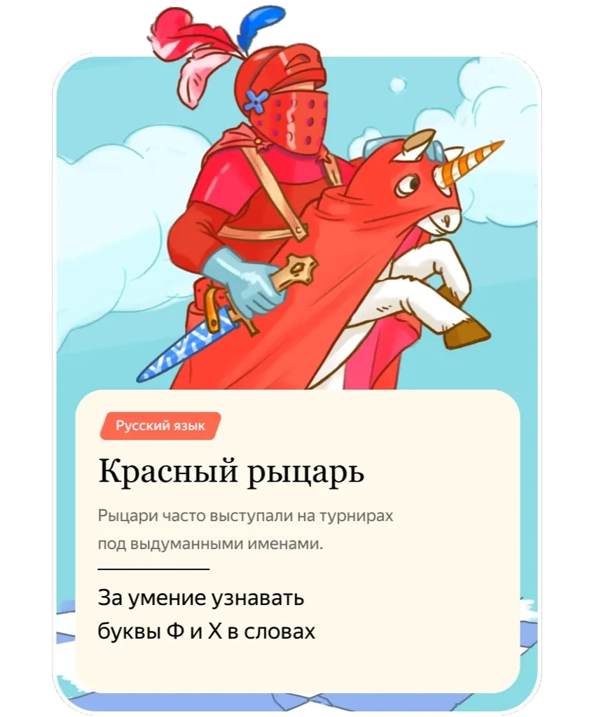
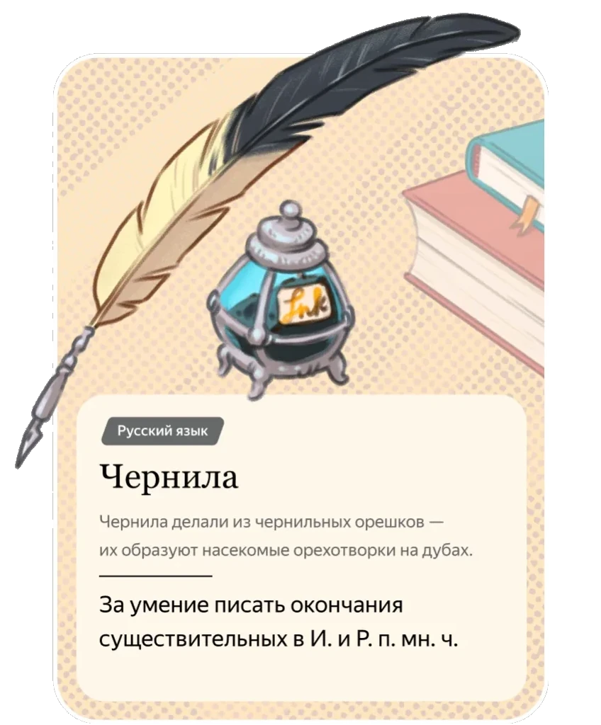
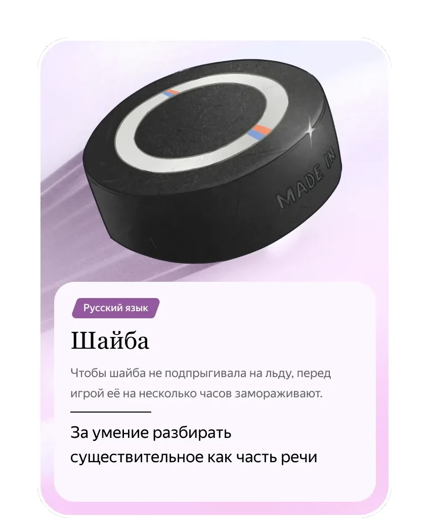
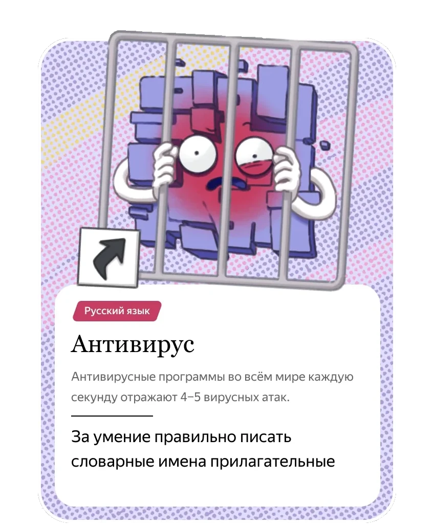
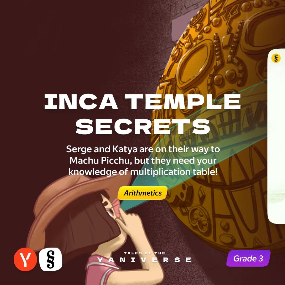
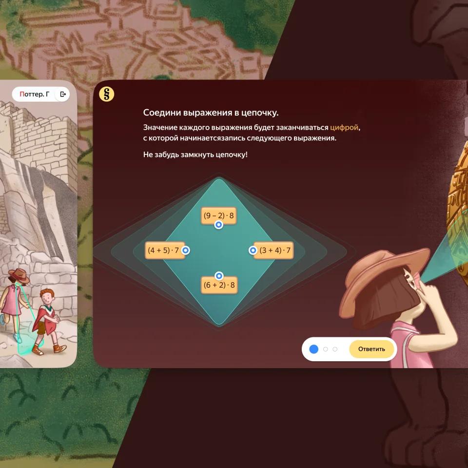
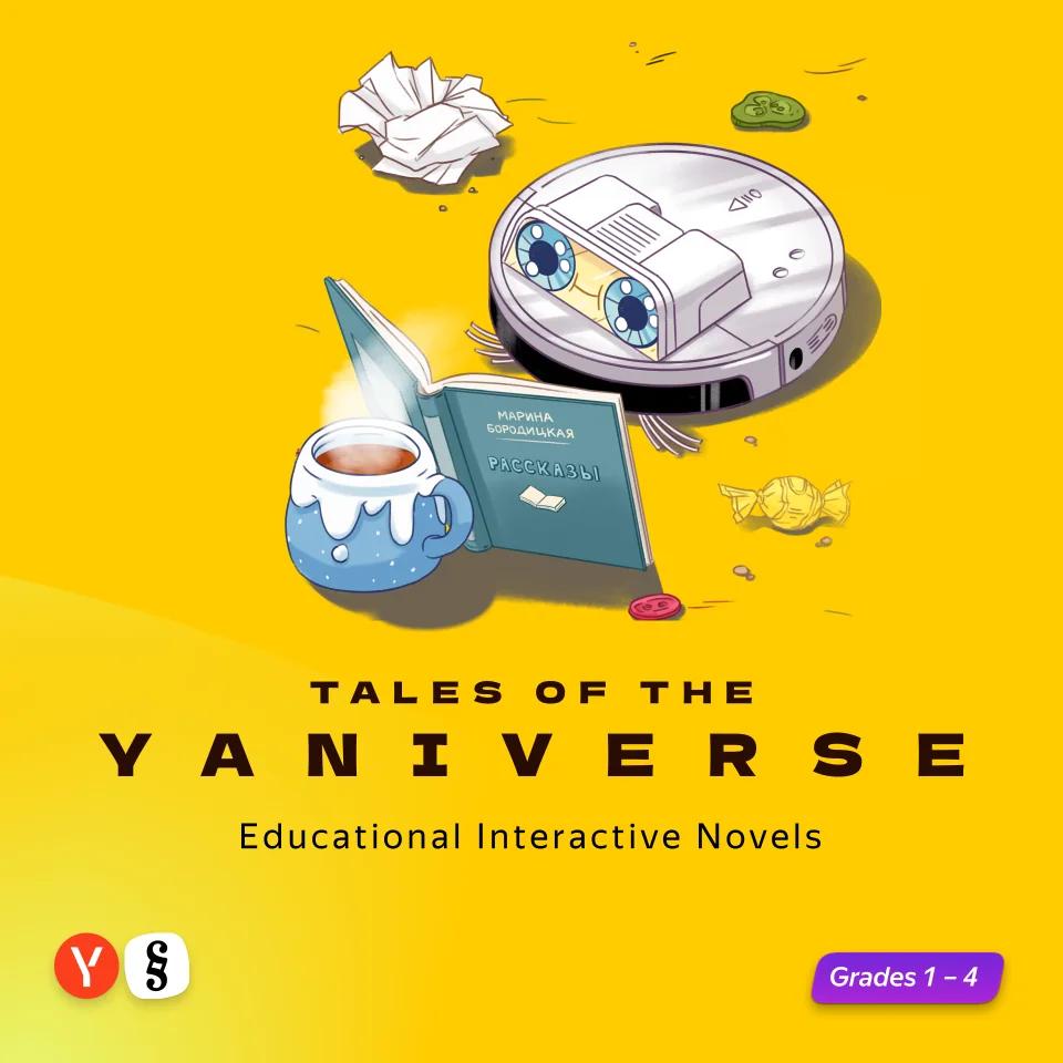
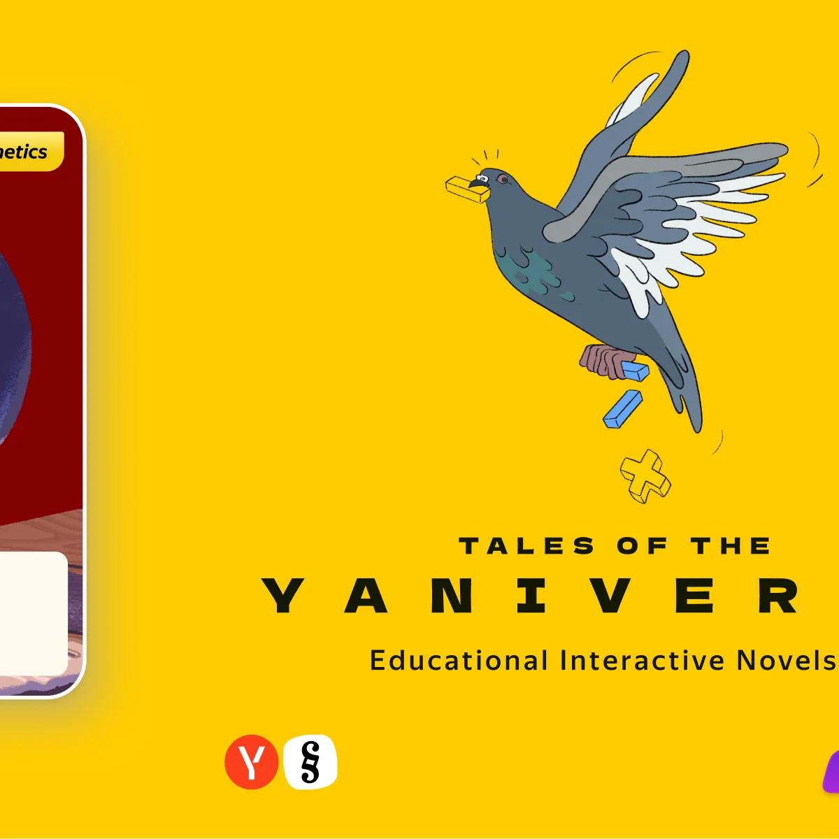
Weekly story-driven illustrated exercises for grades 1–4 in three core subjects as a way to drive exercise engagement and week over week retention
Role: Design Director → Product Manager
Screen homework beat paperrandomised trial with HSE, 6,253 third-graders in 343 schools: the same weekly homework done in the product rather than on paper raised both maths results and interest in the subject — doubling the screen time added nothing further
By the time the question reached me, Yandex Schoolbook had been running for two or three years and was sliding into a slow crisis: the 30K-exercise catalogue was a professional tool most teachers couldn’t use. A new direction came down — Schoolbook had to work for teachers who were never going to be power users. The CEO owned how that would look. My piece of it: make Yandex Schoolbook engaging for the children using it.
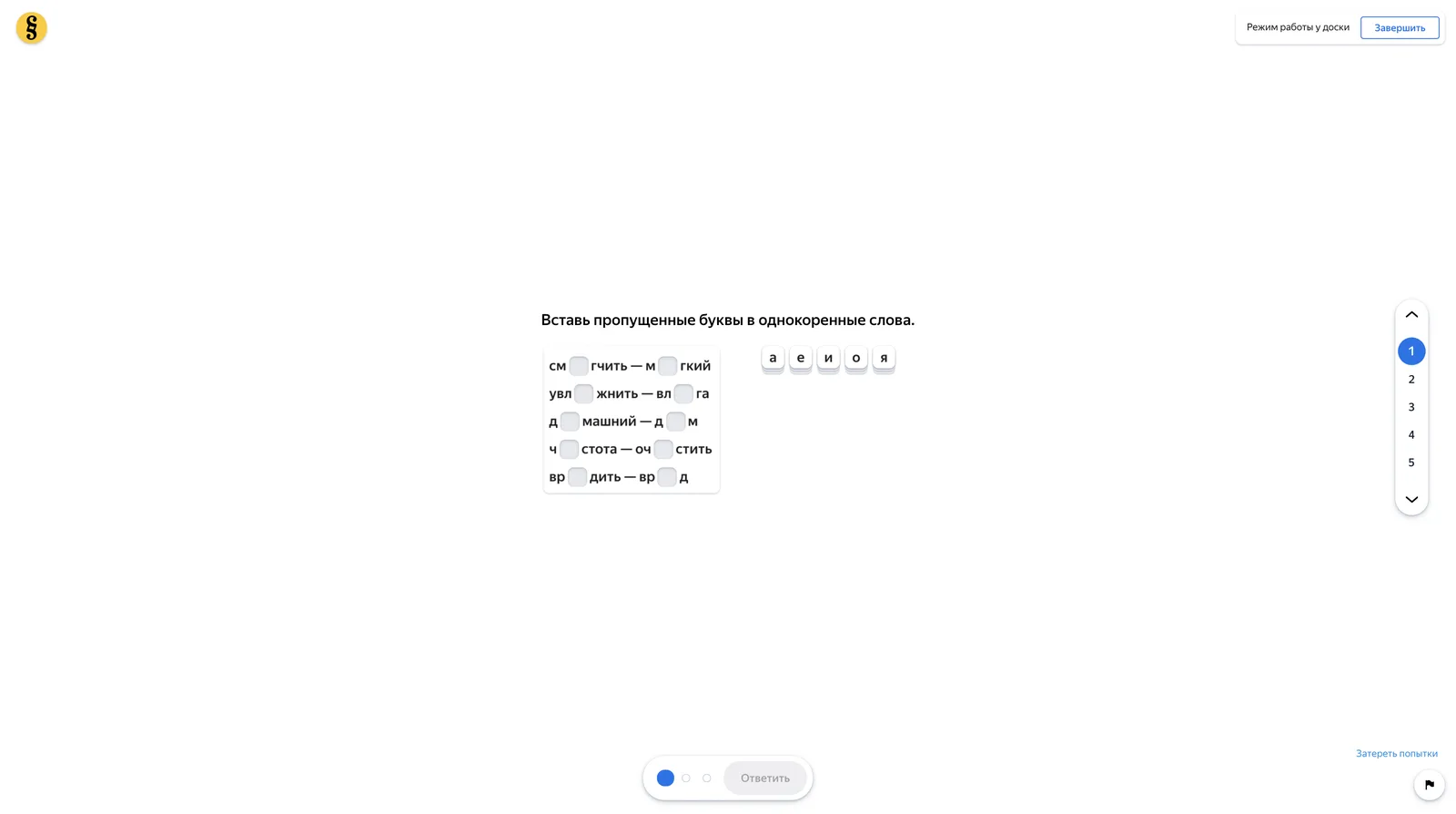
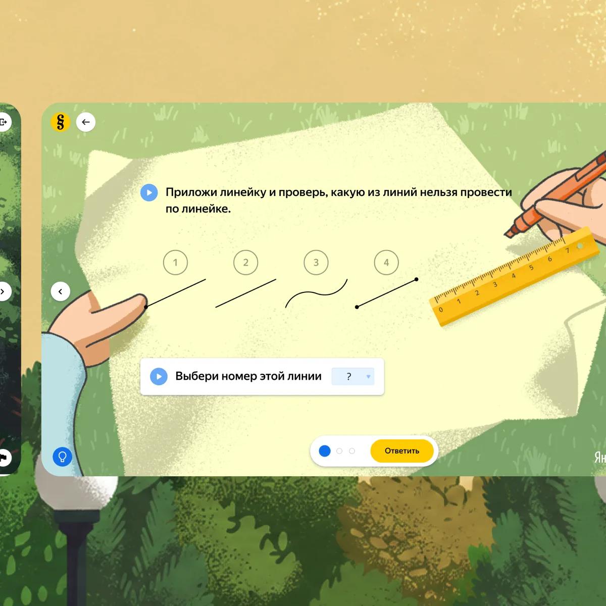
The plainness was a methodological rule. An illustration was allowed only where the exercise used it, only at a small size, and only on white — a page that looked pleasant had, in that reading, stopped teaching.
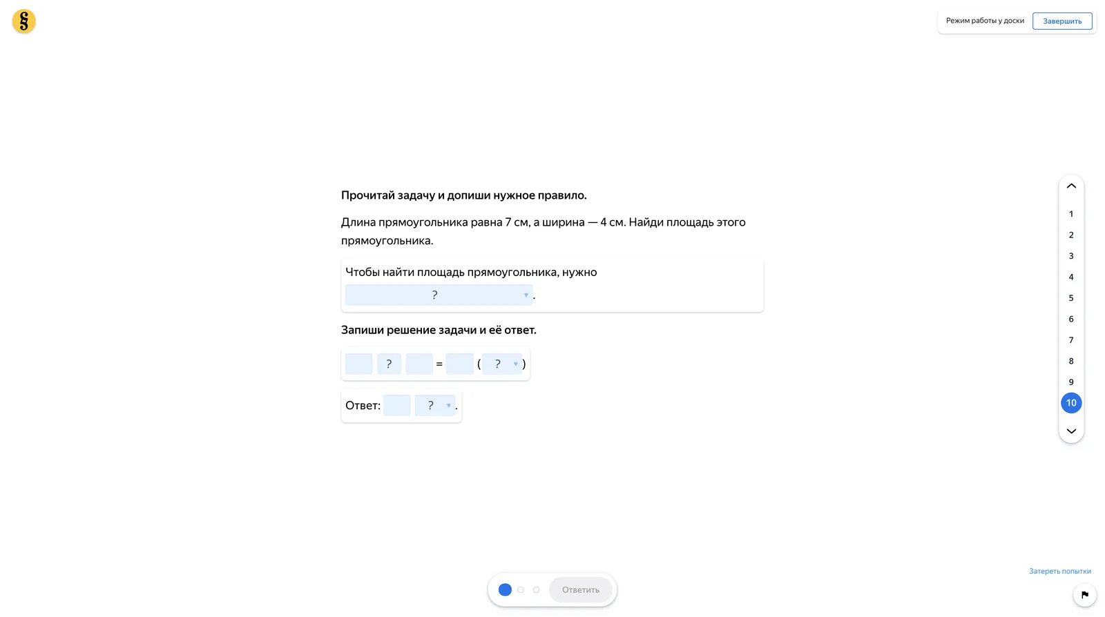
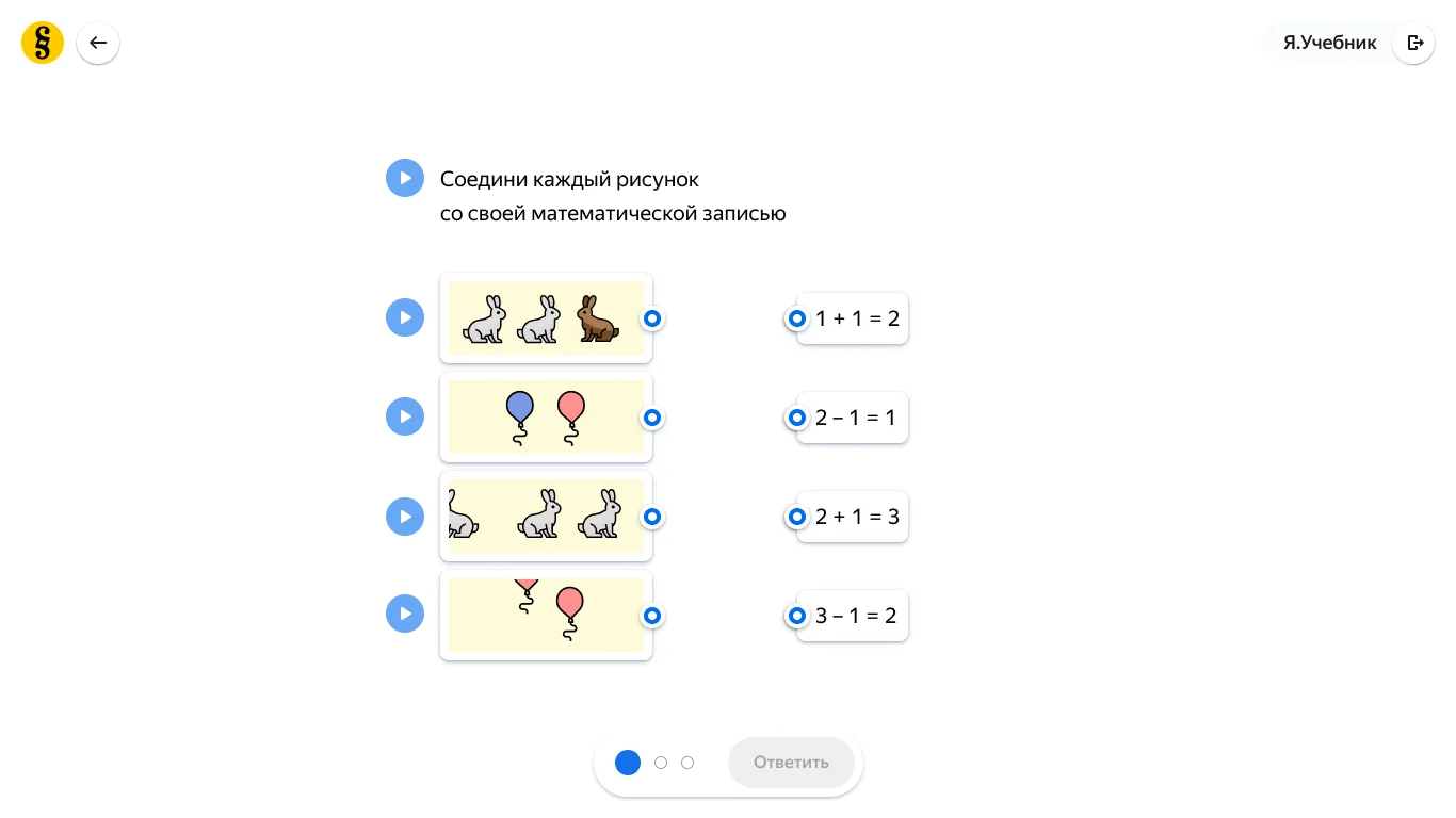
For two months I came back with proposals and the CEO killed every one: no metric, too much work, nothing proven yet, so no resources. On the third pass I stopped pitching the destination and pitched the wedge — a small experiment that would propose a metric for engagement and show movement on it. That one got through, on fractional time from people already on the team: no new hires, barely any dev or QA.
So I ran a voluntary summer club. An in-product landing converted kids and their parents — about 3,000 sign-ups — and since it cost nothing and no teacher assigned it, a child coming back each week was choosing to.
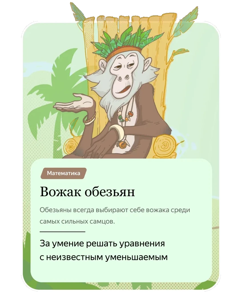
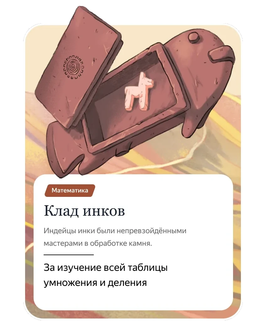
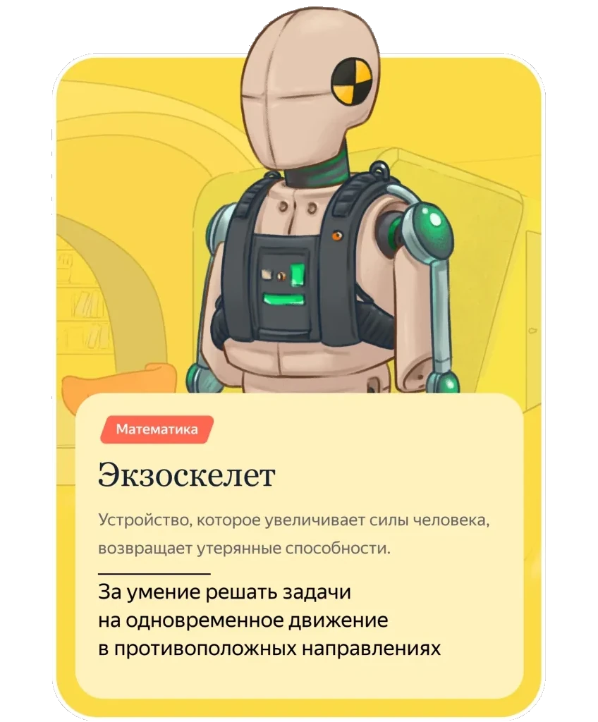
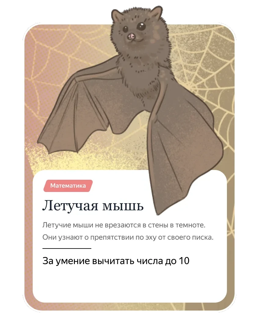
My bet: give children exercises with a story and a world behind them, and they’d stay longer and return more often.
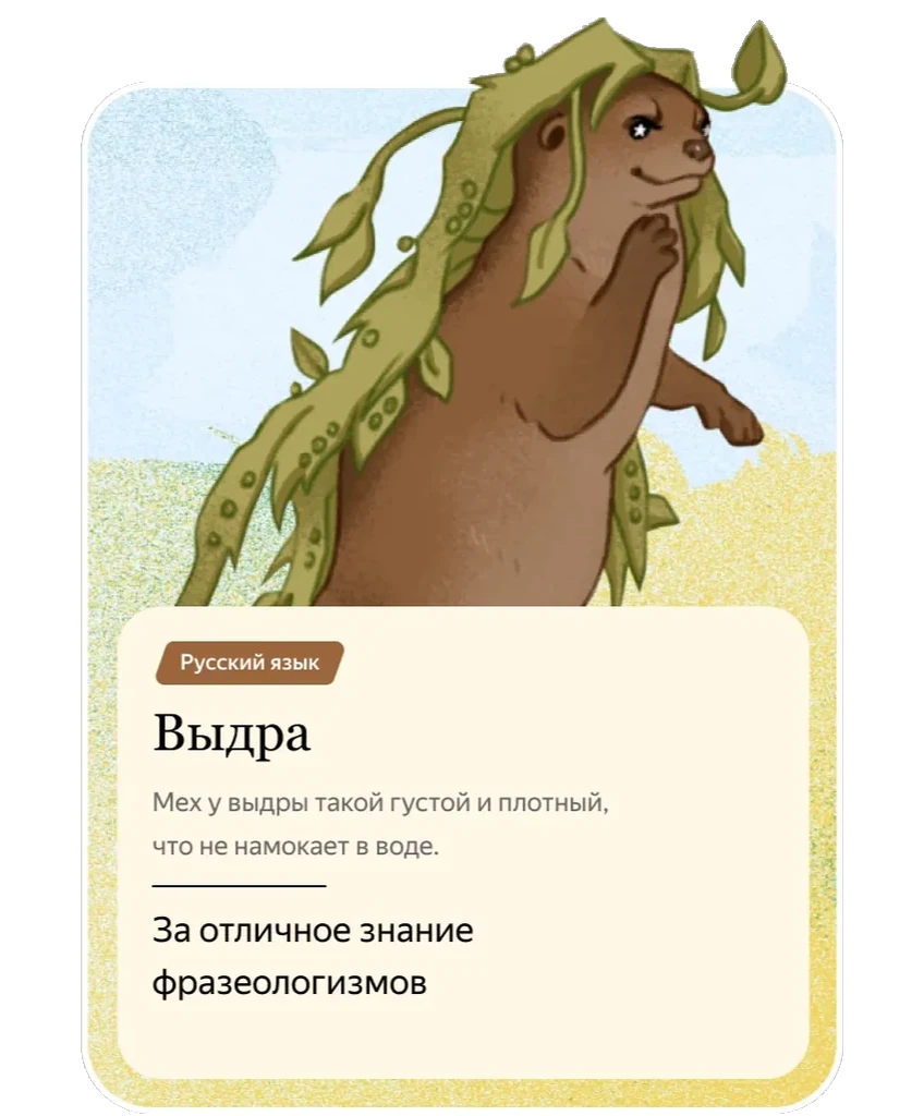
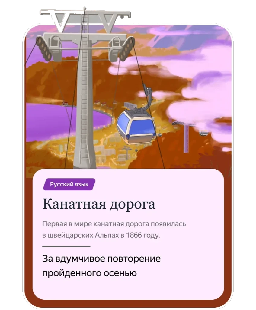
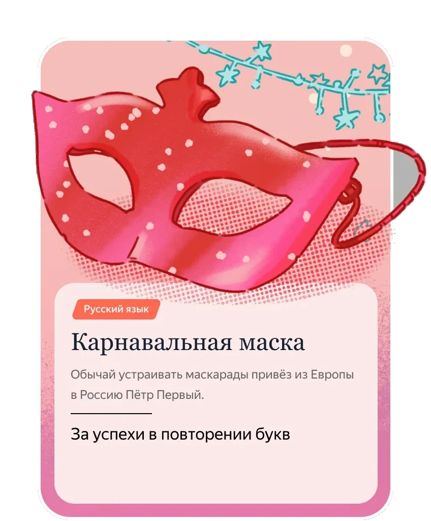
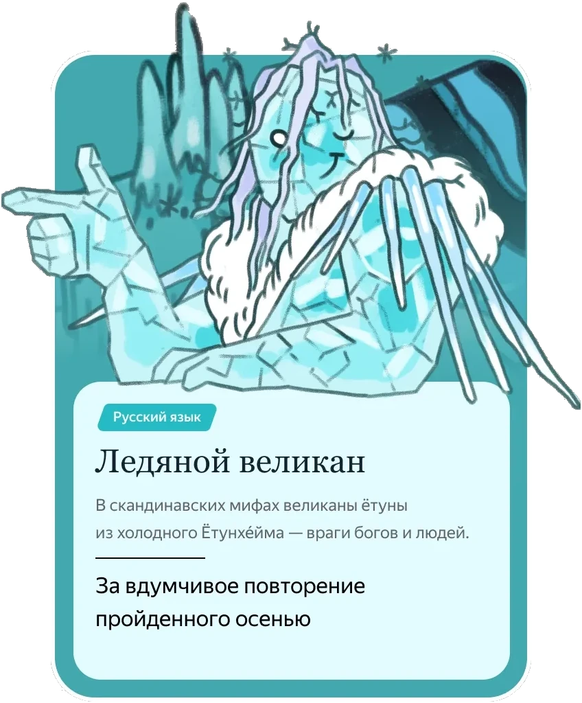
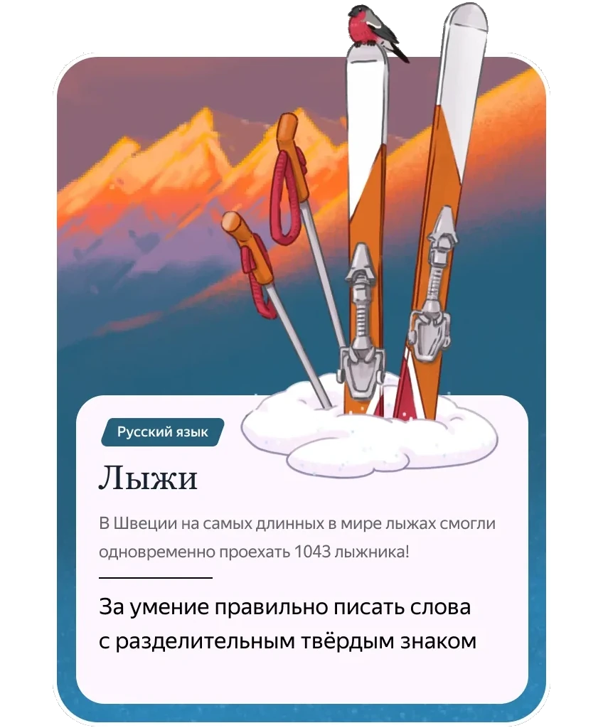
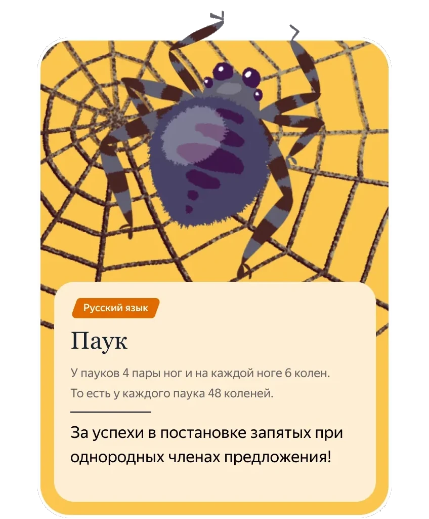
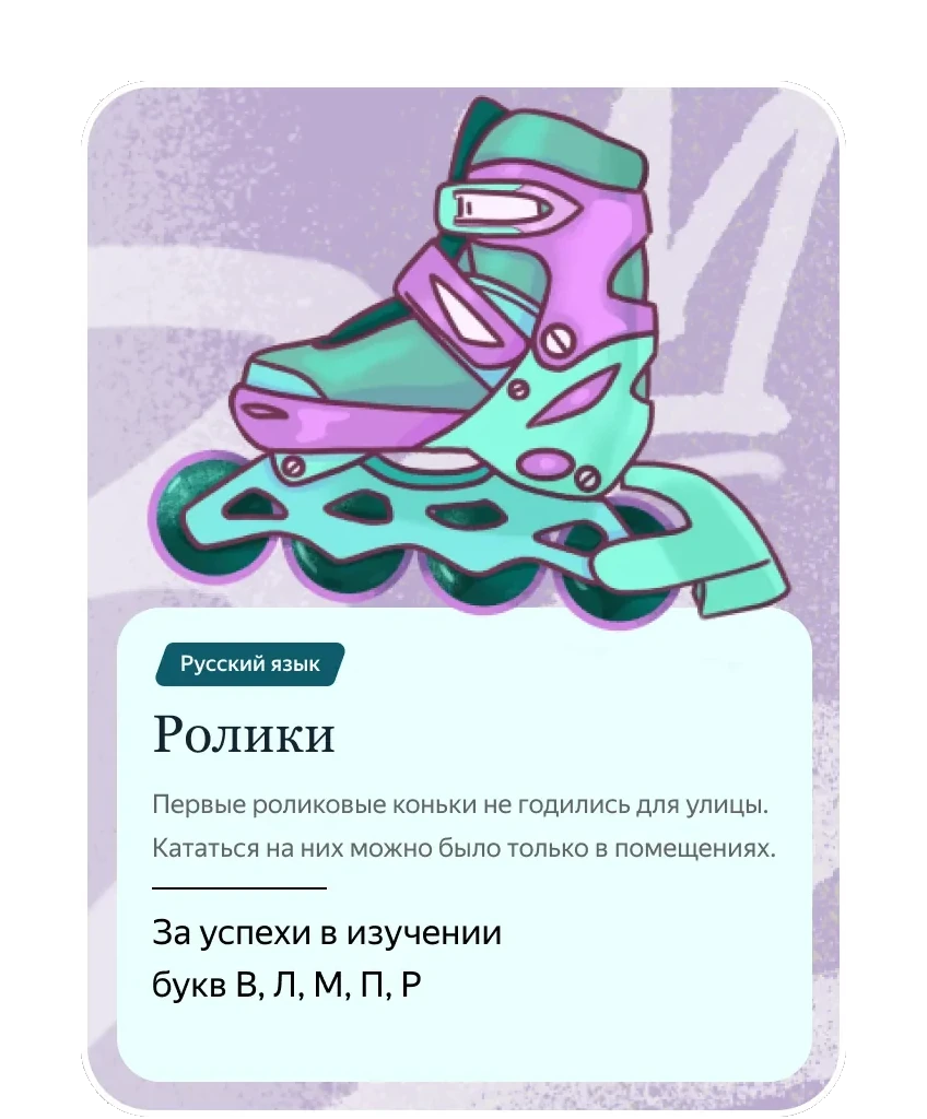
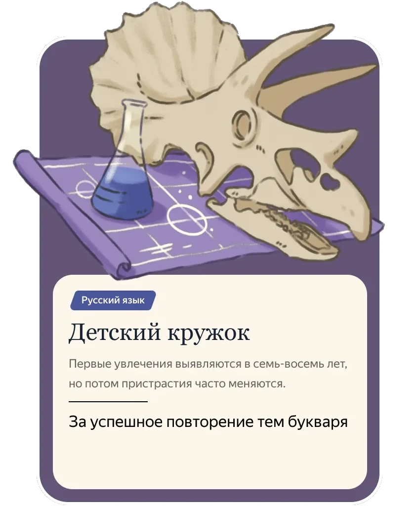
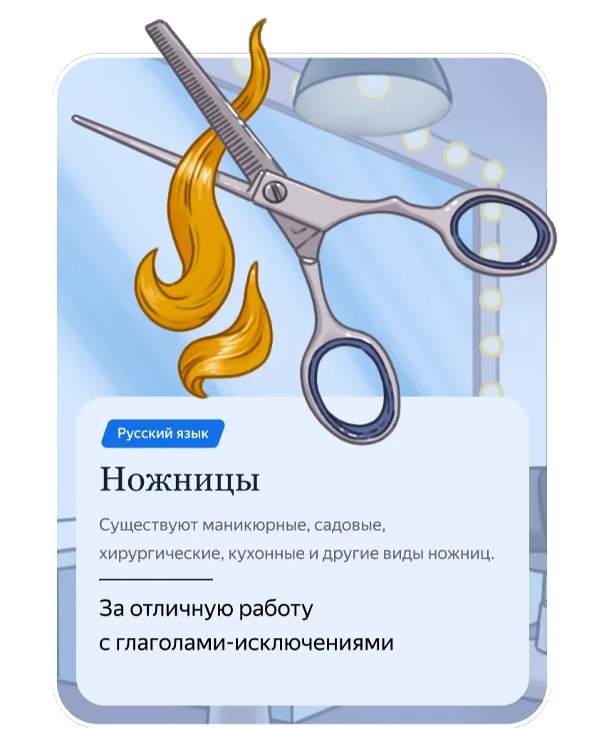
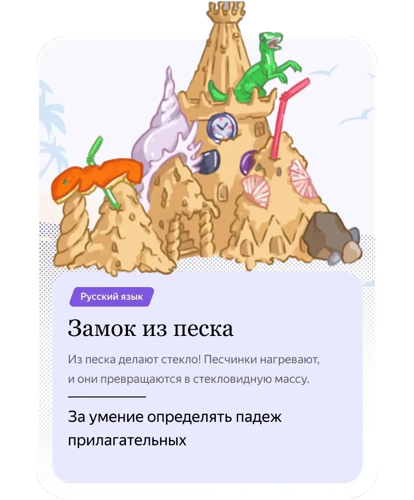
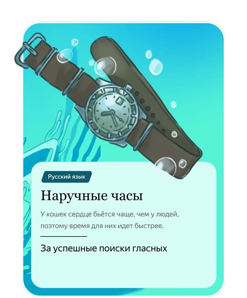
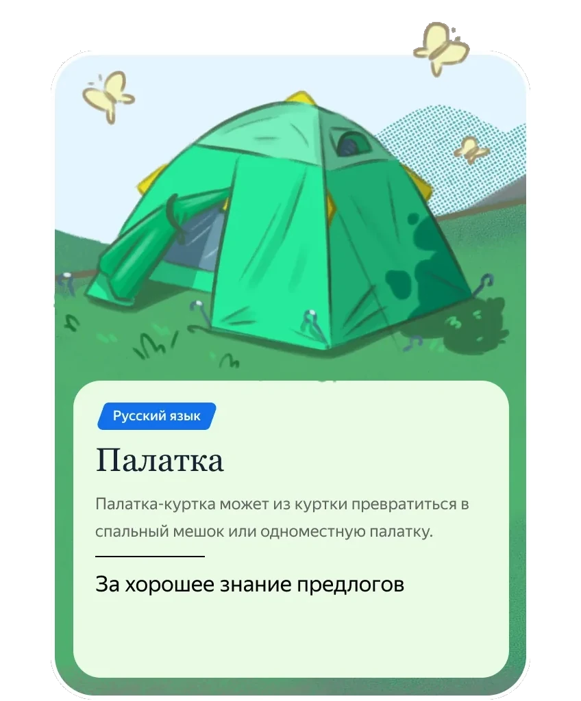
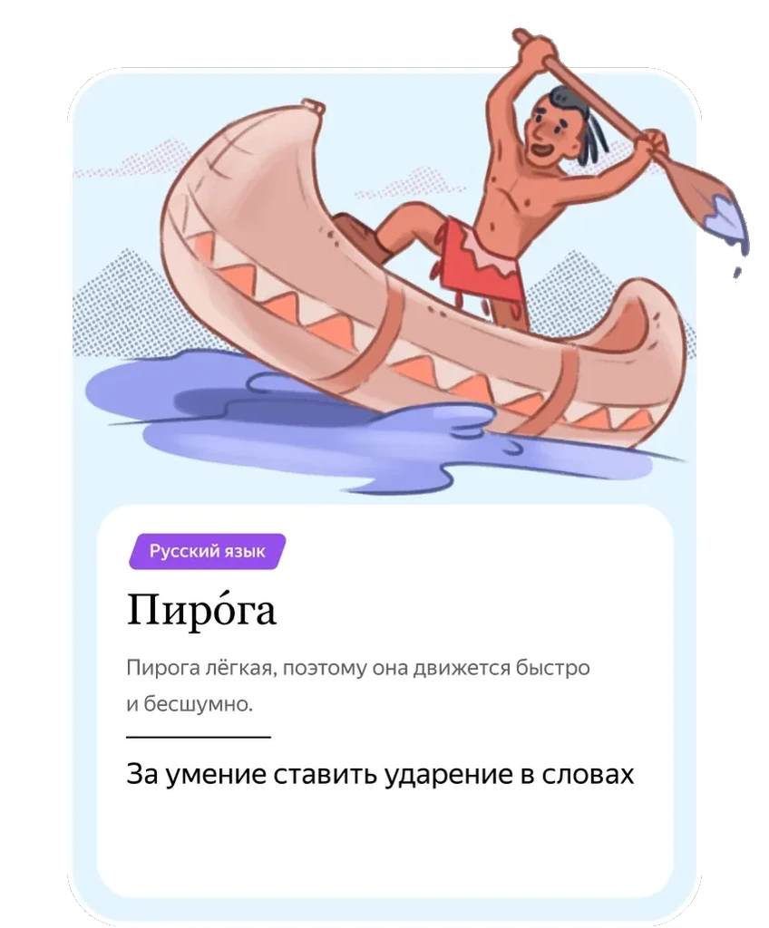
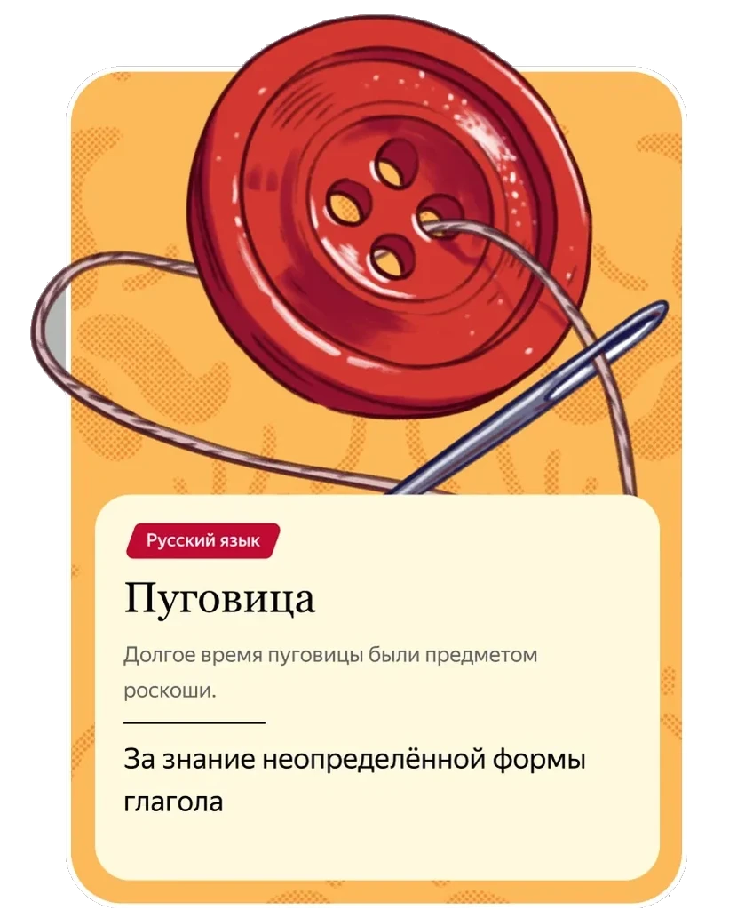
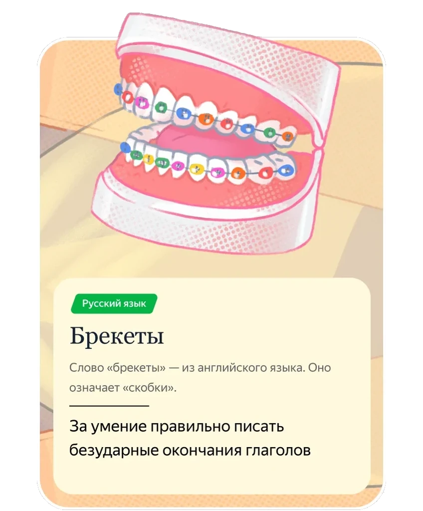
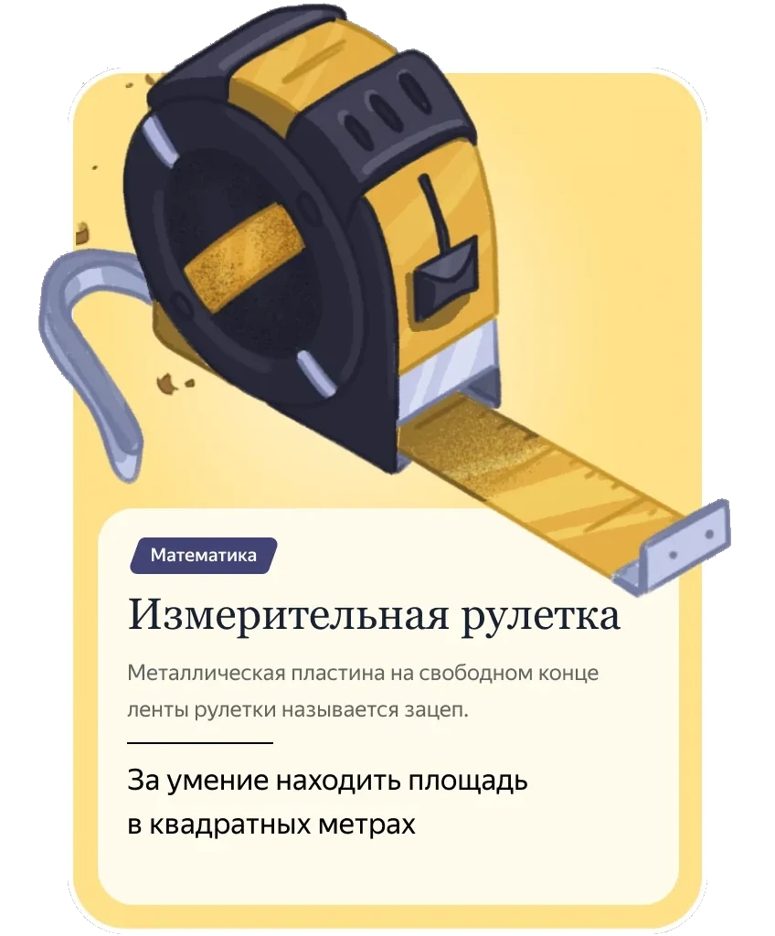
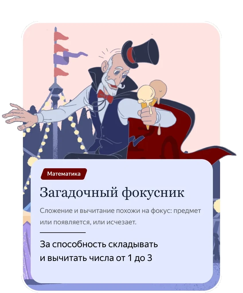
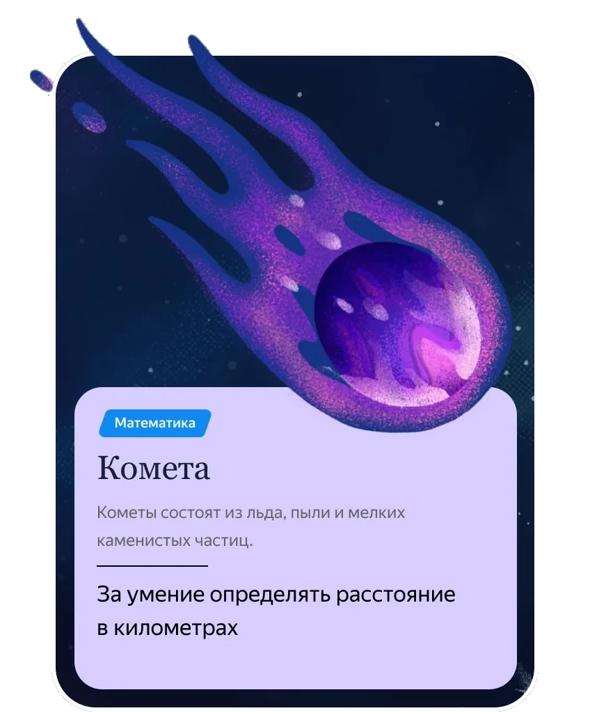
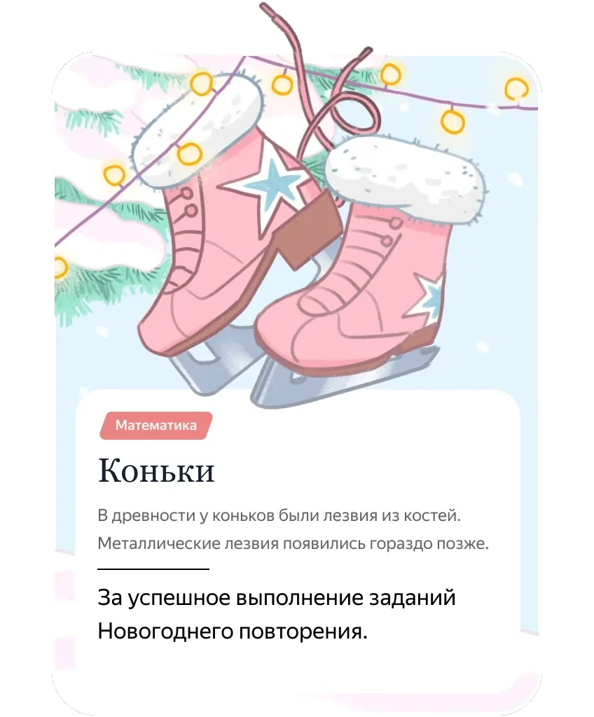
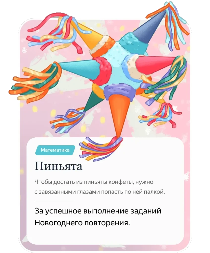
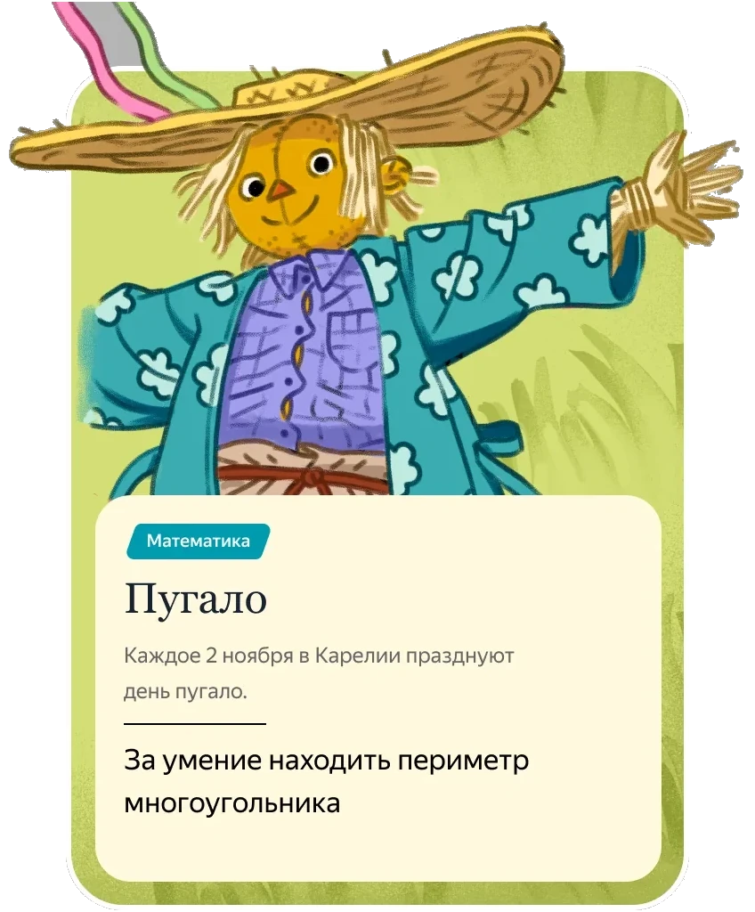
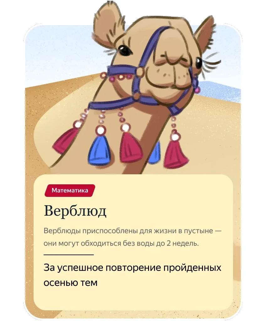
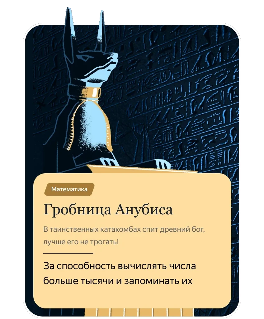
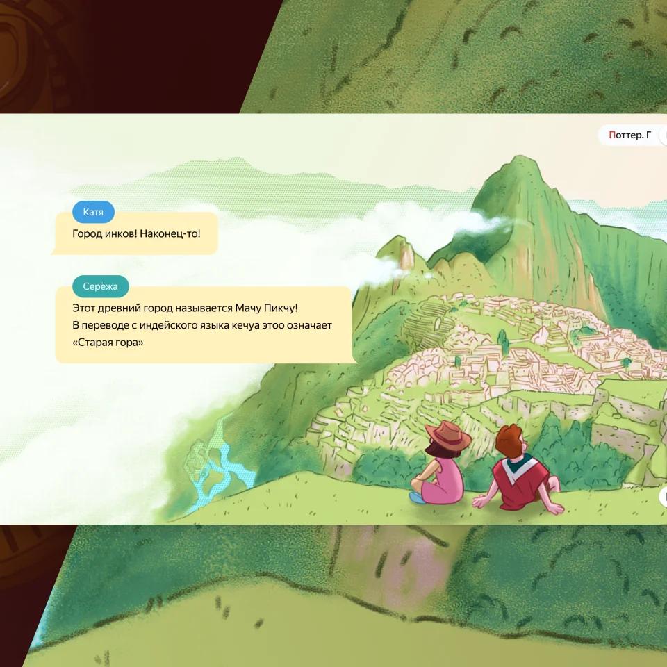
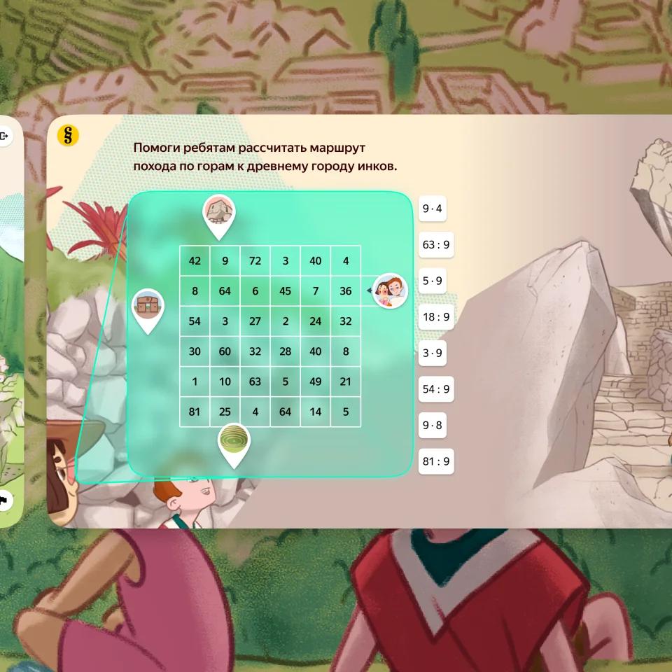
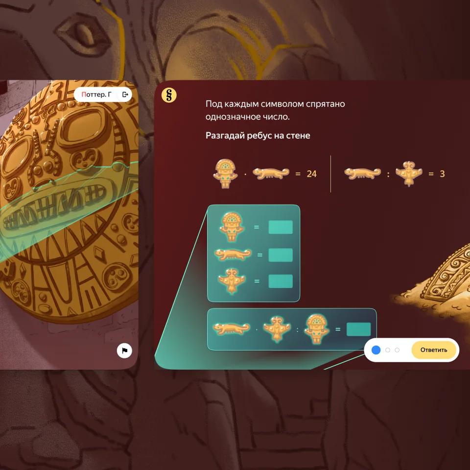
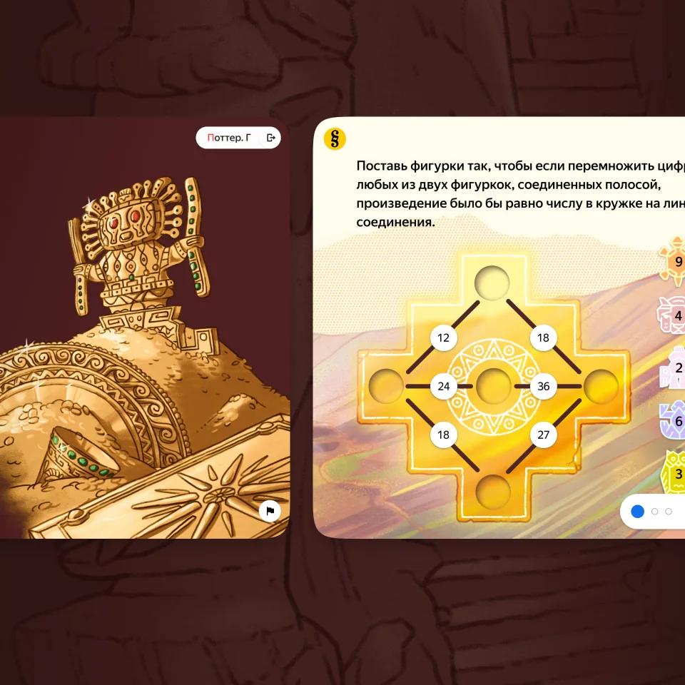
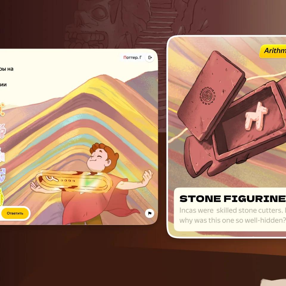
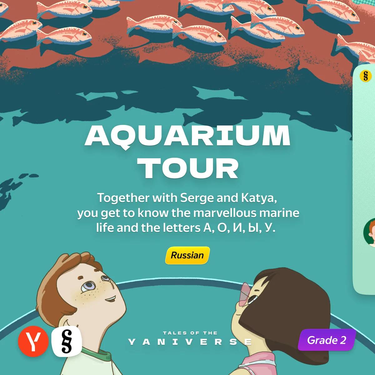
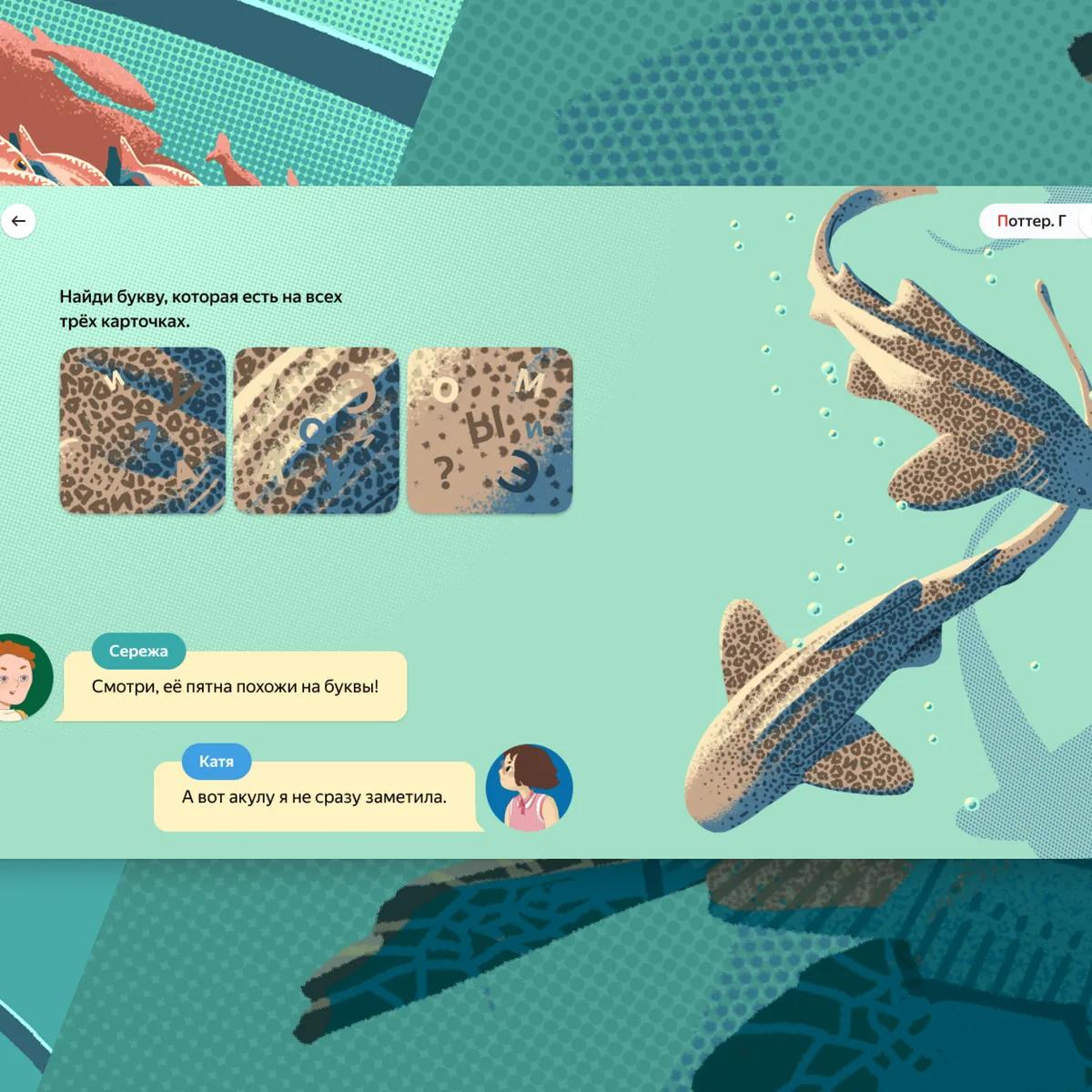
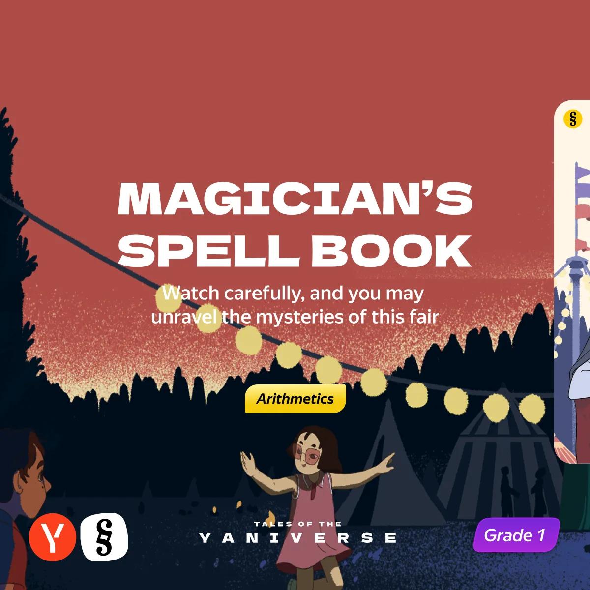
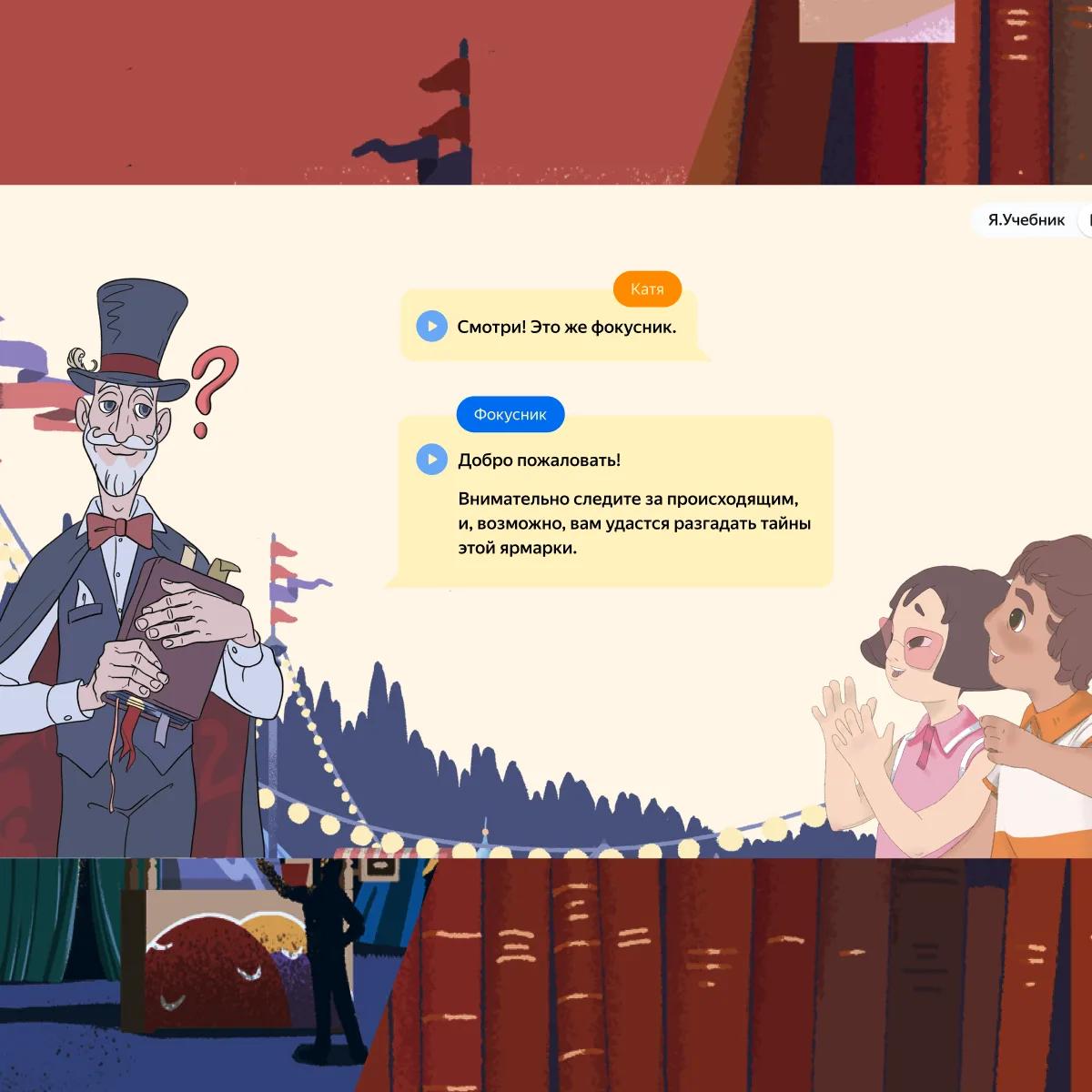
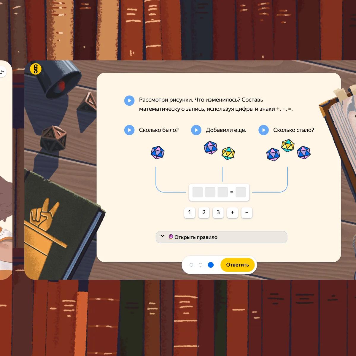
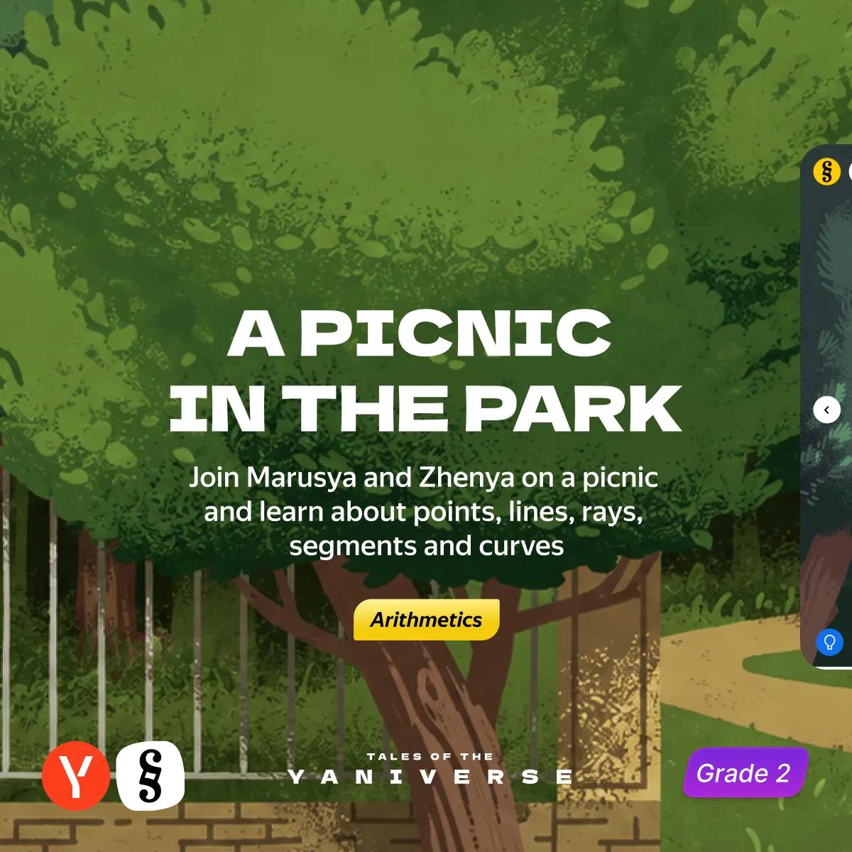
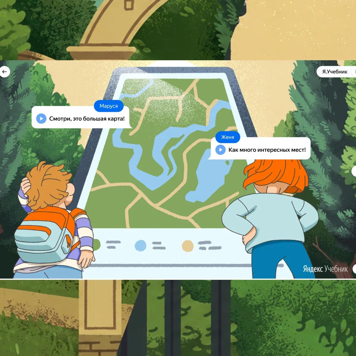
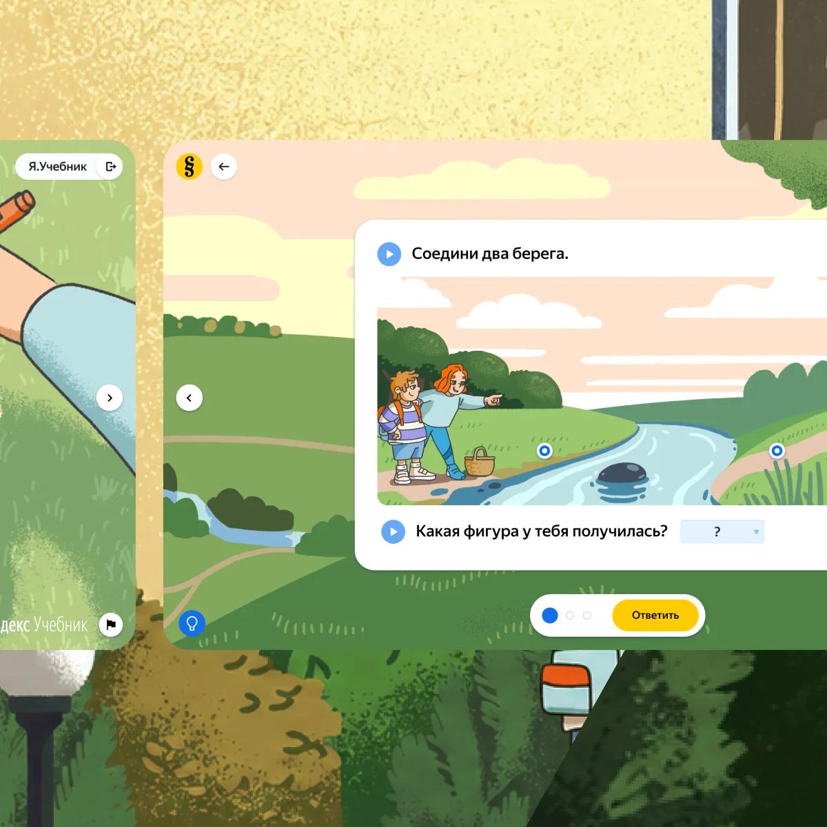
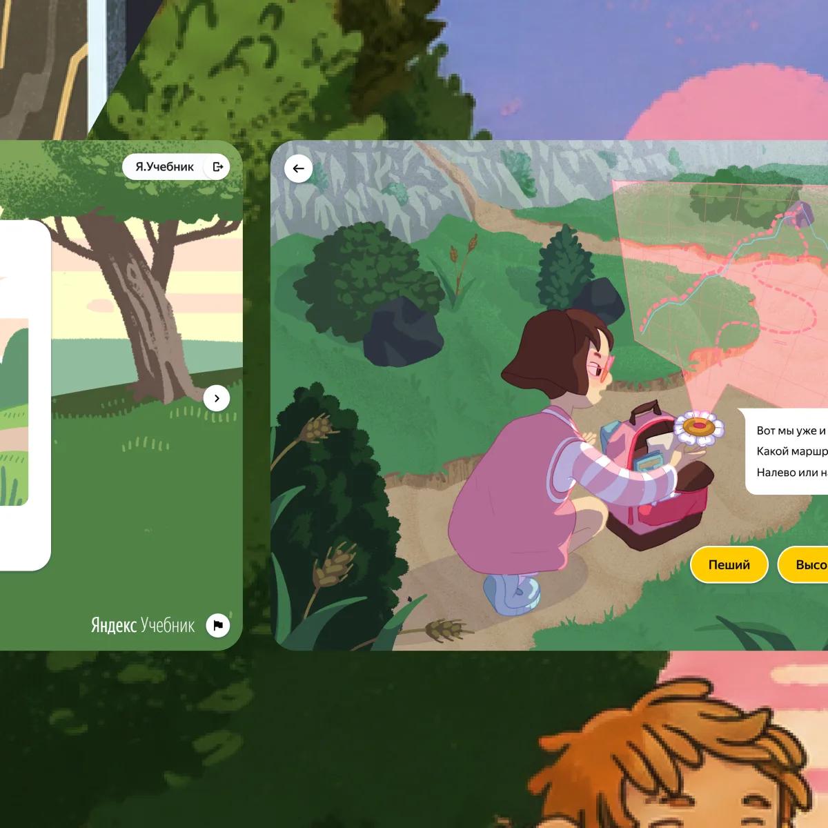
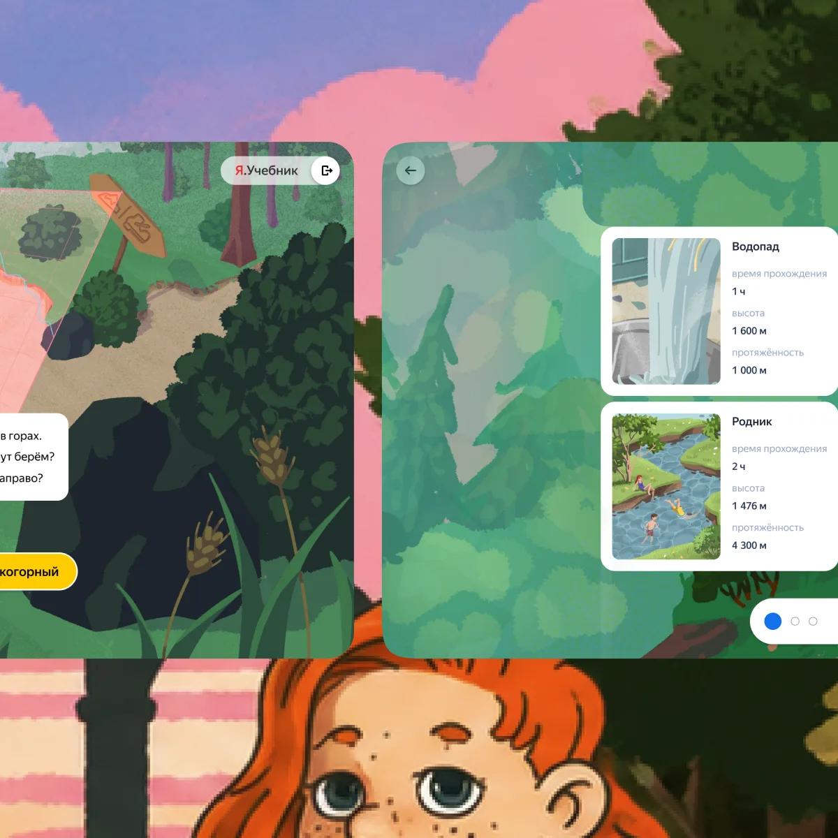
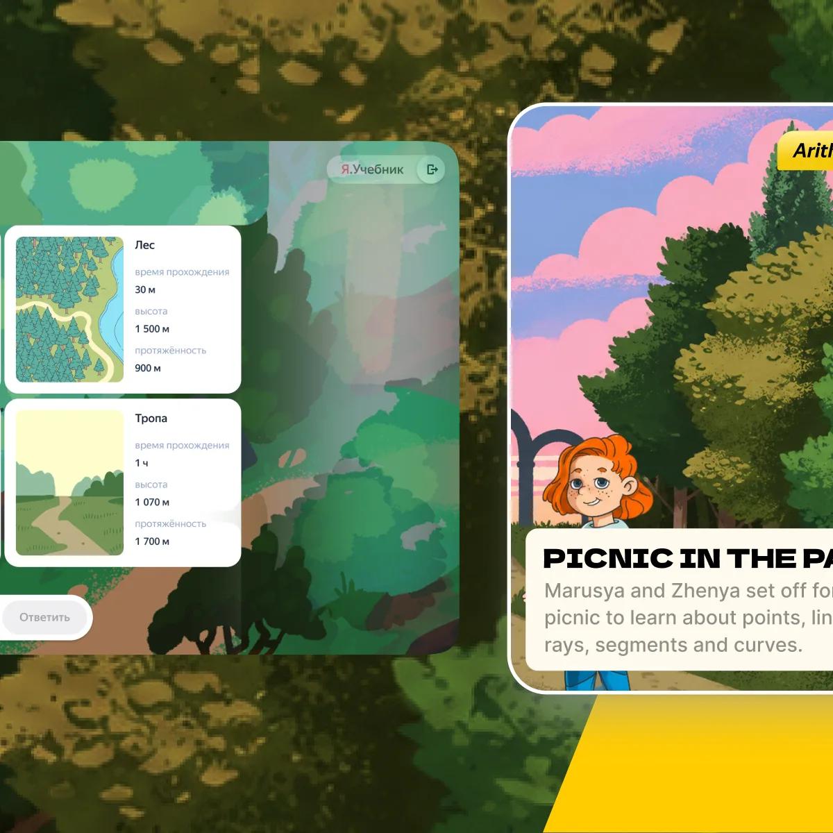
The summer club had no illustration budget and no world to draw on yet: the Yaniverse came much later. So the experiment used what the platform already owned — the encyclopaedic art sitting in the content library — and changed the staging instead. The same pictures ran large and in colour, with the exercise built around them, so a spelling exercise arrived as a fishing trip and an arithmetic one as a traffic stop.
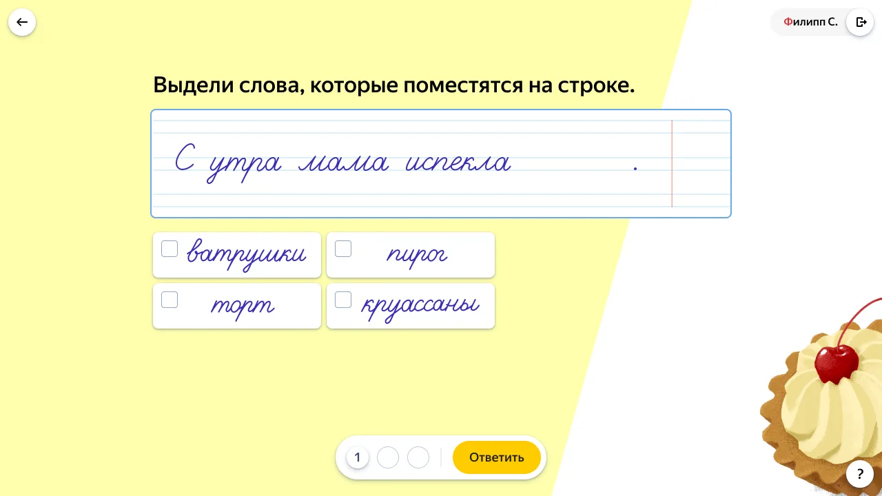
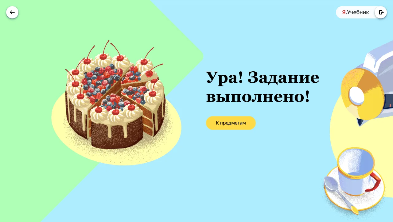
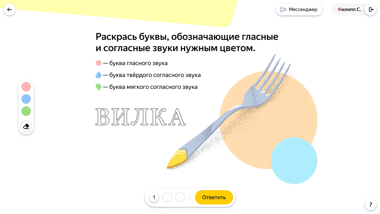
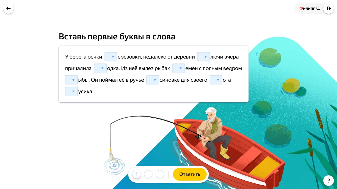
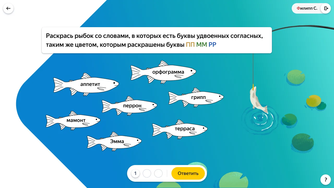
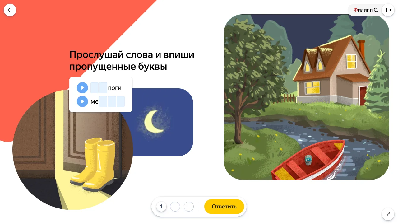

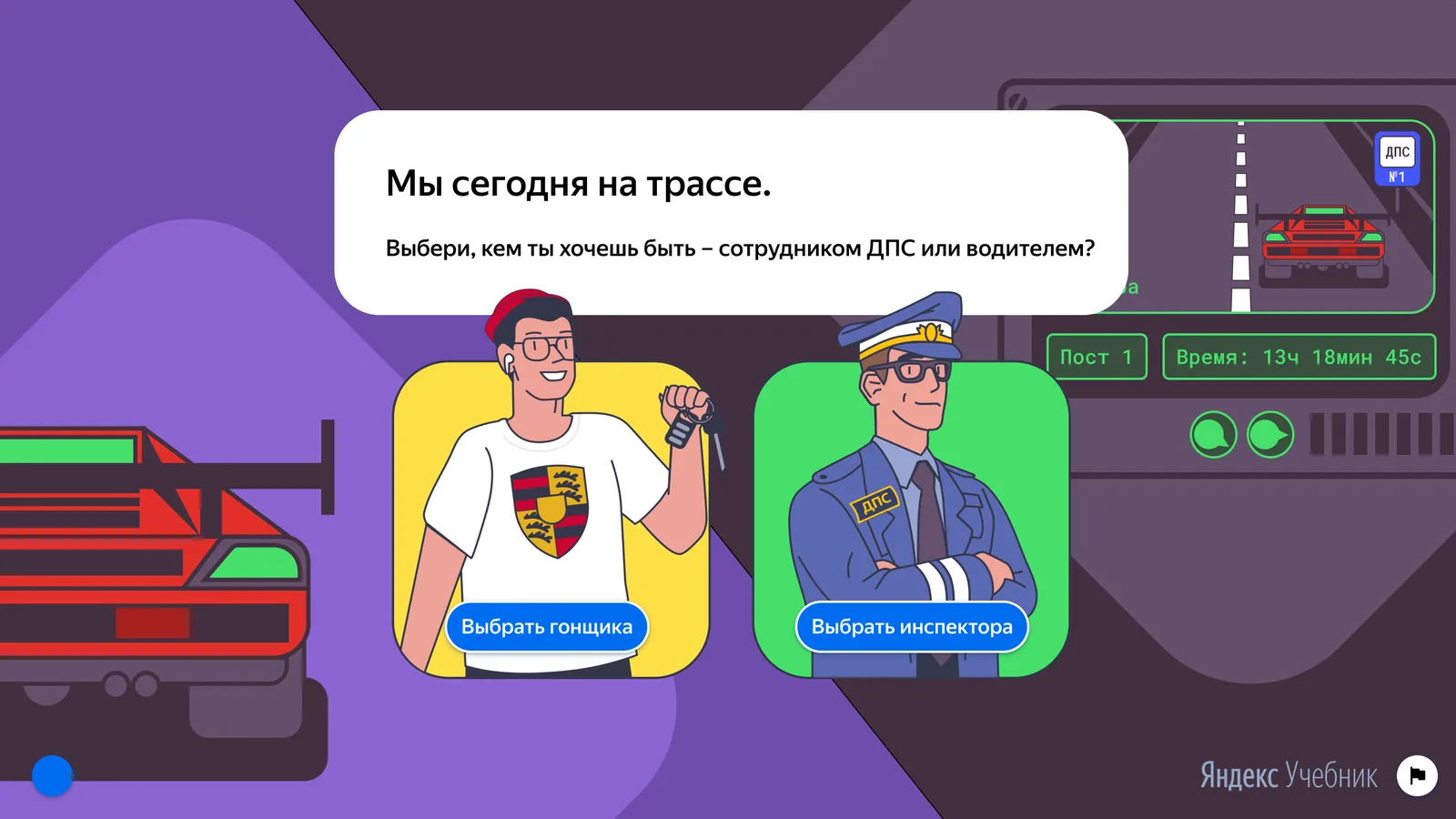
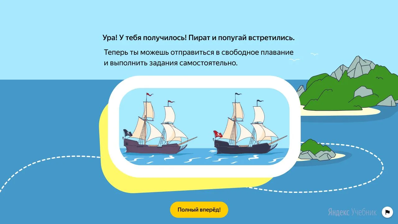
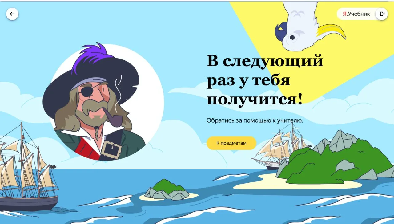
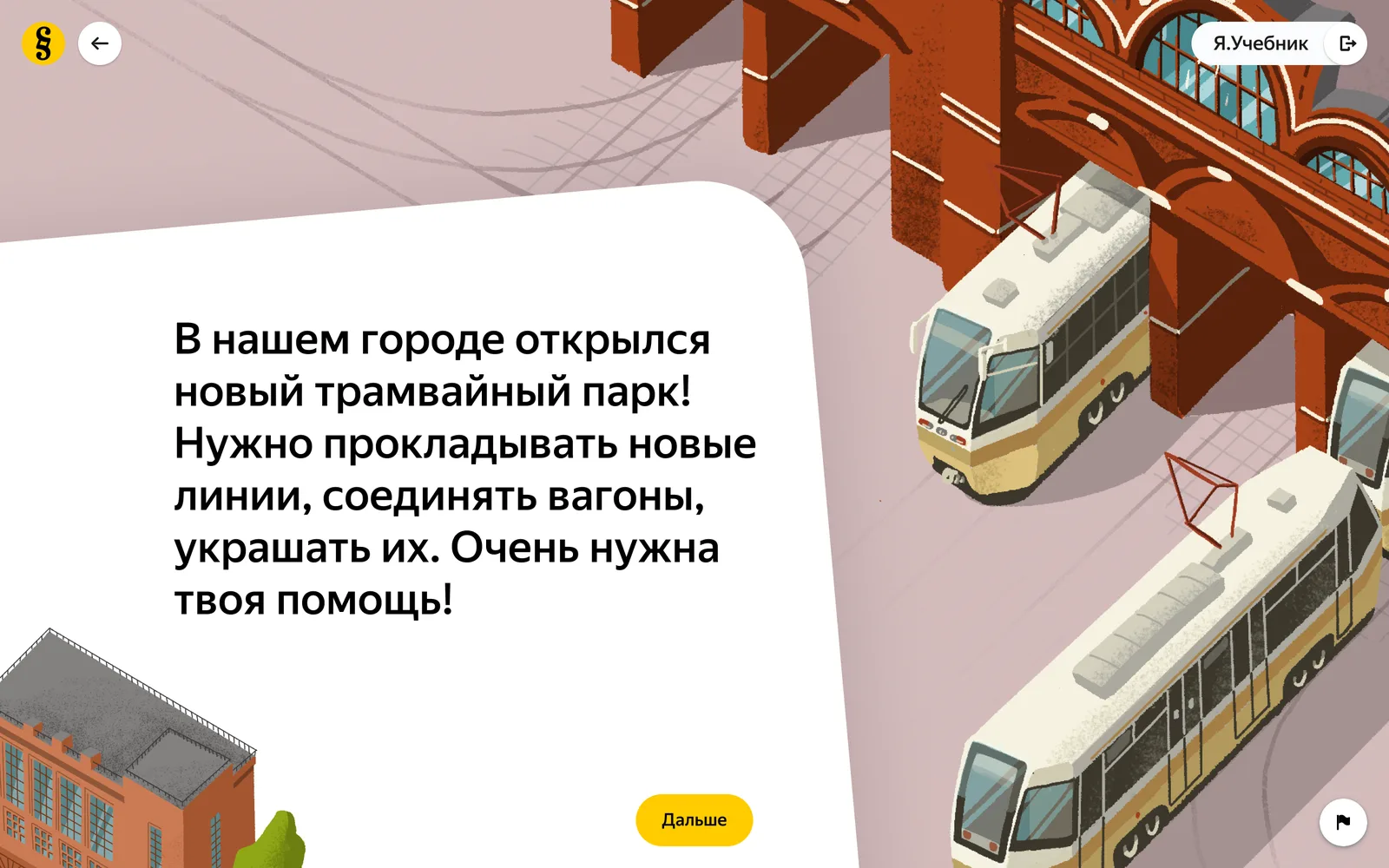
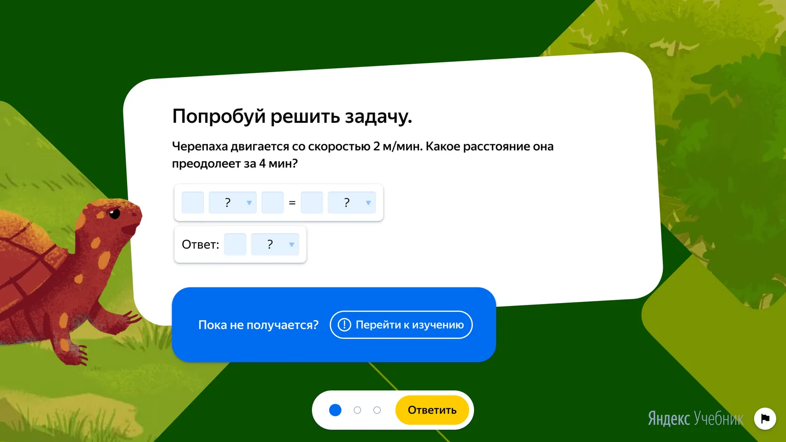
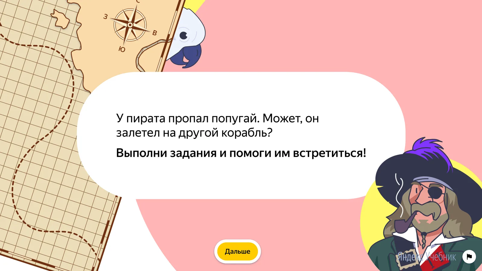
Deep in the methodology sat a belief: that a pretty exercise was a frivolous one — that learning is, as one of our methodologists put it, “a necessary violence against the child.” So we tested it fairly. The same content went out in two versions, one bare and one alive with characters and story, and the children settled the argument — they came back.
The fear ran the other way too: that pictures and a plot would work as distractors and children would solve worse for being entertained. They did not — there was no statistically significant difference in the quality of the work between the two versions. Engagement moved; accuracy held.
| Plain | Illustrated | |
|---|---|---|
| Week-to-week return | ~70% | 85% (+15pp) |
| Completion | 72% | 88% (+16pp) |
| Avg rating ★ | 4.5 | 4.9 (+0.4) |
A catalogue that size needed a population. We built seven heroes: a single face turns into a mascot overnight, and a mascot was a trap — competitors had already staked their branding on one, a corporate mascot meant endless approval rounds upstairs, and we had no time to test one. Seven meant a hero could be introduced, retired or swapped before any child grew too attached.
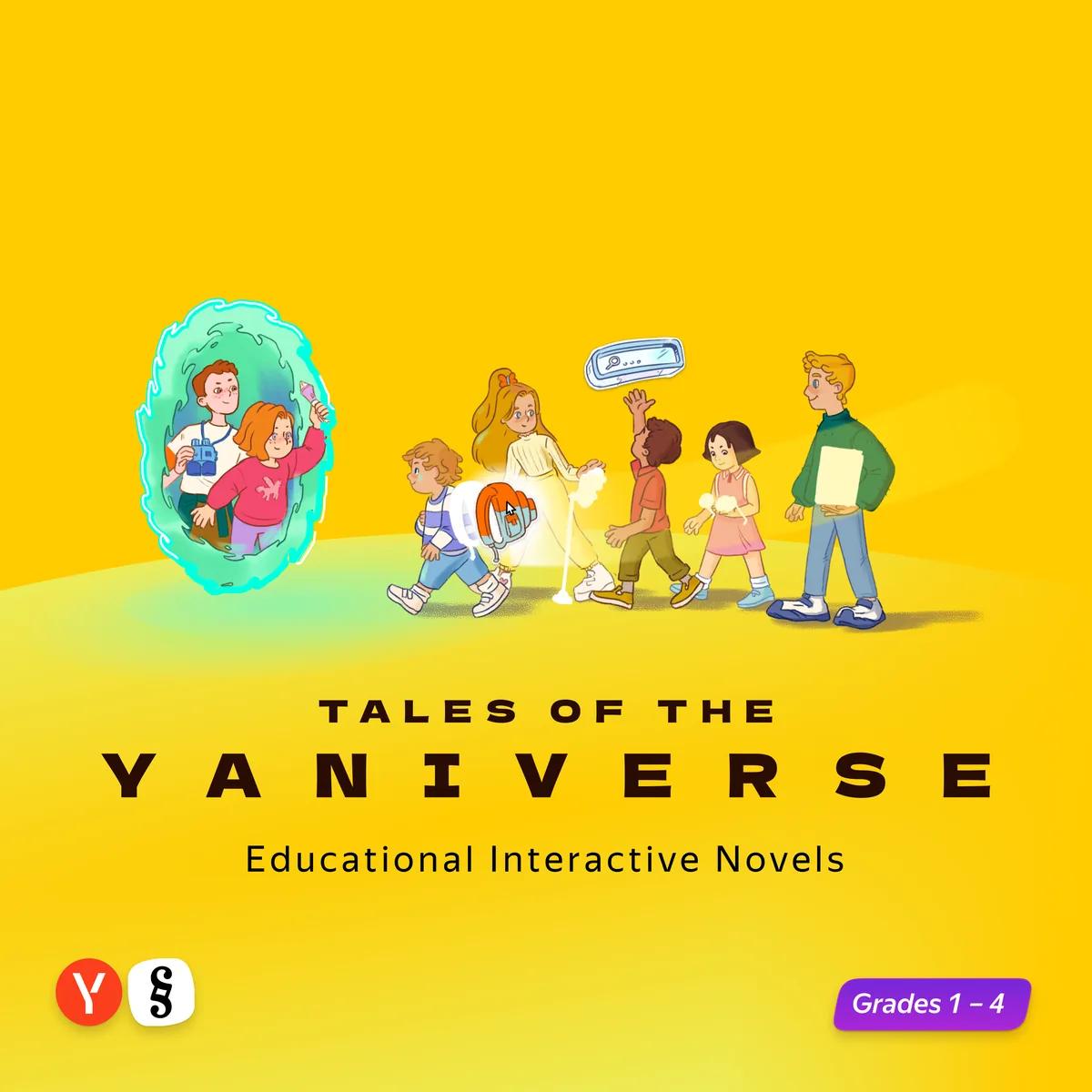
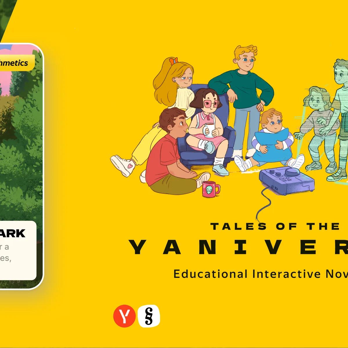
We built the universe and its lore, and it arrived sideways: the world through the cast, the lore through the small weekly stories, a piece at a time. There was no season arc — teams drafting in parallel across four grades could not carry that dependency, and neither could a child who joined in week nineteen. Only Glitch runs through everything; the rest of the trouble is local and lasts one story. All of it lived in a story bible the teams built from.
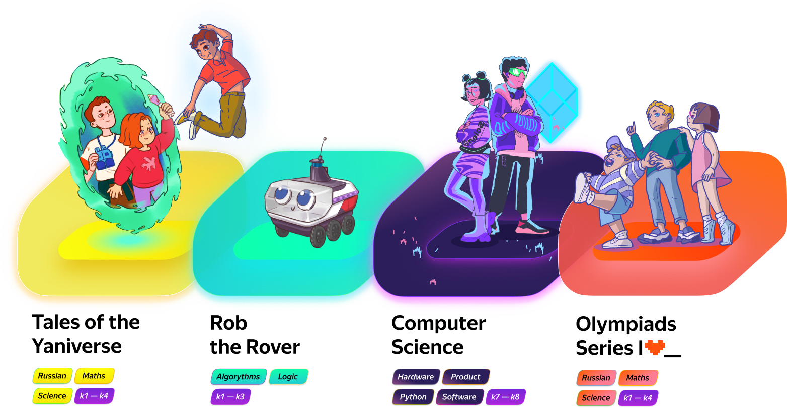
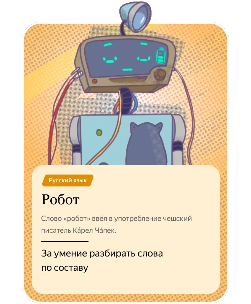
That bible is what the rest of Schoolbook ended up running on: some of it designed in from the start, like the Maths Olympiad and Rob the rover, some laid over the world later, like the middle-school informatics product.








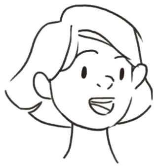

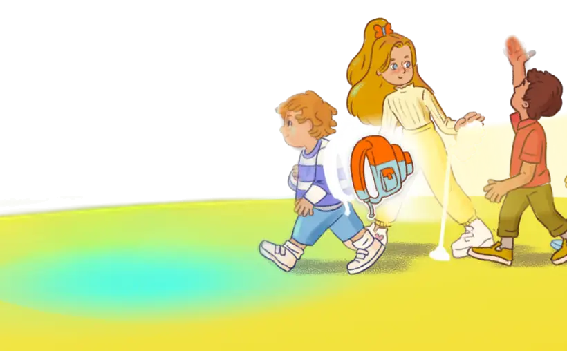
The cast had to work in silhouette before it worked in colour. Seven children a six-year-old tells apart at a glance, and any team can draw without asking us: the tallest, the roundest, the one whose ponytail adds ten centimetres.
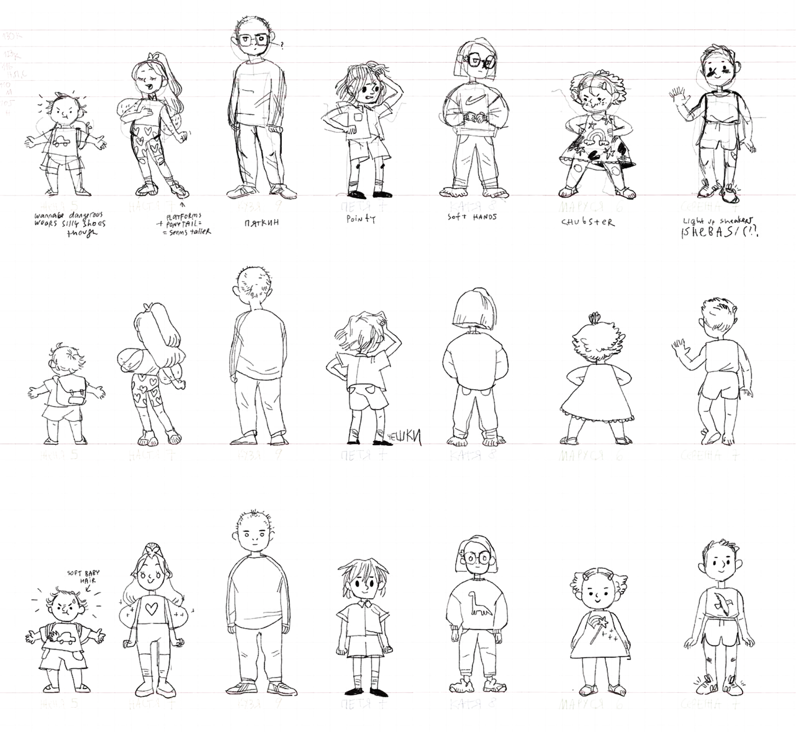
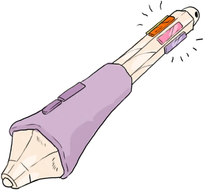
Then every hero got a life to stand in — a temperament, a family, a best friend, a grudge, who annoys whom — and a power that is a Yandex service wearing a costume. Each also got an object — a prop a child can point at names a hero quicker than any description.
All of it went into a character bible, and under the bible an asset library: every hero in a range of poses and expressions, each one delivered on alpha. A scene could be assembled from parts — a pose swapped, a face changed — without anyone redrawing the hero. It is how an animation studio works, and it is what let every team keep drawing the same seven children.
By the time the writers opened the bible, the people already existed. They were casting them.
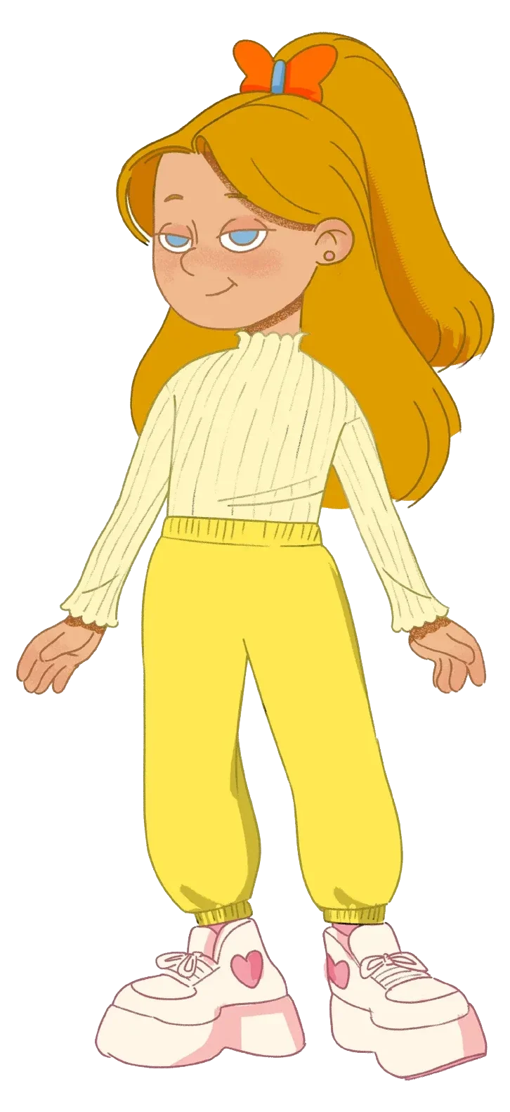
Puts it on stage
Seven, and already directing. Nastya turns whatever is happening into a show — she stages it, narrates it, and films it from three angles at once. Platform shoes and a high ponytail so she reads as the tallest child in the line-up even when she is not.

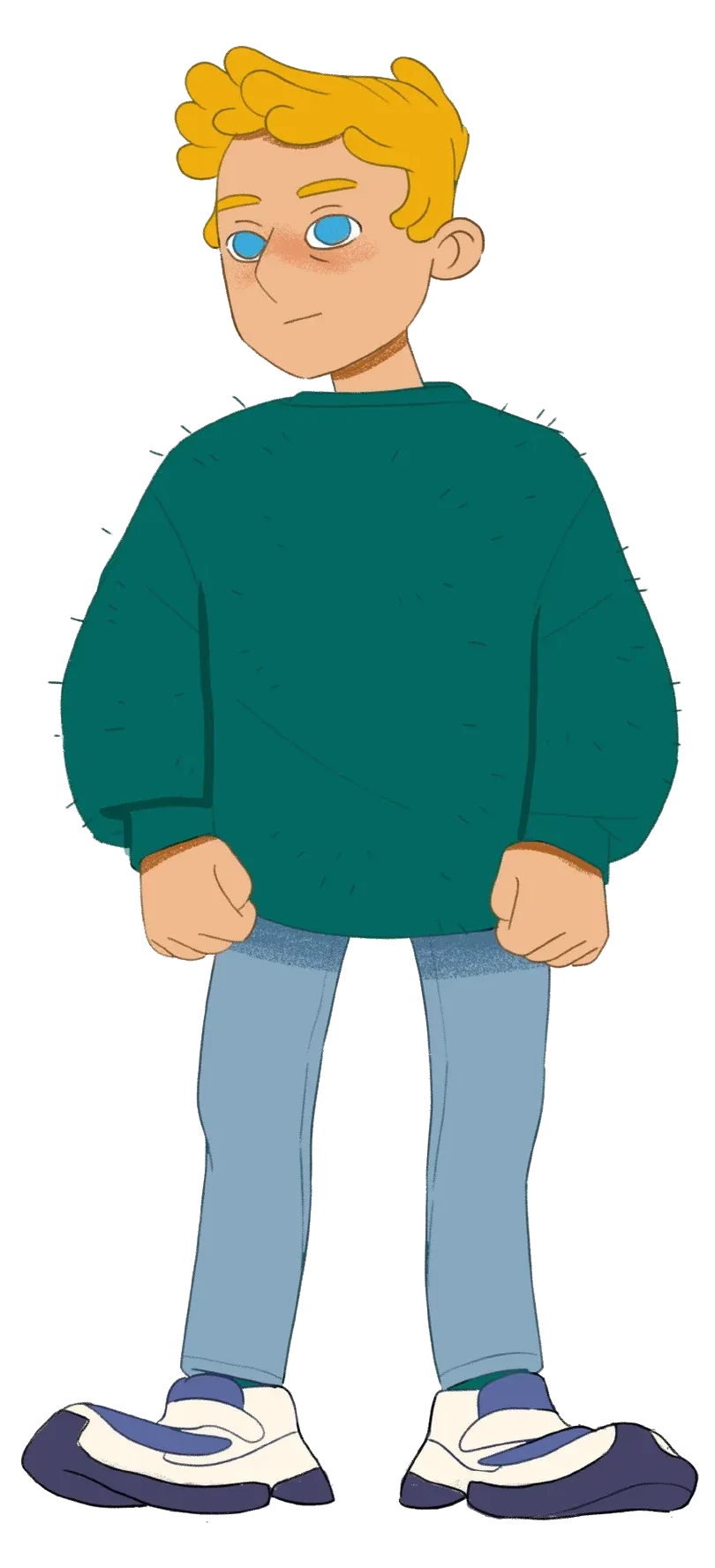
Reads the situation
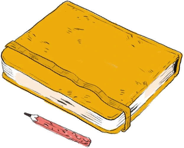
The oldest of the seven and the one who has read about this before. Kuzma keeps a notebook of adventures copied out of books and films, and when the group is stuck he knows which page they are on.

Pulls out the one thing nobody packed
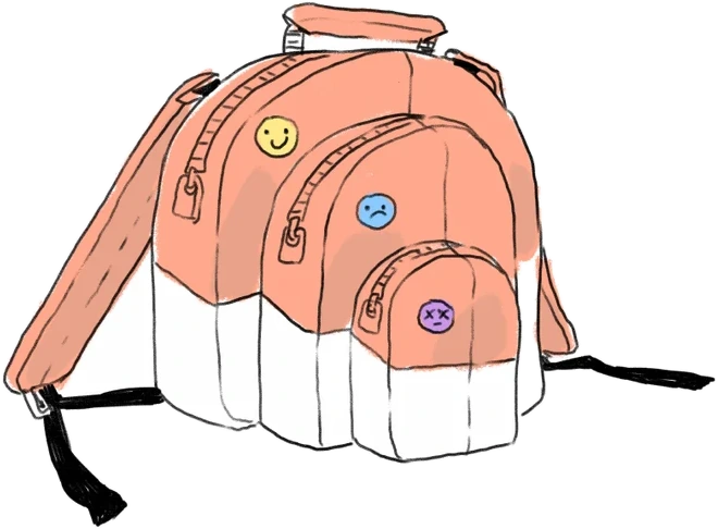
The smallest, the loudest, and the one carrying a backpack with no bottom to it. Whatever the group forgot, Zhenya has it — along with a football and a horse called Goshad that nobody else can quite explain.
Asks the question properly
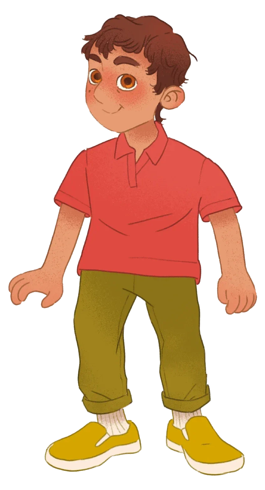
Petya knows that the answer depends on how you ask. His search device pulls a query bar out of thin air, and half his stories are about phrasing the question correctly.


Keeps the point in focus
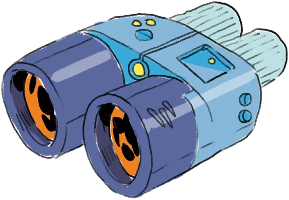
The one who notices what the picture is actually of. Katya wears glasses with a camera in the frame: she can hold a detail in focus, zoom it, and show the others the thing they were looking straight at and missing.
Sees what others walk past
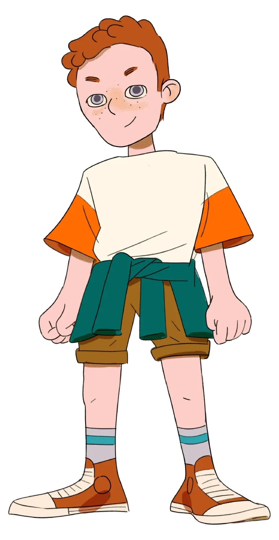
Marusya’s older brother, and the far-sighted one. Serezha spots the thing on the horizon — a route, a roof, a shape in the trees — and light-up sneakers give away where he has already been.
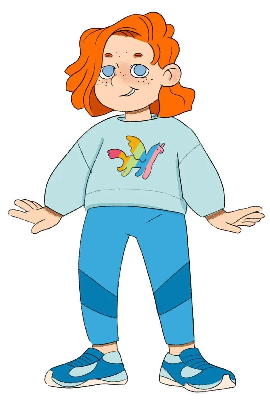
Draws the thing nobody has seen yet
The youngest of the seven and the one who solves things by drawing them. Marusya sketches what the group needs and it turns up — which makes her both the most useful and the hardest to argue with.
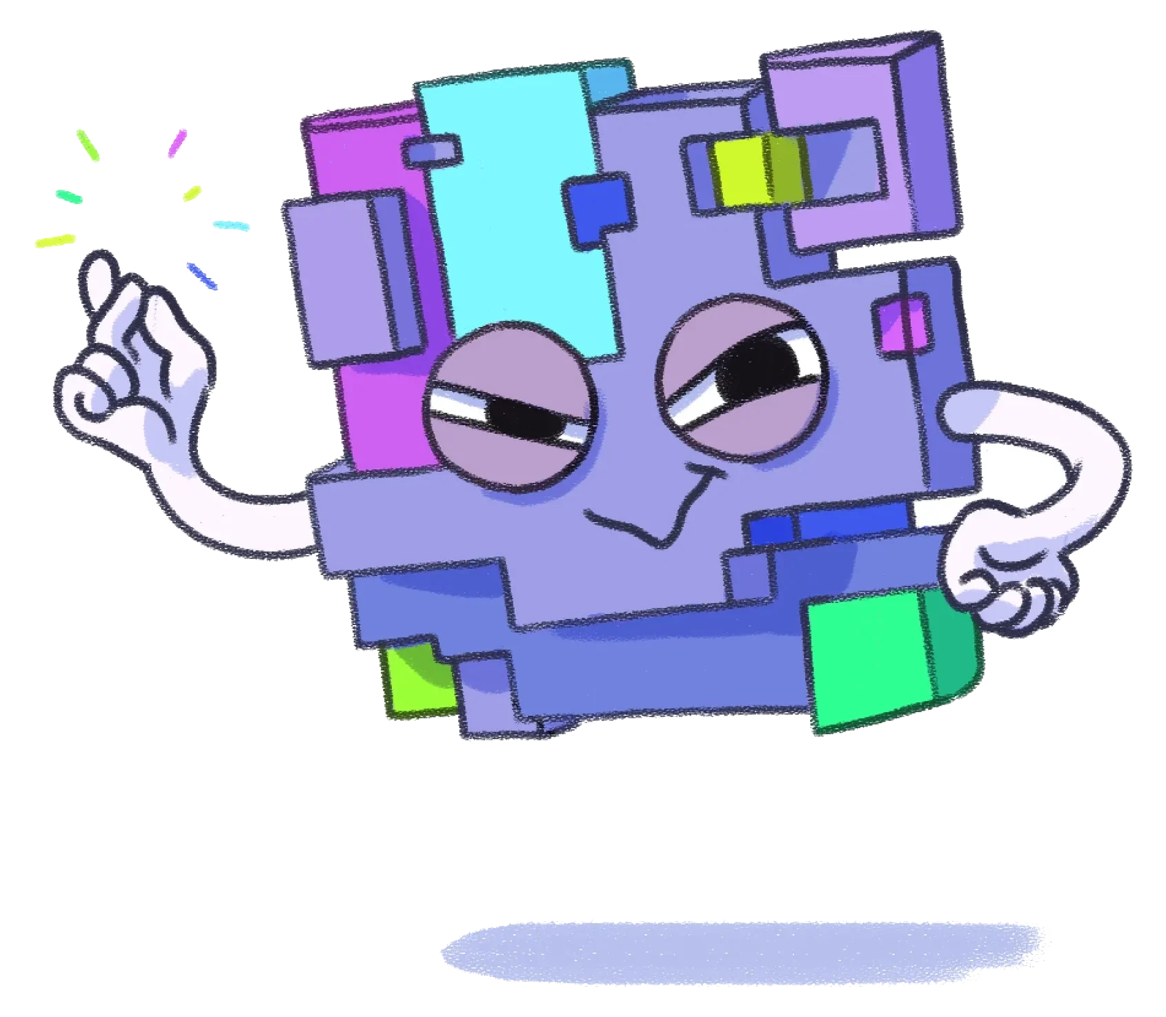
The villain of the world
A wormhole eating at a bright world: an unexplained fault, a bug, a troll in one virtual body. It breaks services, snaps connections, spams, lies and talks children out of believing in themselves — always arriving like a jack-in-the-box, in the comic shape of a black cat, a mad owl, a snake. Its power shrinks the moment the heroes stop being scared and keep going their own way.
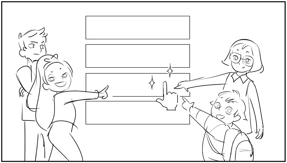
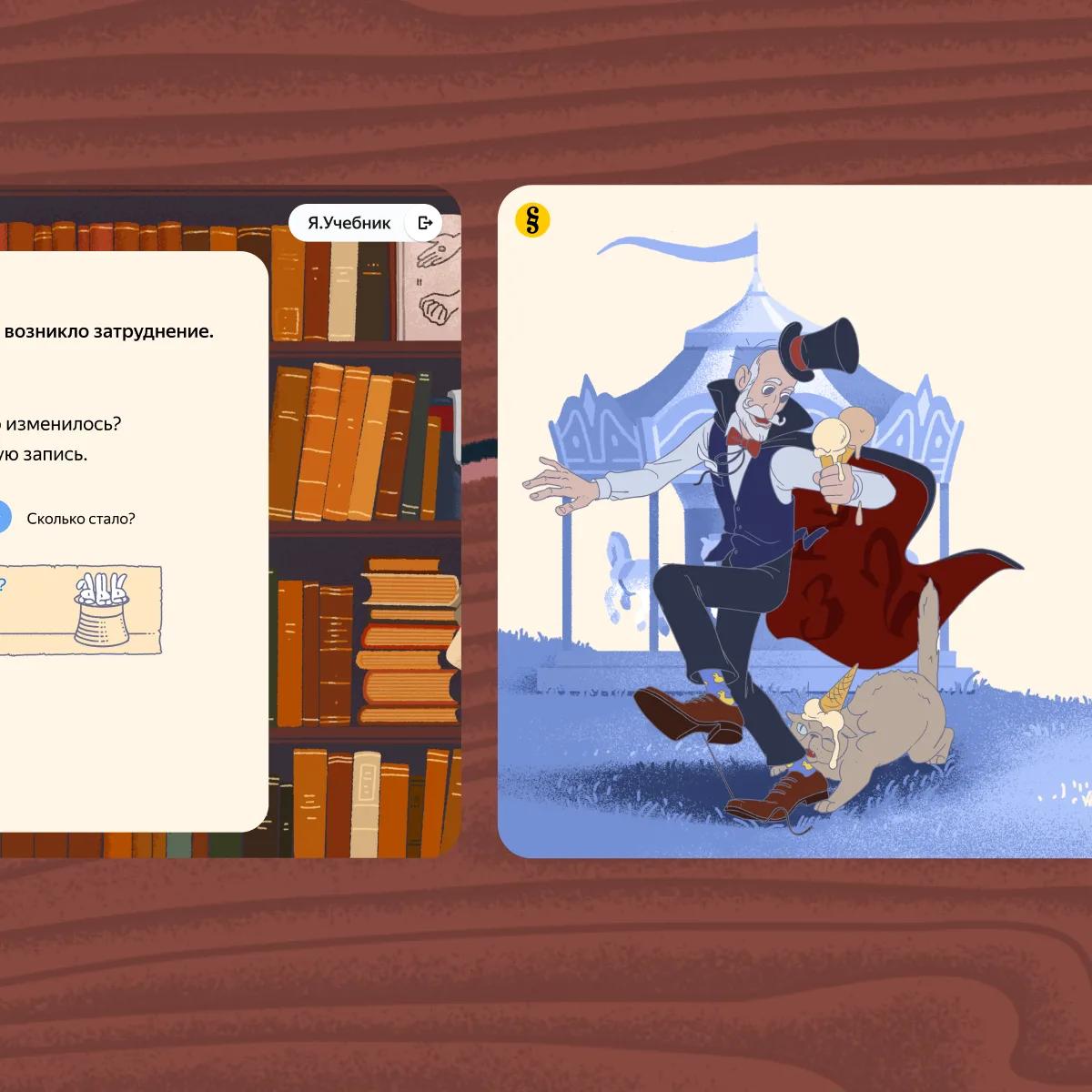
A week’s story was a handful of exercise layouts, and the kit for telling anything inside them was small: the layout itself, the poses the cast stand in, what their faces are doing, and the objects in the scene. No camera, no cuts, no narrator — a child gets the plot from those four things or does not get it at all.

The stories had to be simple. A child reads them between two exercises, so the plot cannot compete with the maths: clear enough to follow in four lines, plain enough for a seven-year-old, and still obvious enough that you notice a story is being told at all.

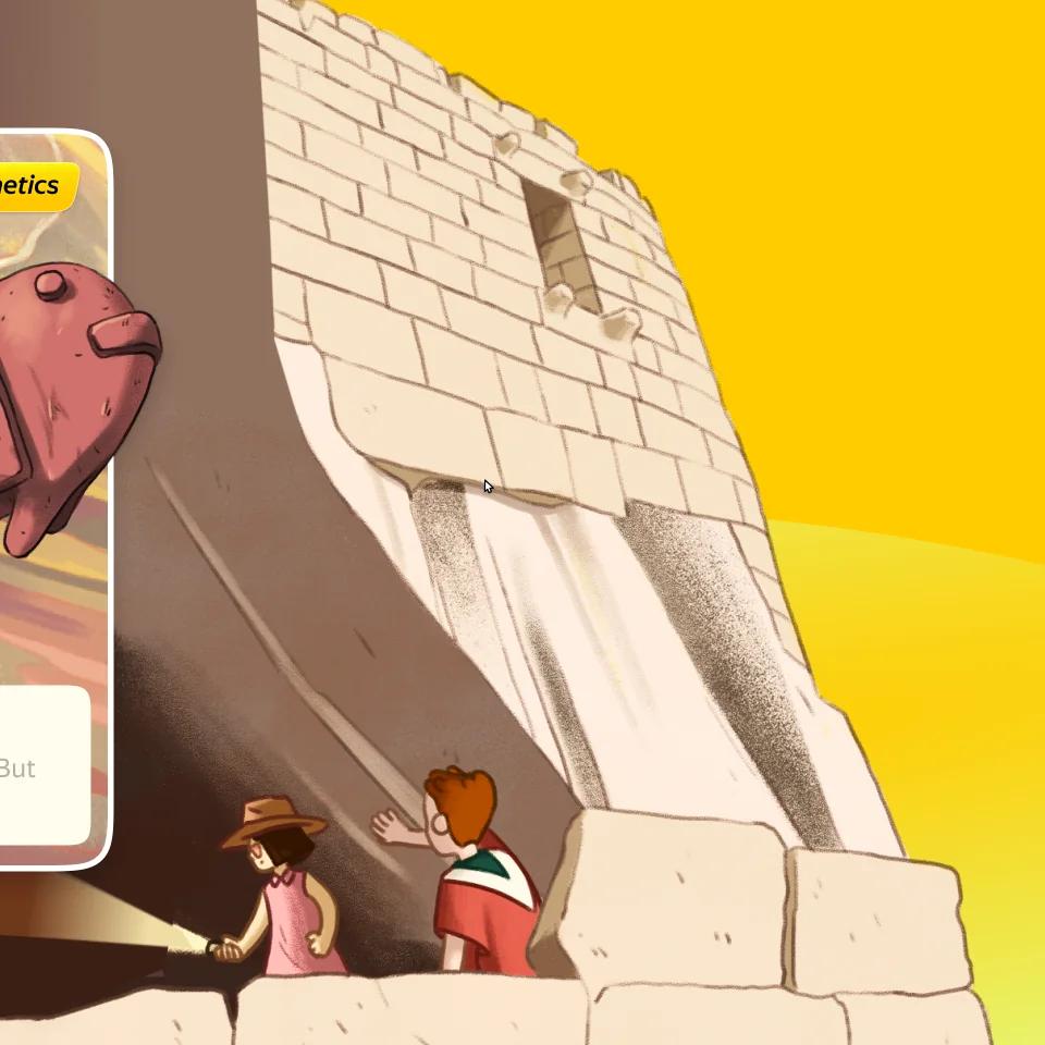
So the plot came out of the place. Put the cast on a tropical island, in a watermelon field, on a ski slope, at a train platform, on somebody’s living-room couch, and the location hands you the situation, the props and half the vocabulary the exercise needs. Layouts and backgrounds were built for exactly that: one scene, room in it for the dialogue, and nothing competing with the answer field.
The rest came from the supporting cast — whoever else happens to be in that place. They give the week a face without adding a plot anyone has to remember, and they are local by design: a supporting character belongs to one story and leaves with it. A team could invent whoever the exercise needed without clearing it with everyone else drafting that month.
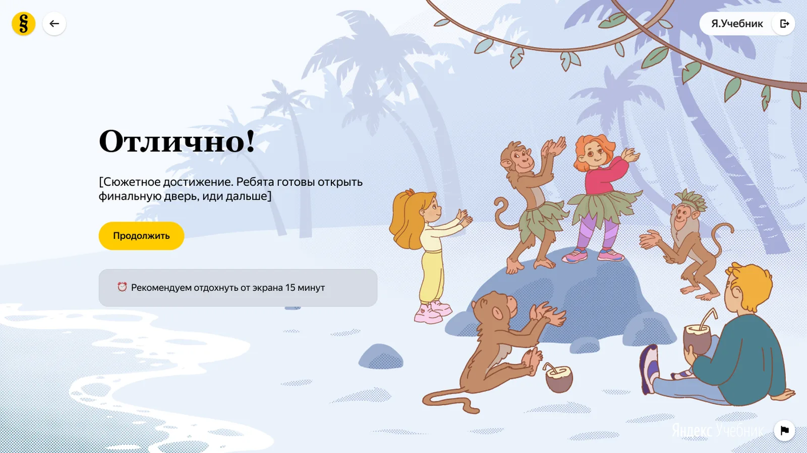
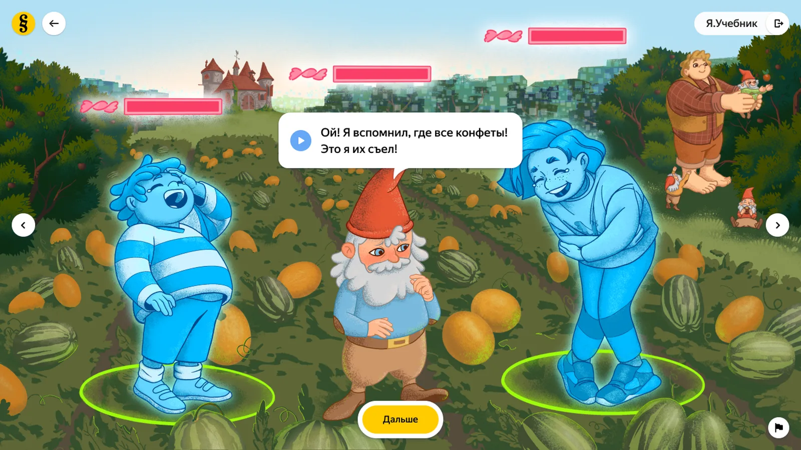
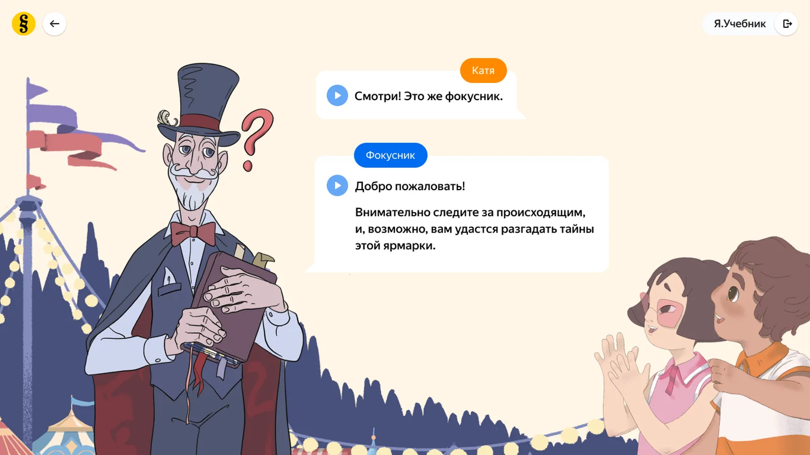
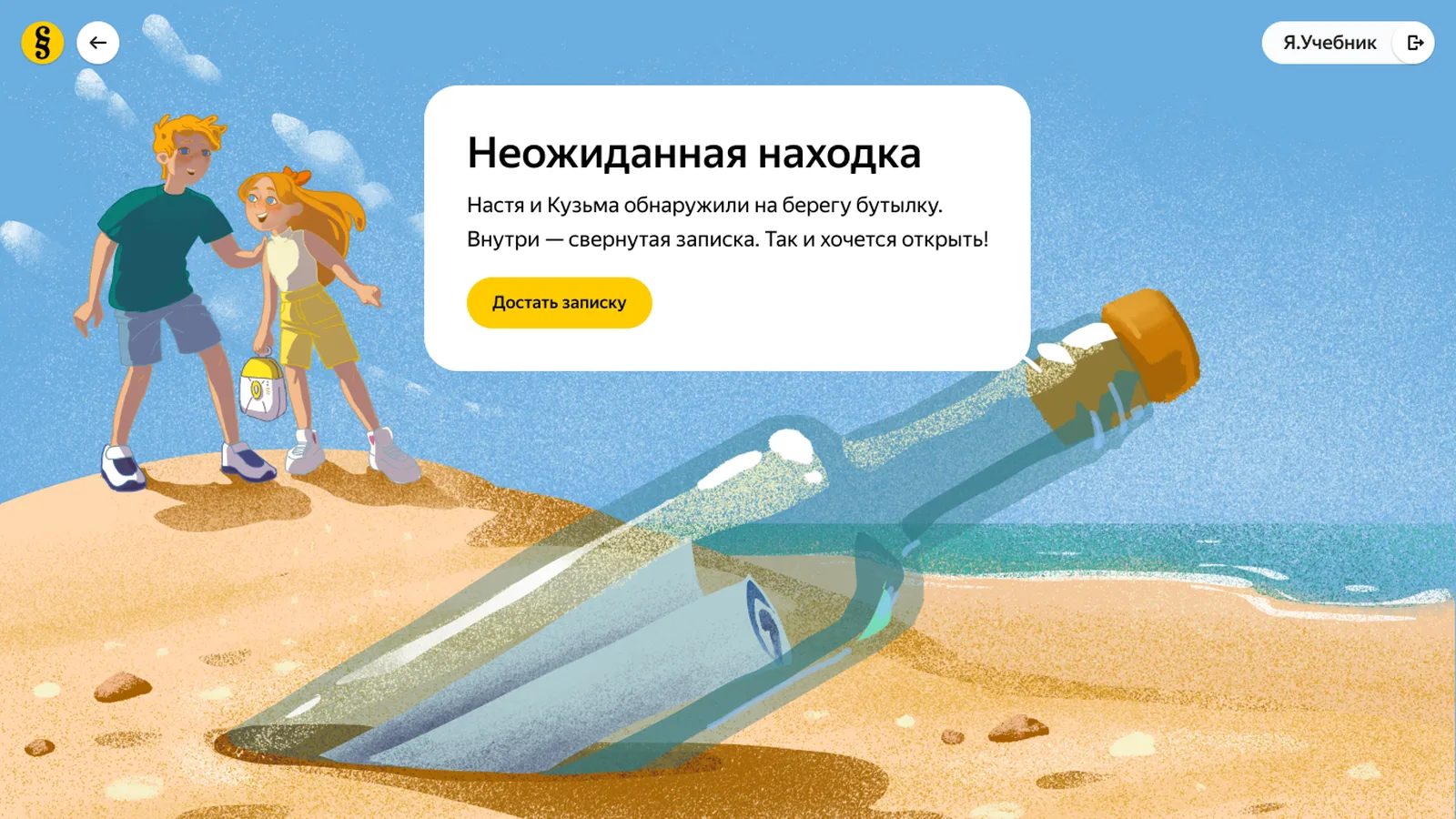
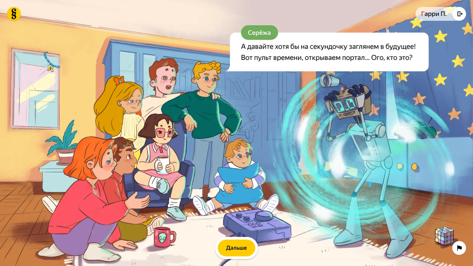
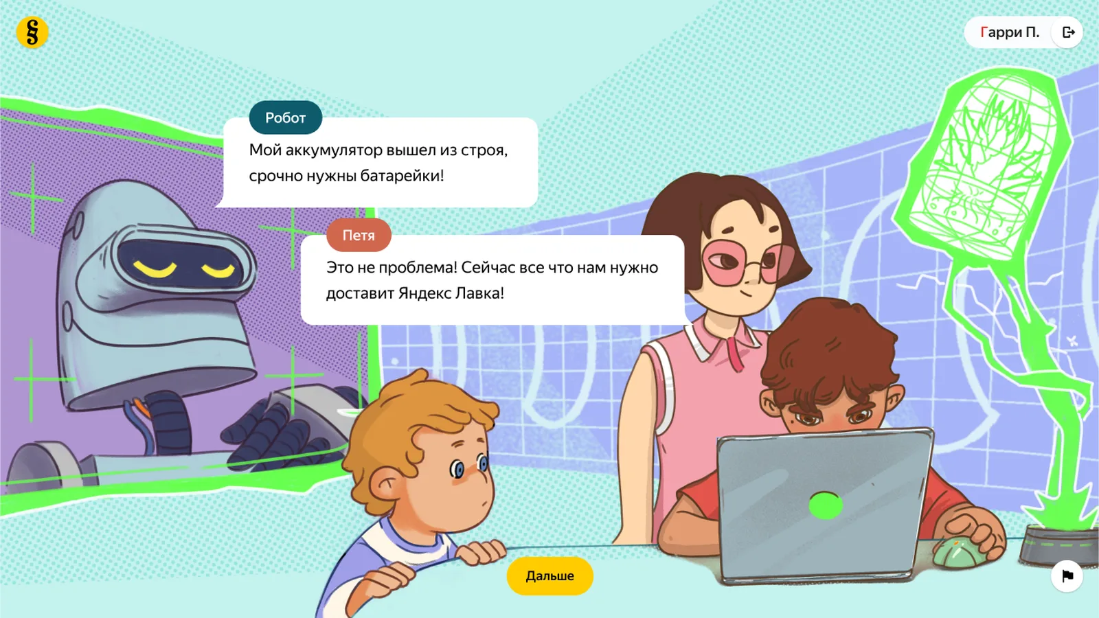
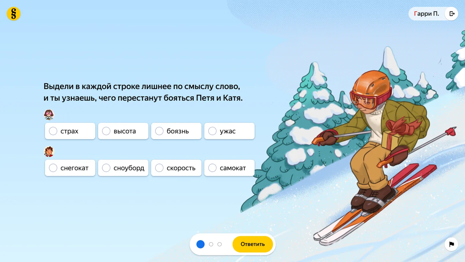
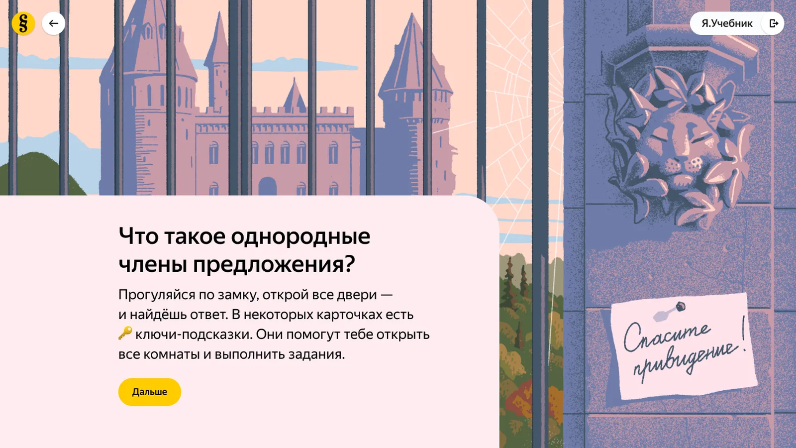
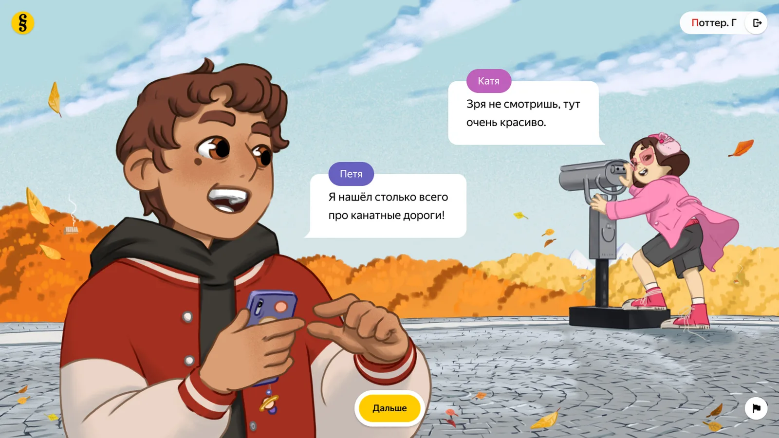
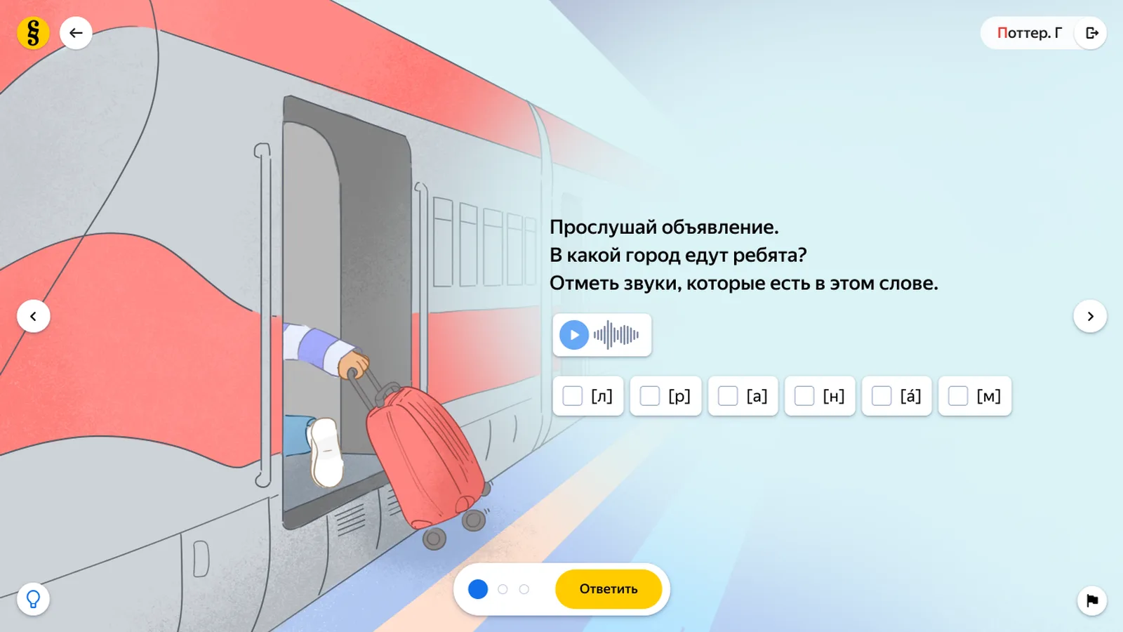
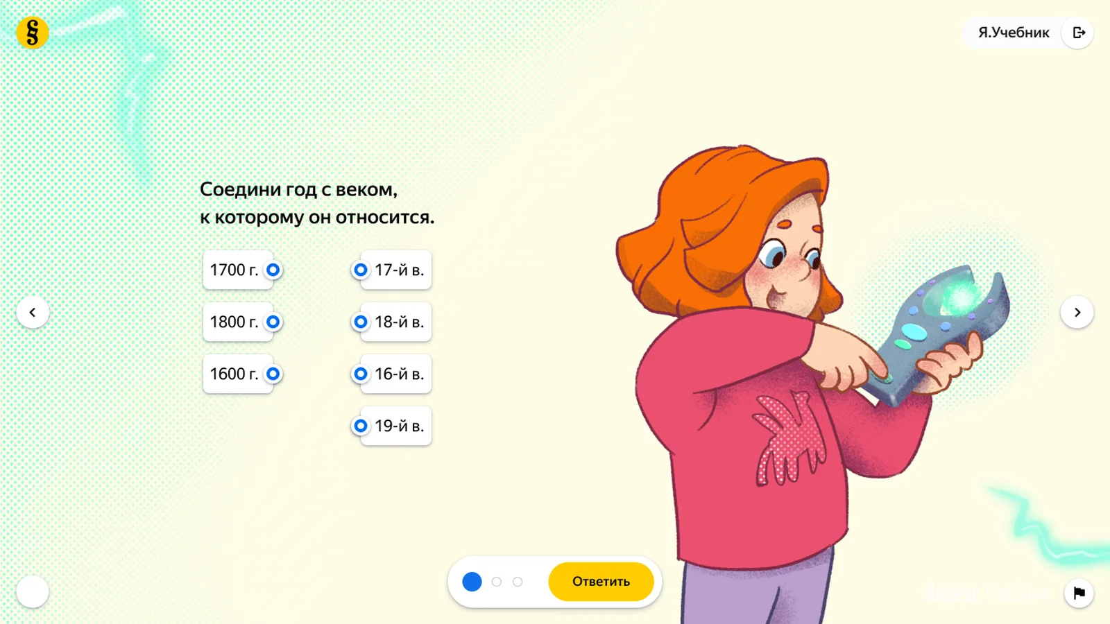
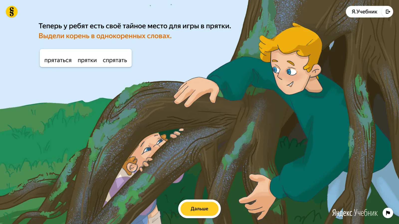
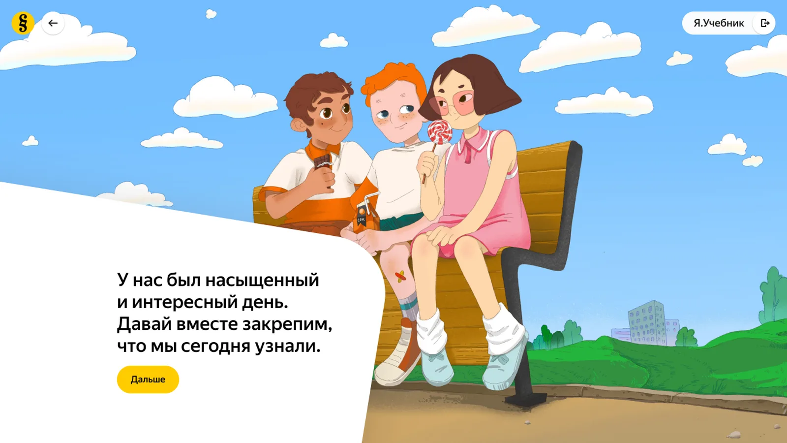
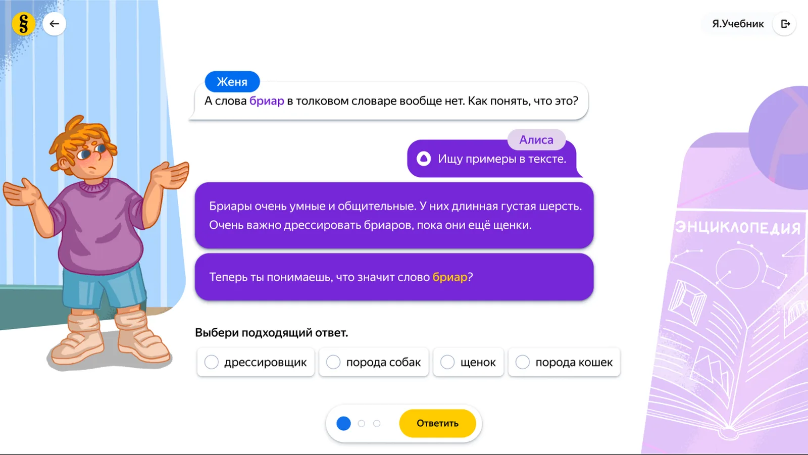
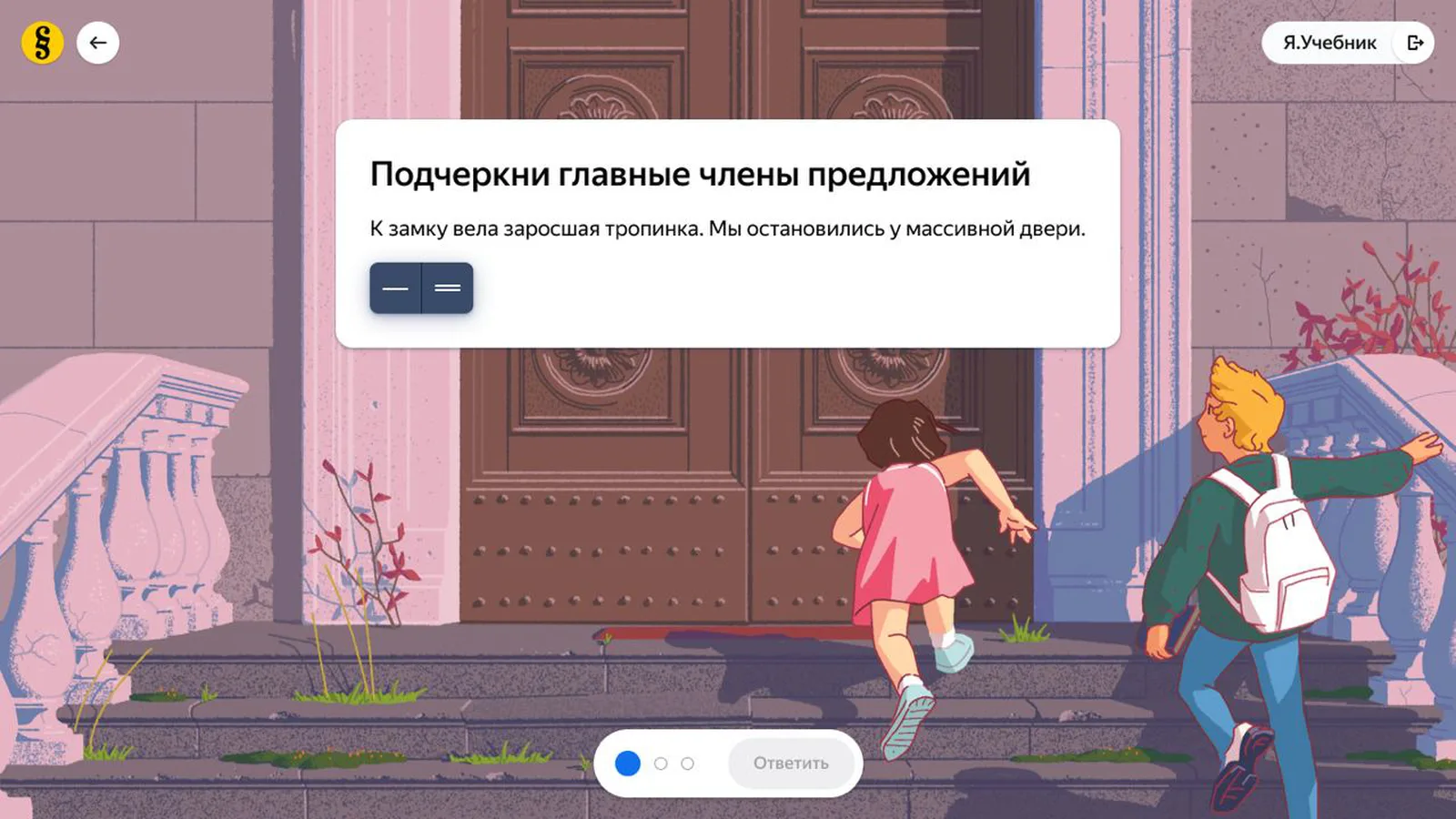
The experiment had worked, so I took over production with one thing to solve: a format proven on a handful of stories now had to arrive every week, in three subjects, across four grades.
The company was organised vertically — illustrators sat with illustrators, methodologists with methodologists — and a story travelled through every department in turn before it reached a screen. I broke those departments up into cross-functional teams: a methodologist, a designer, a scriptwriter, an illustrator, a content manager and a producer — a role I introduced to own the schedule and the hand-offs. Each team carried a story from brief to shipped screens.
We started with three. Once they held their cadence, we scaled to eight.
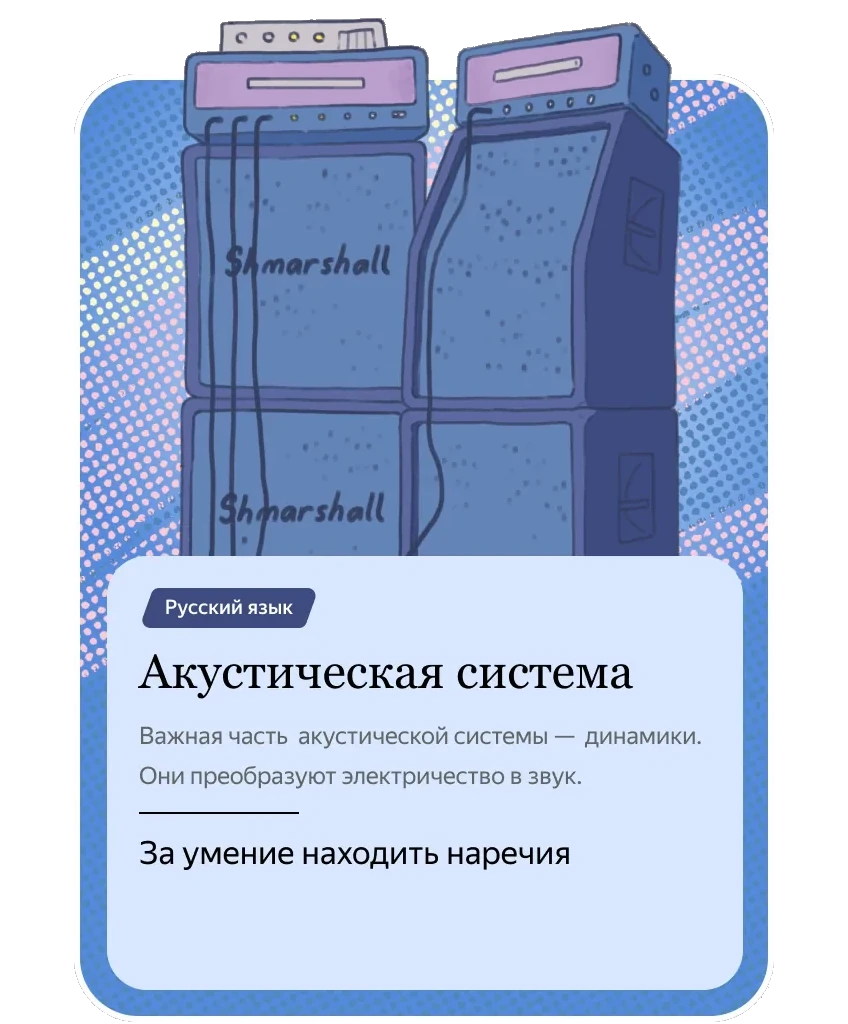

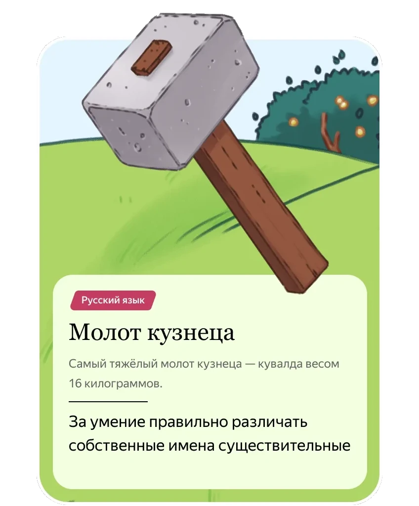

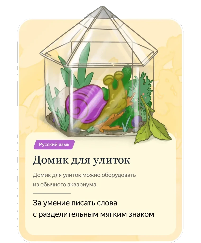
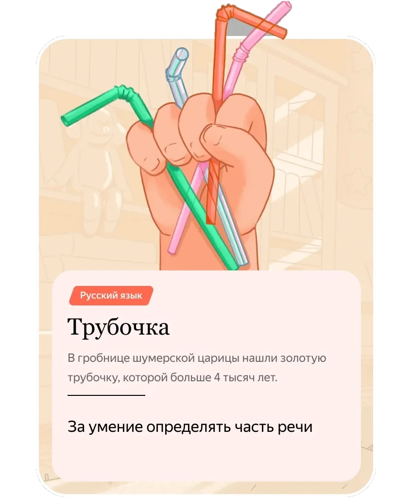
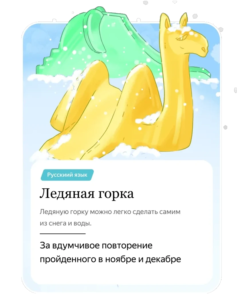

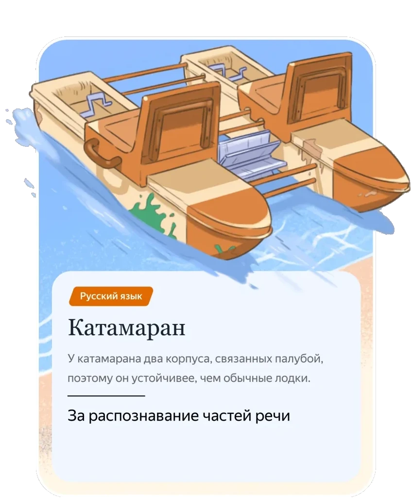
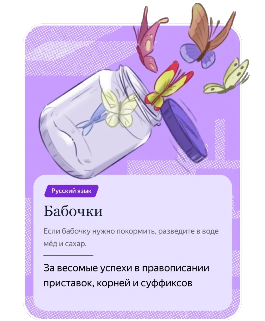
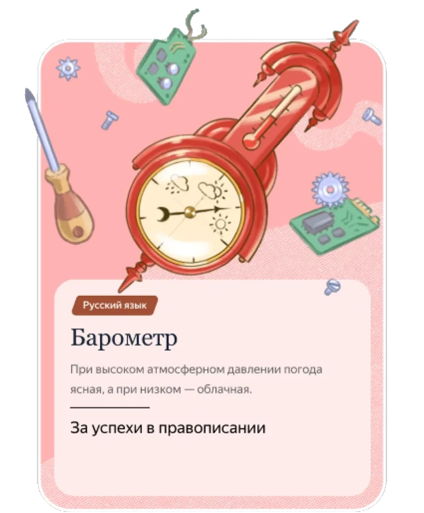
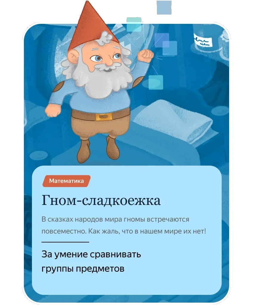




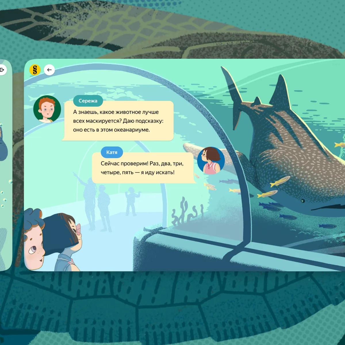
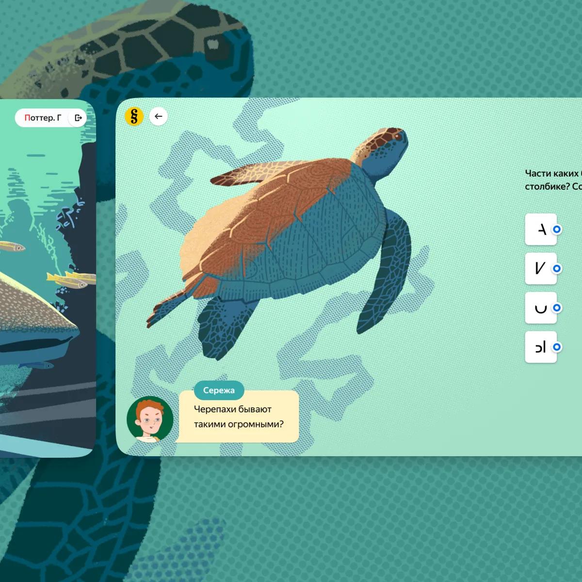
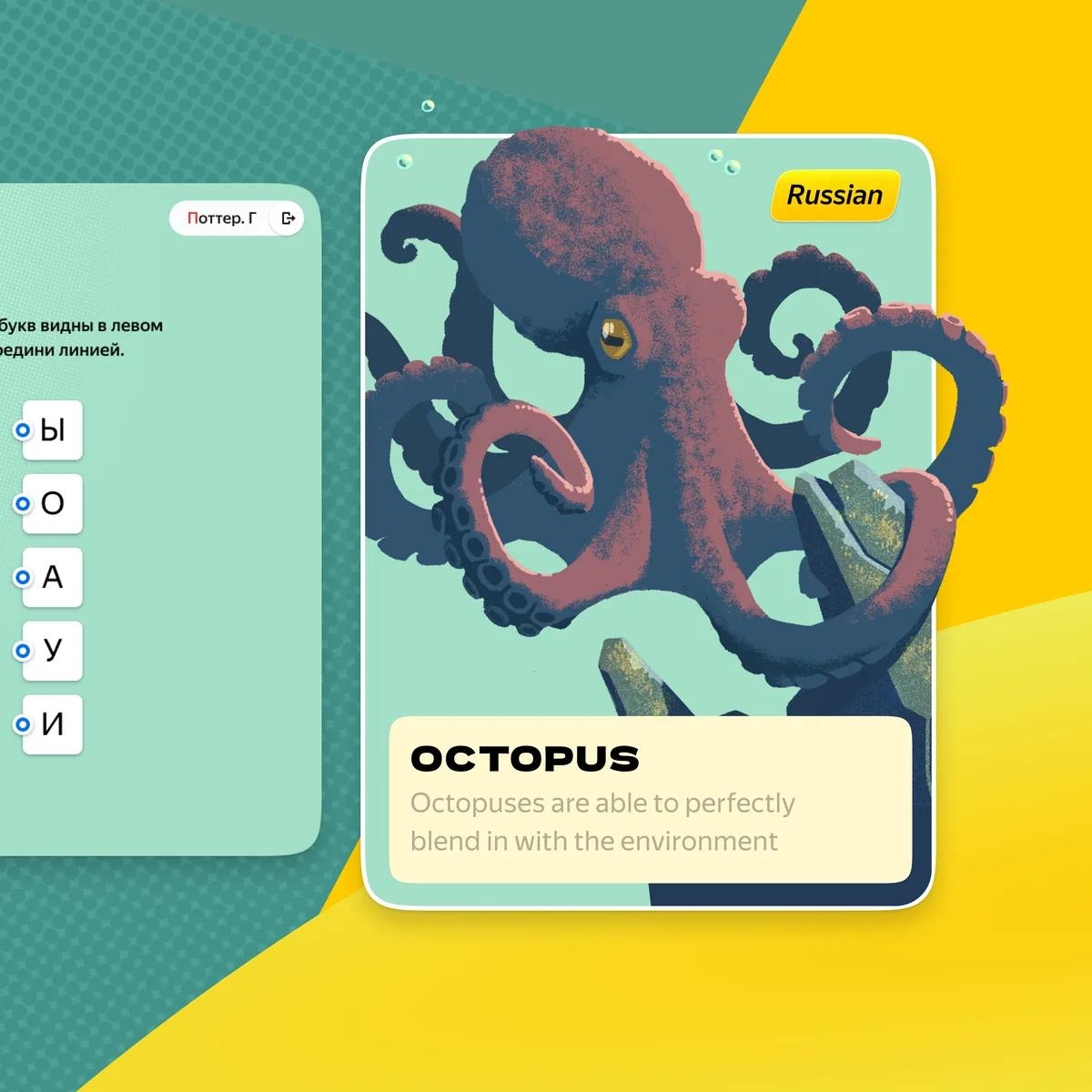



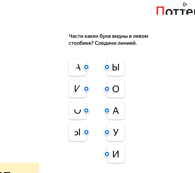
Yandex Schoolbook
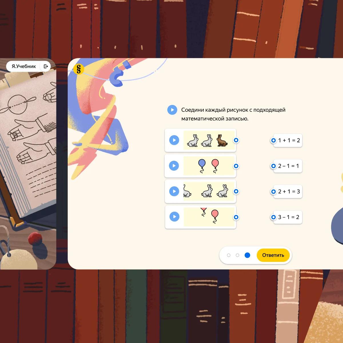
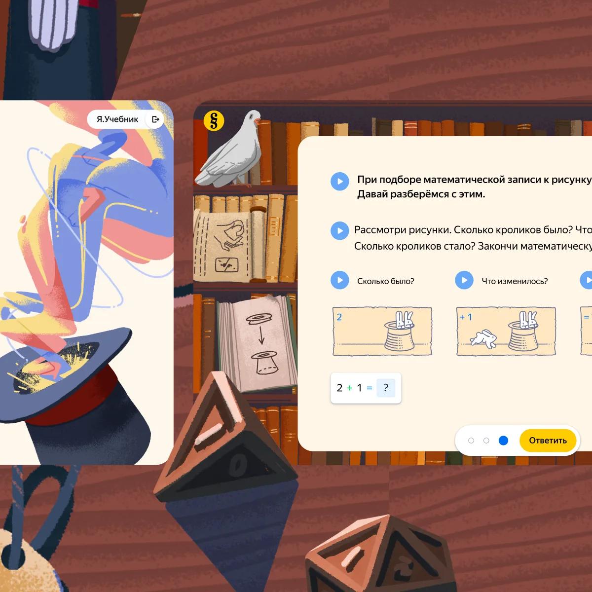
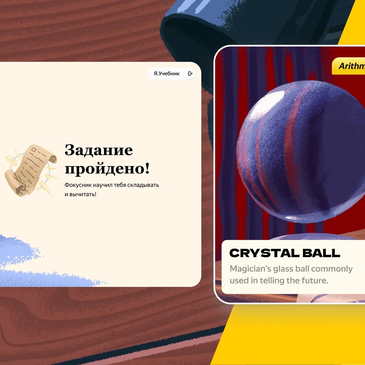
Hints, local verdicts and error markers reshape each child’s path through the exercises, with storytelling, collectibles and progress recognition to keep them going — the quick and the struggling alike
Details coming soon
UULA
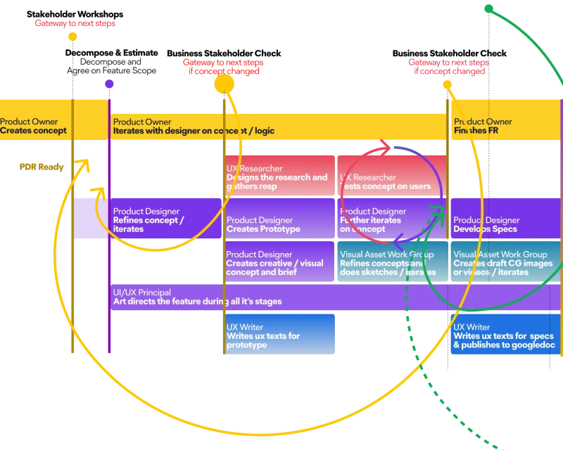
Design department rebuilt around pipeline and research, leaders added, effective rituals created, pace & quality measured
Details coming soon

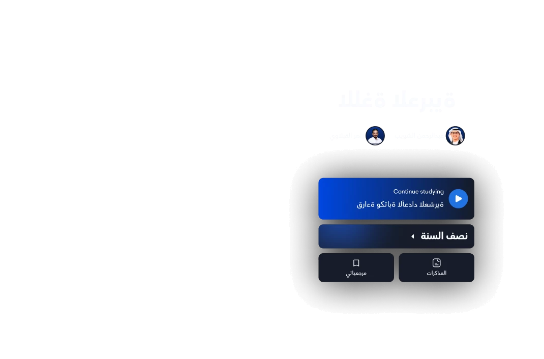



UULA
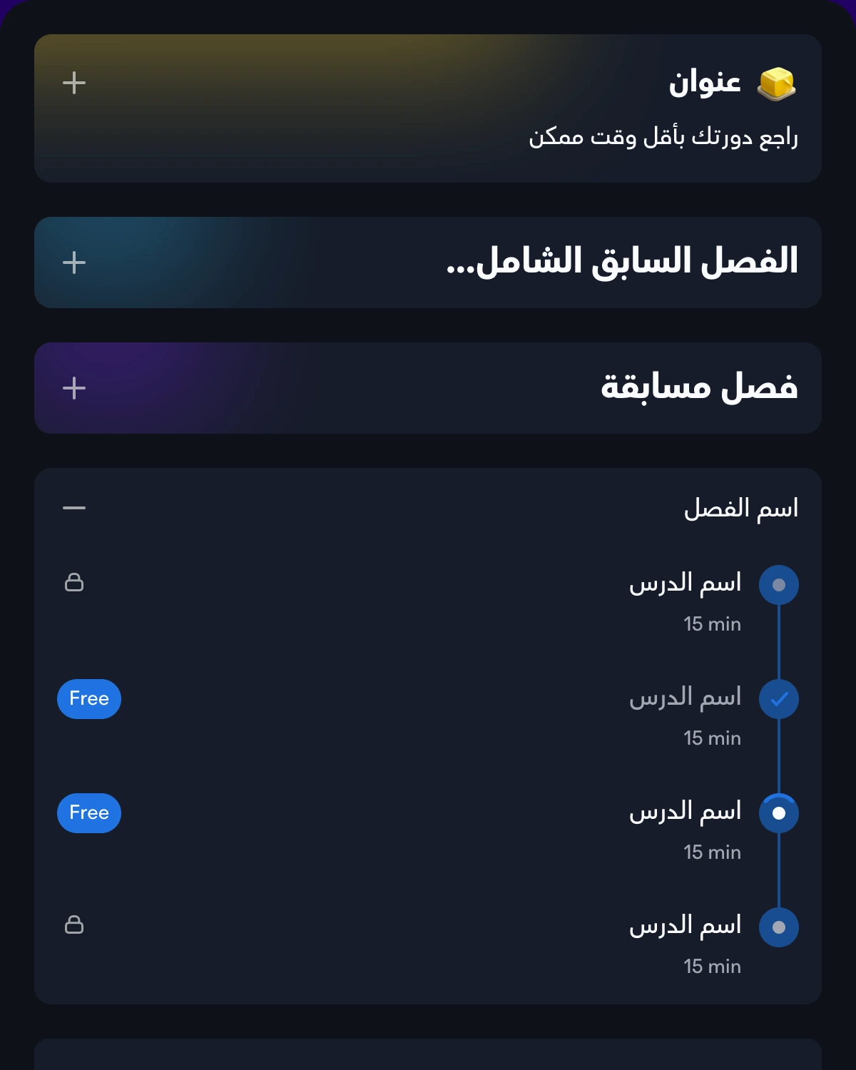
Template screens and ready component combinations to reuse — applied rules for choosing a modality and a layout template — and a routine that changed how the team works with the system
Details coming soon
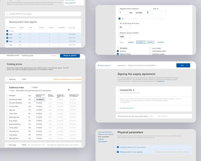
State Post Service
A new digital business line, from discovery to release — publishers of periodical titles plan print-runs region by region, price them against postal tariffs and discounts, and run document flow and analytics in one cabinet
Details coming soon

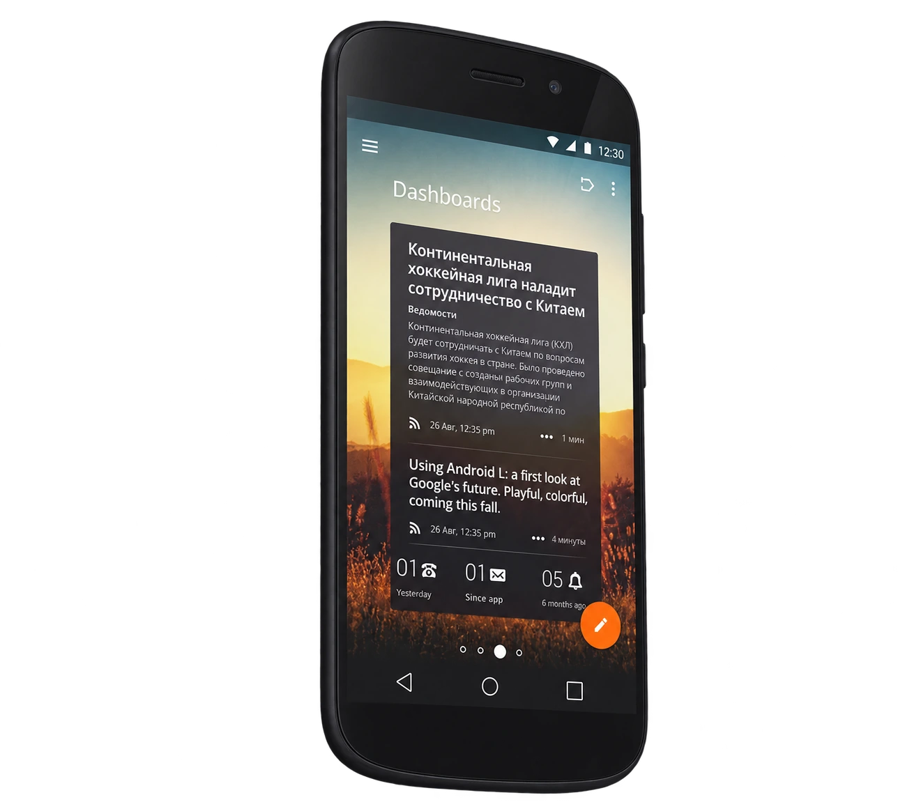
YotaPhone
UX for an E-Ink second screen — flipping the phone hands the content over, auto-lock decides which display stays live
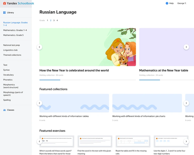
Yandex Schoolbook
Teacher-side library and lesson assembly: pick exercises out of the catalogue, build a lesson from the cards and assign it to a class
Details coming soon
Russian: native, English: fluent, Serbian: conversational
I'm available for Head of Design roles in global, remote teams, and ready to relocate for great projects.
If you have more questions about me, my skills and experience, or want to talk about an advisory engagement, drop me a line.