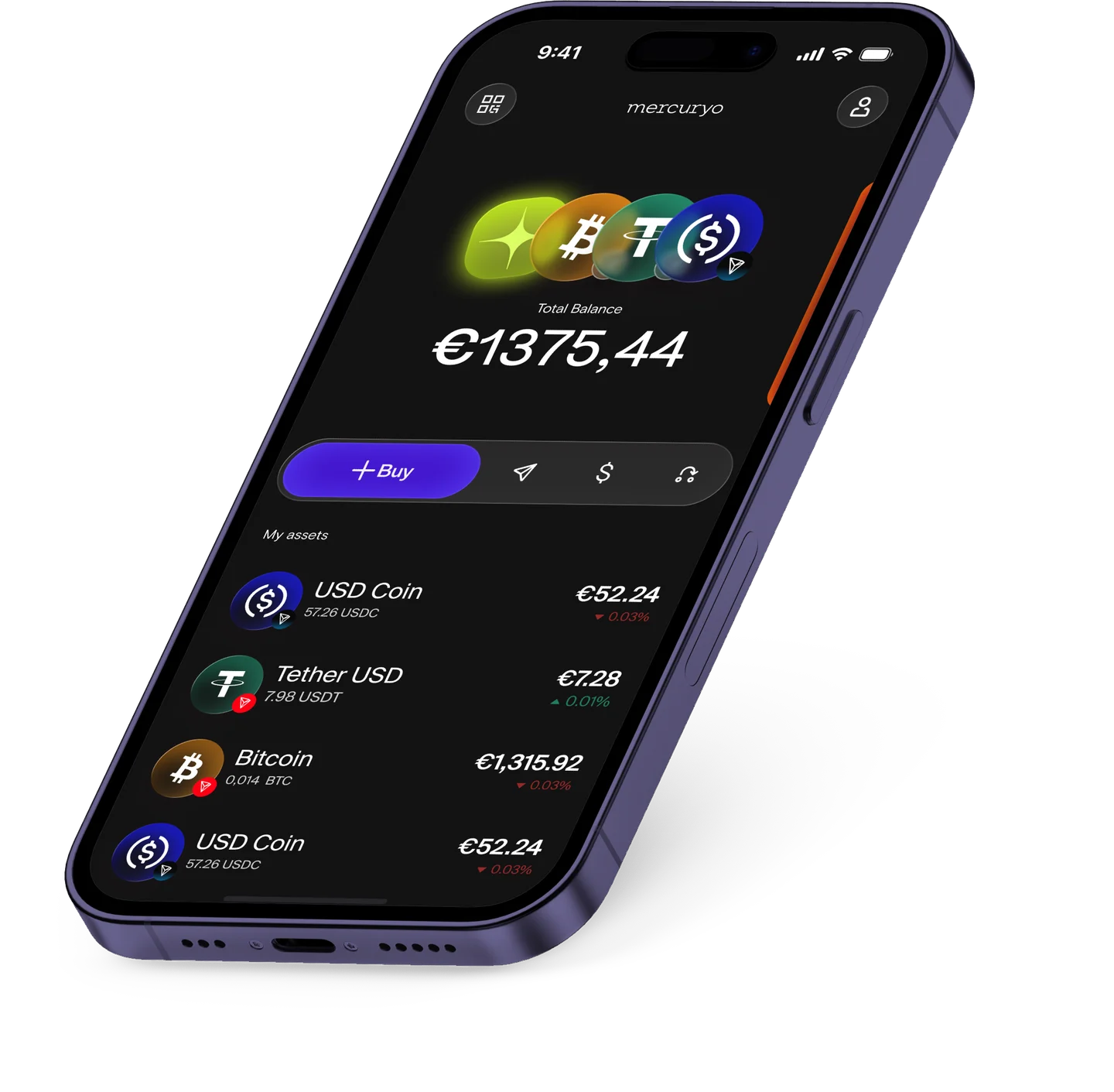
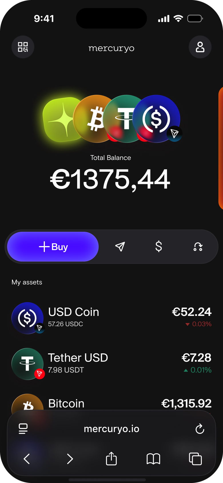
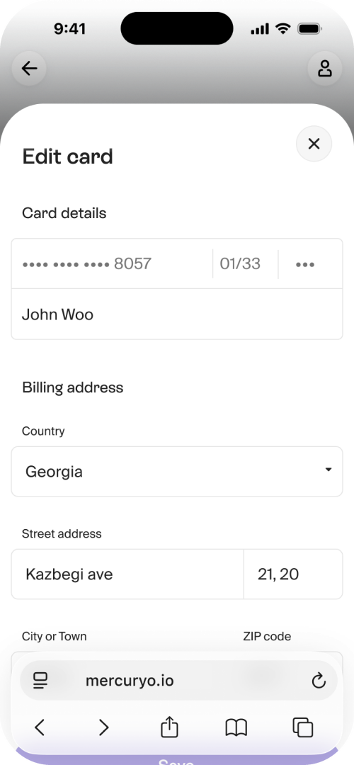
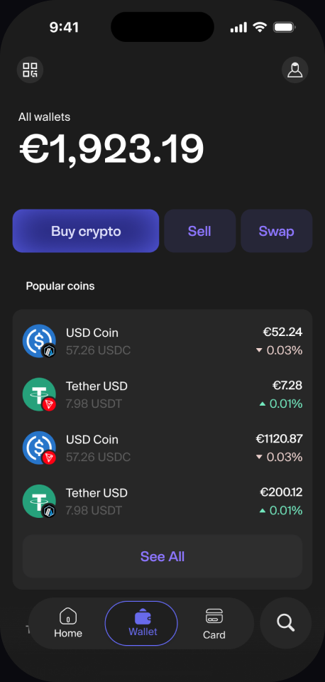
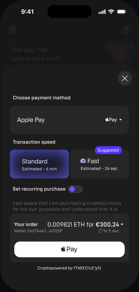
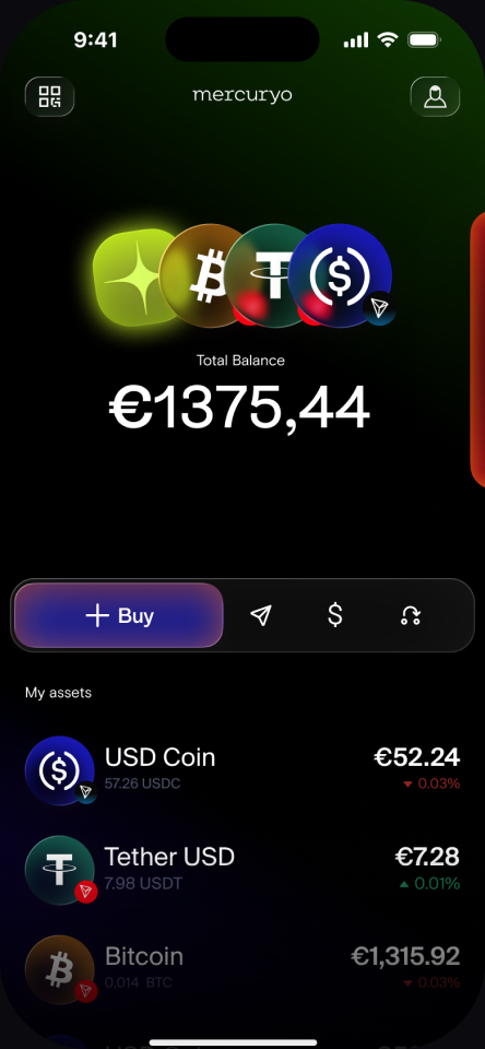
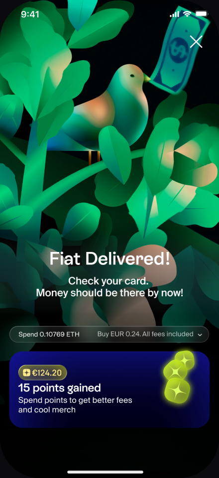
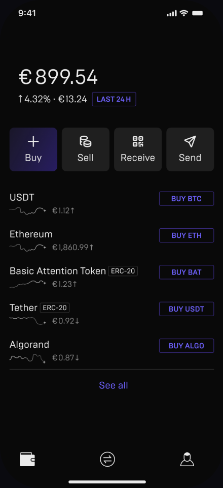
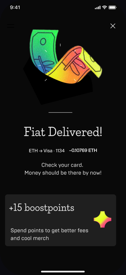
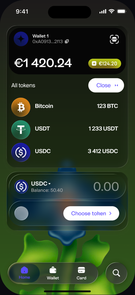
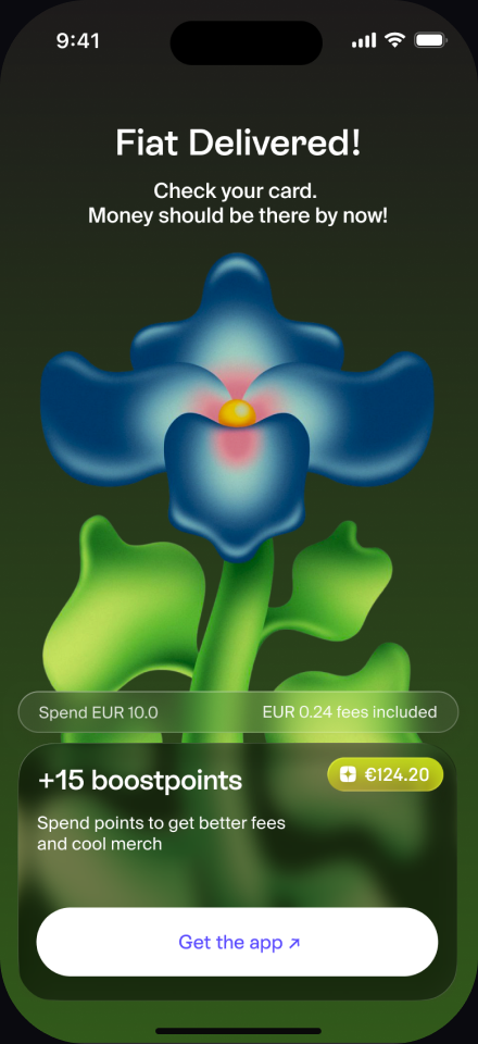
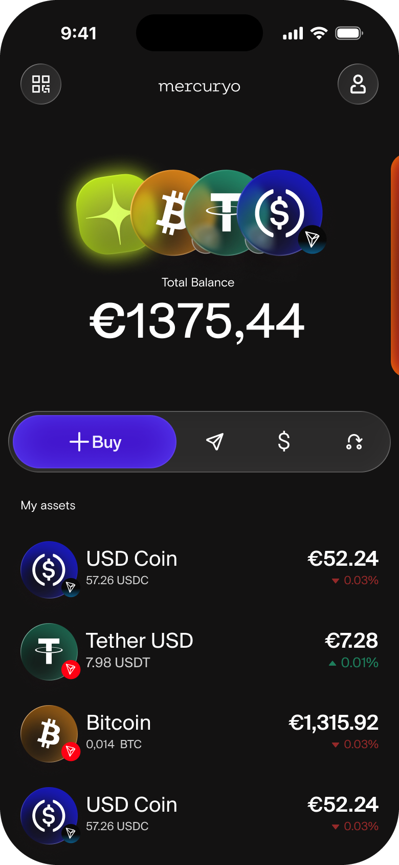
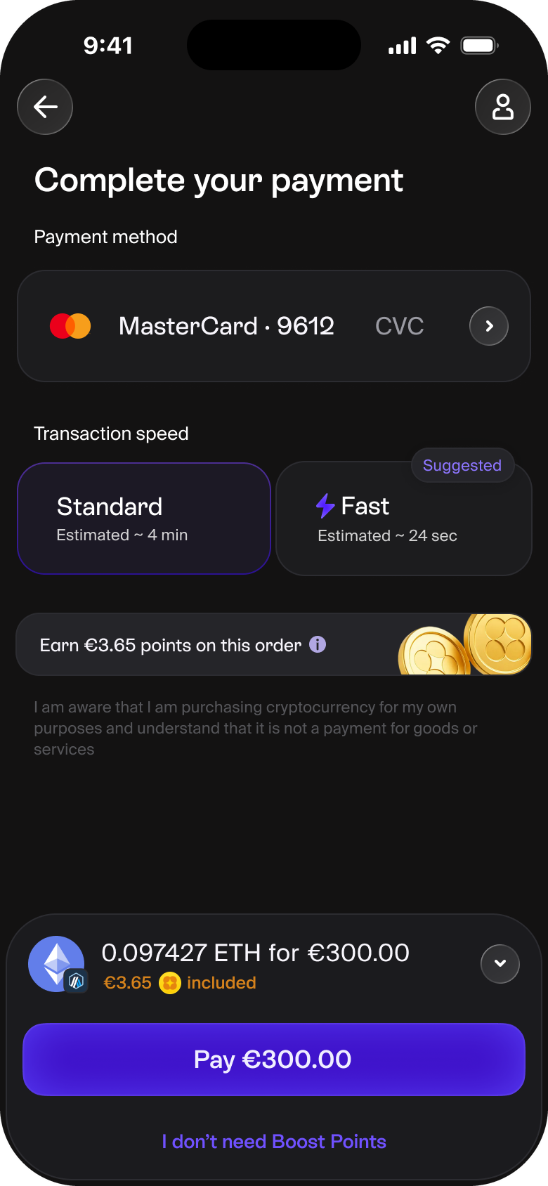
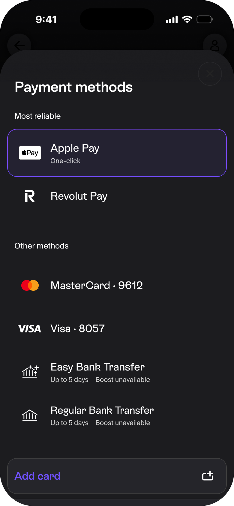
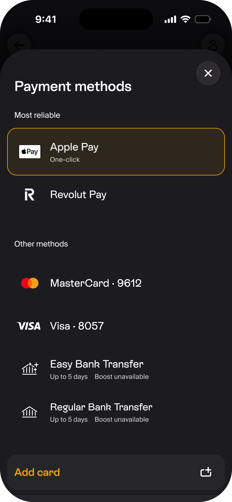
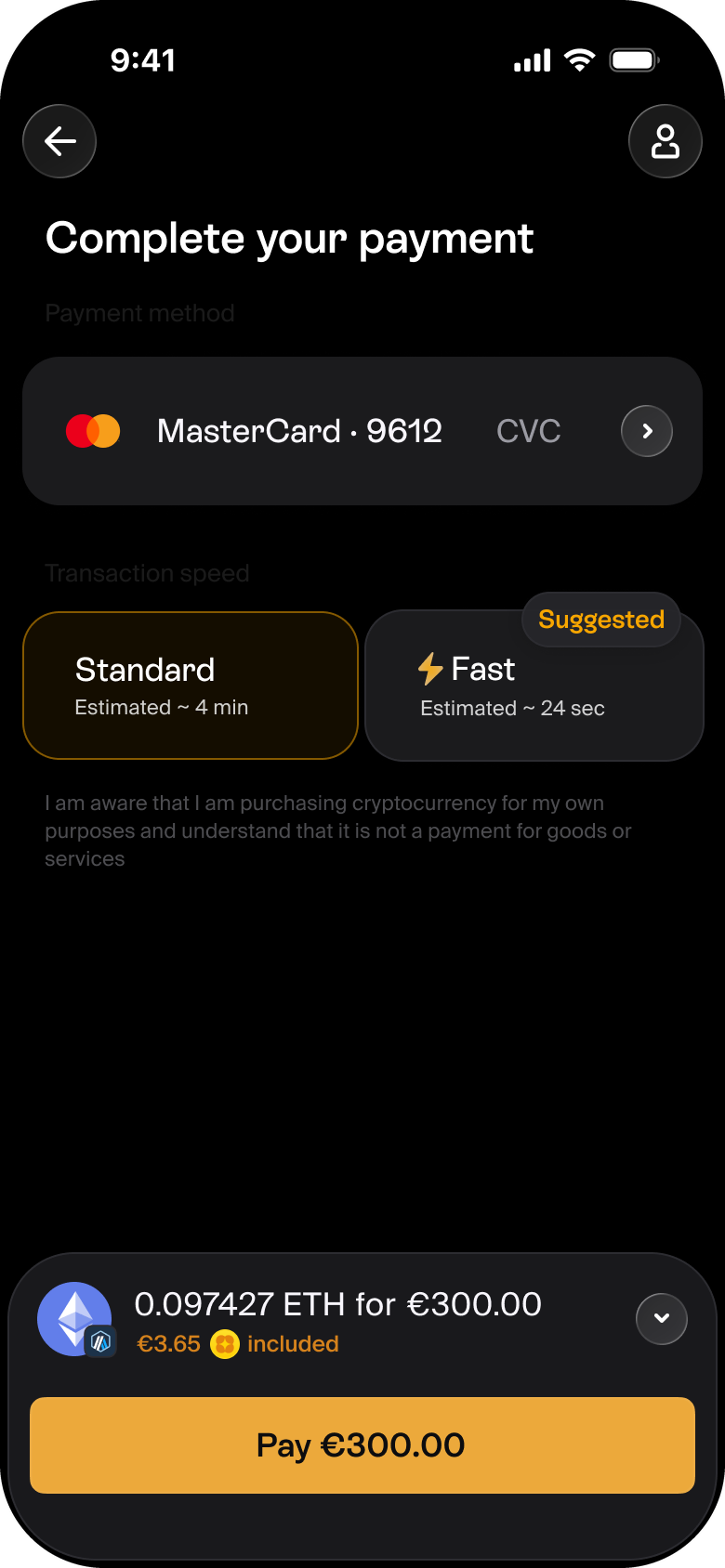
Clean, modern, trustworthy
Strong Positive · rated 4.0 / 5 · won on clarity
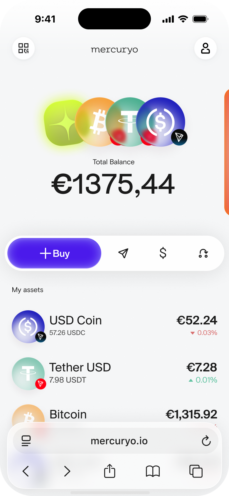
“Feels like a classical wallet — I’d trust it with money. The abstract art was pretty but got in the way.”
Mercuryo Head of Product Design I unified Mercuryo's fragmented product visual language into one system: users chose the direction in preference testing, it shipped incrementally across the product, and it hardened into a design system the team keeps building on.
Mercuryo's product visual language had aged out of step with the company's brand. The marketing site had just been refreshed and everyone loved it. The product told a different story: most marketing assets showed the web service — functional, plain, a world away from the brand it was meant to sell.
An earlier redesign had stalled. The CPO handed me the mandate: realign the product with the brand, and ship it this time.
A product's interface is a brand asset: it rides on almost every banner and deck, so a screen that drifts from the brand undermines the marketing it anchors.
How far had the product drifted? Far enough that marketing stopped showing it. When a campaign needed the product on screen, the marketing designer drew a conceptual mock-up — an idealised, on-brand product that existed only in the artwork. The real interface had become a liability the brand worked around, and that was the signal to change it fast.
Let us walk you through the tool that engages users like nothing else
I inherited several genuinely separate visual languages, and everyone knew it.
The native app was decorative and illustrative, with serif display type and gradients; its first interface came from a graphic-design studio. The web app was its opposite: flat, technical, and plain. Meanwhile the marketing brand — print, decks, the website — added a third layer: two or three systems, partly aligned, partly conflicting.
Same company, few accents, multiple personalities.
A user-chosen system across web and native.
Simpler flows, fewer steps — with the product team.
A durable kit the whole product builds on.
Taste in a design review is loud and unreliable, so we settled the direction with evidence: two rounds of preference testing, around three hundred participants each. We asked what matters for a crypto wallet — which feels clearest, which feels most modern, which reads as a crypto product.
The first round compared four directions; the winner went into a second round against fresh iterations and won again — a stable preference across roughly six hundred people.
One of the four directions in the first round was the product's existing native interface, and every new candidate beat it. That was our clearest signal that the redesign moved the visual language decisively forward.

Strong Positive · rated 4.0 / 5 · won on clarity
“Feels like a classical wallet — I’d trust it with money. The abstract art was pretty but got in the way.”

Mixed Positive · rated 3.7 / 5

Neutral · rated 3.5 / 5 — the existing design

Polarized · rated 3.1 / 5
We shipped the variant that performed. Several of us preferred other directions; the users chose this one.
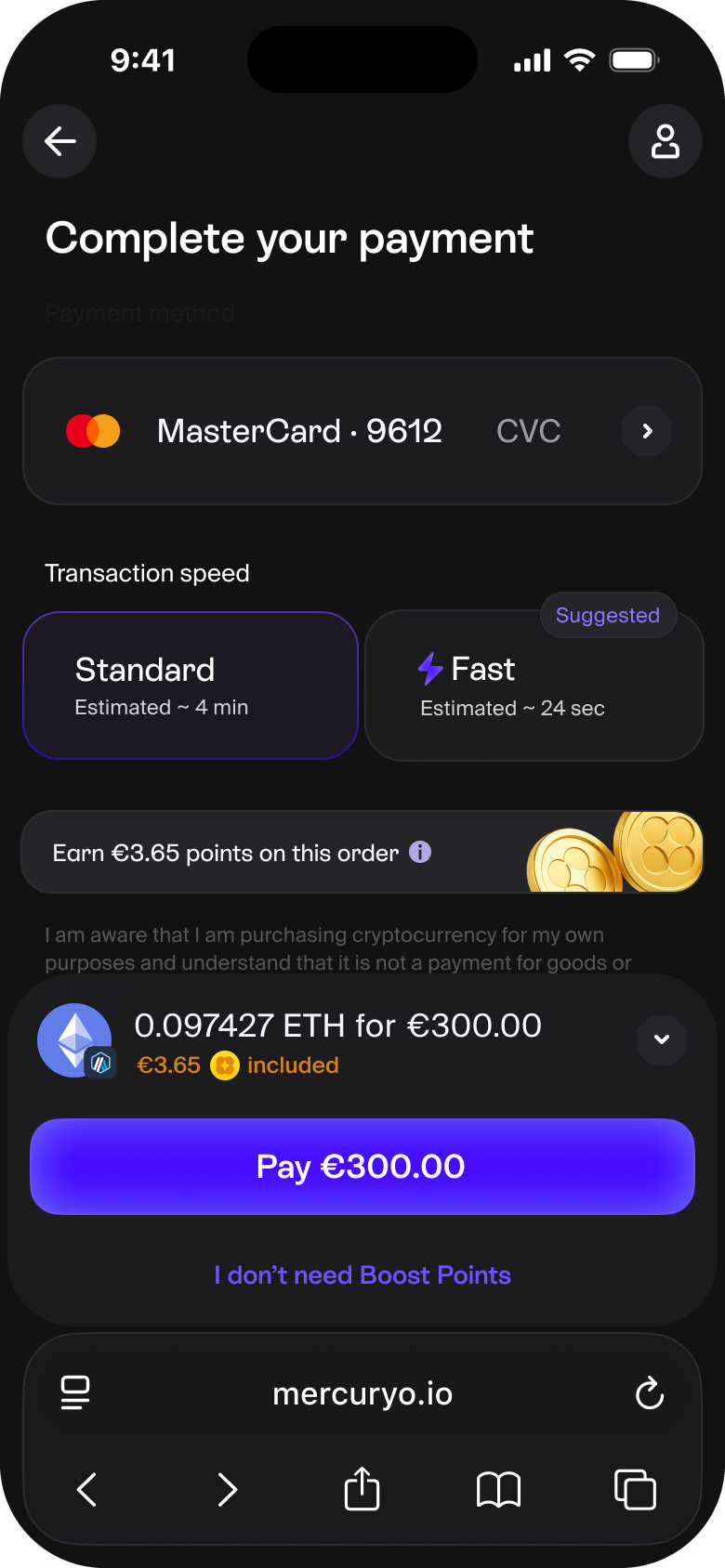
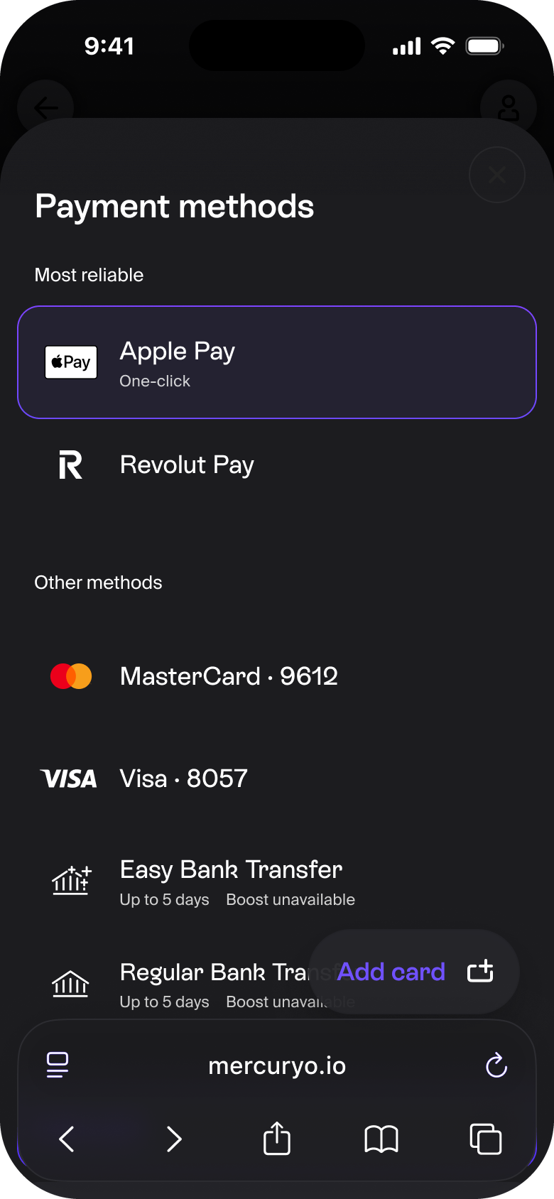
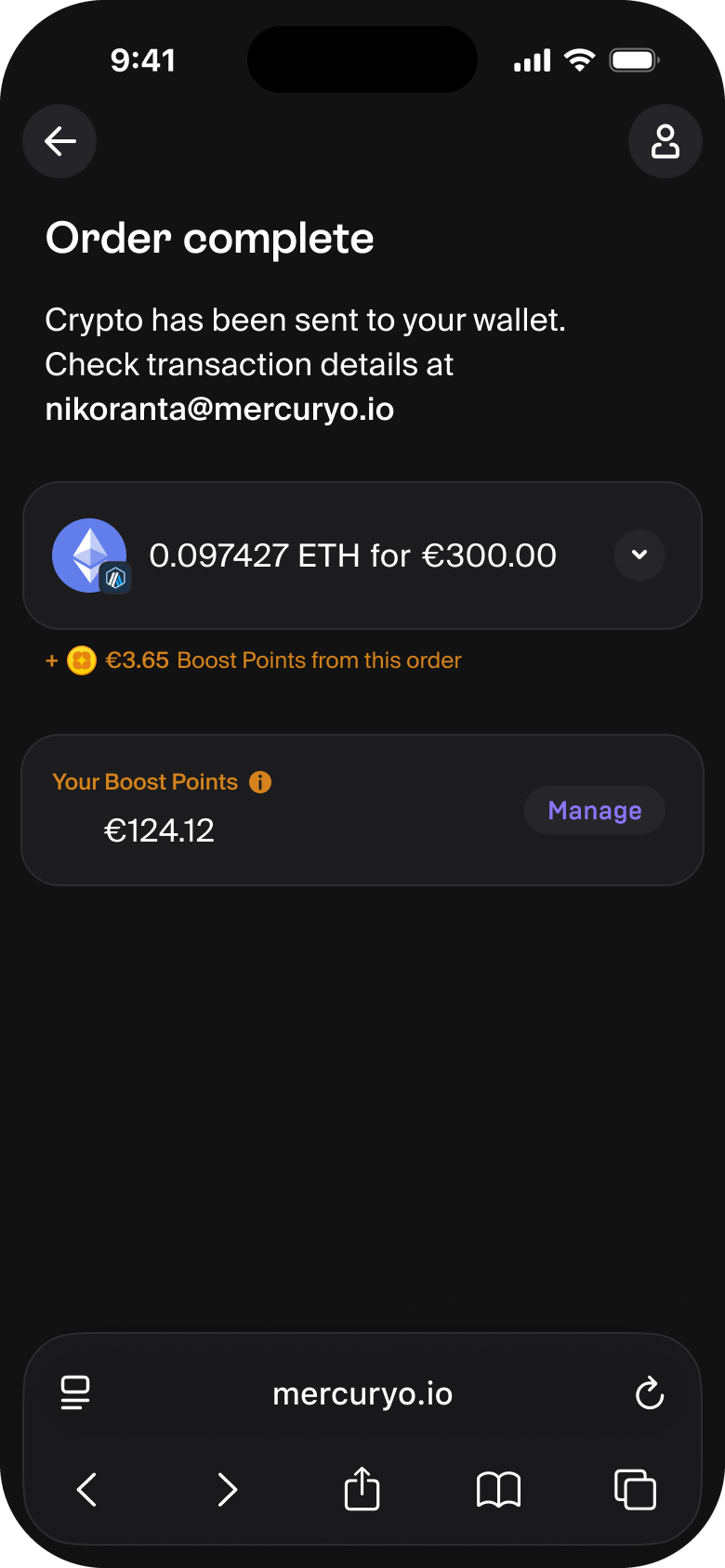
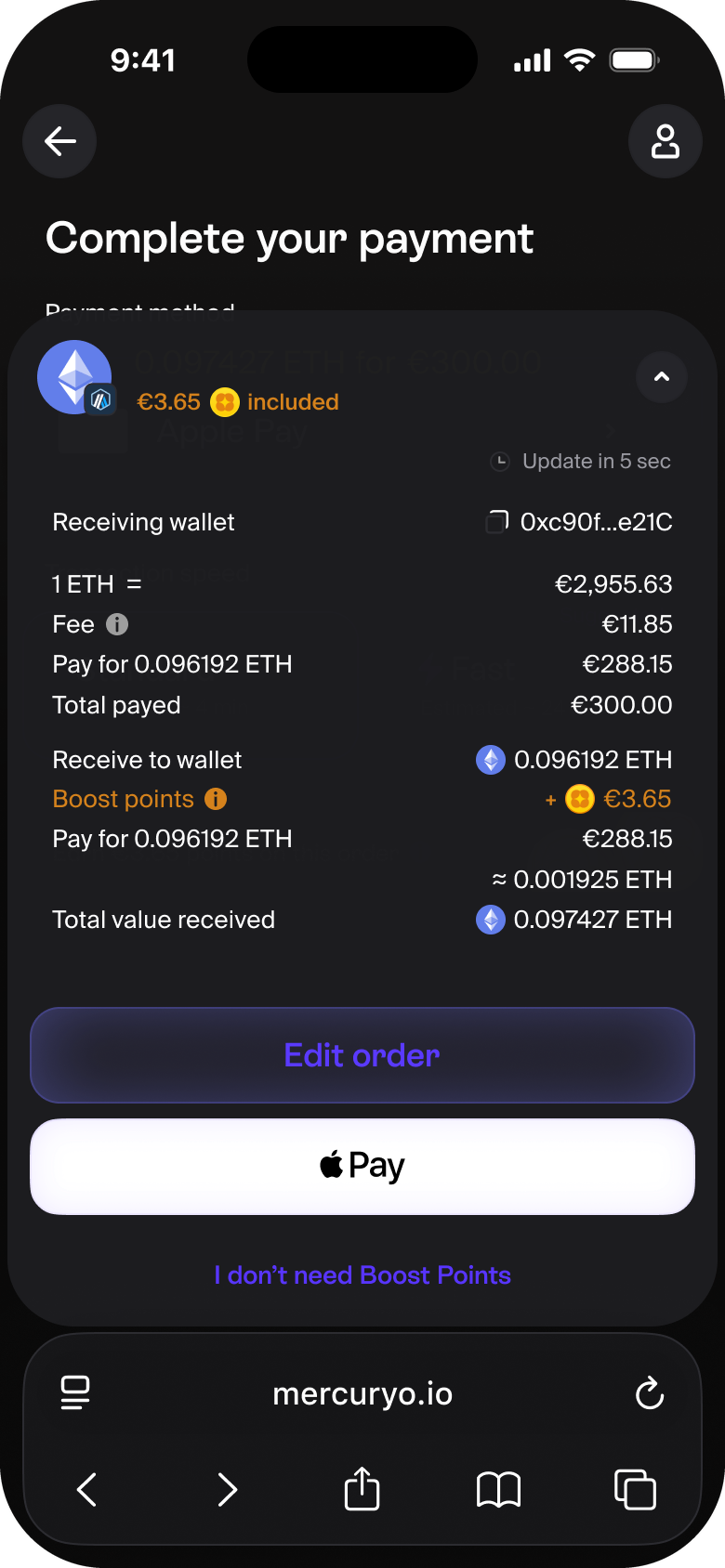
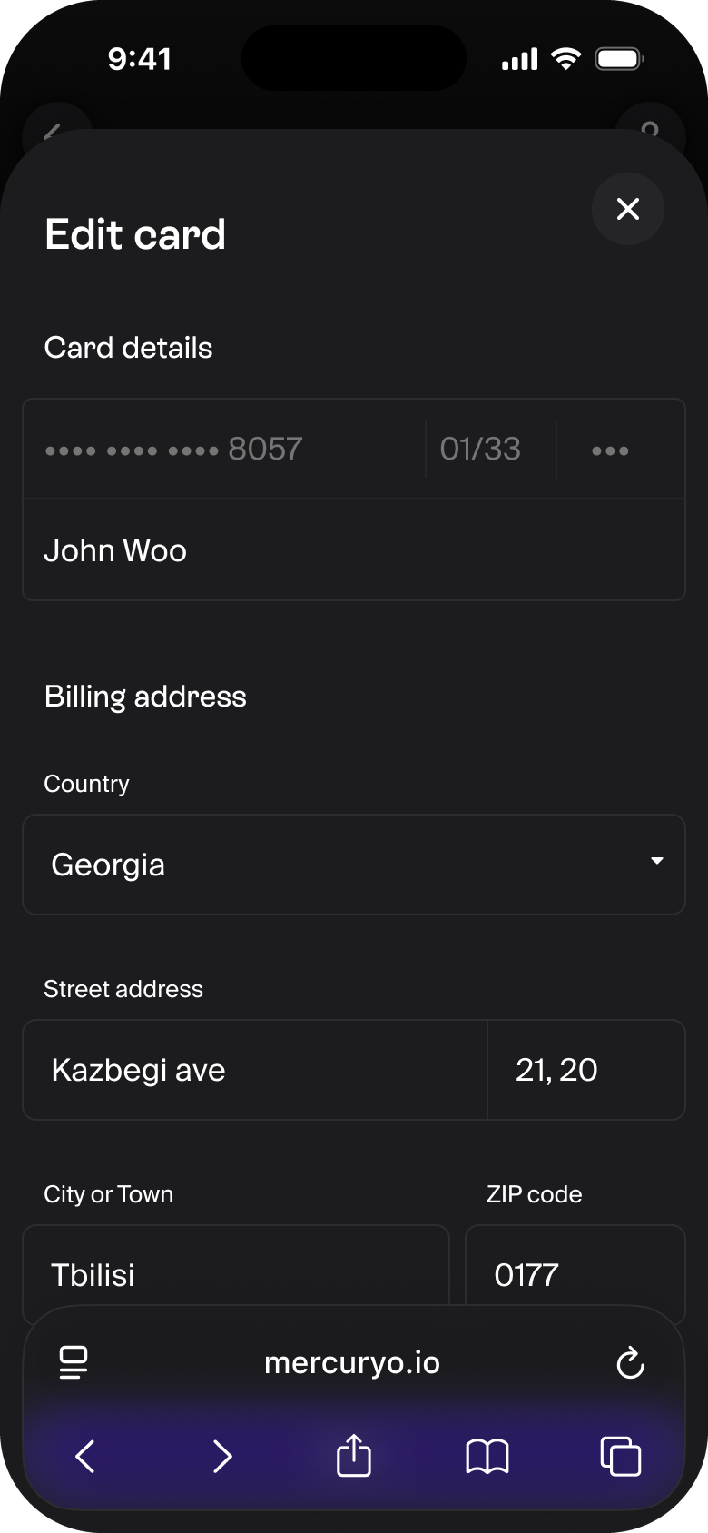
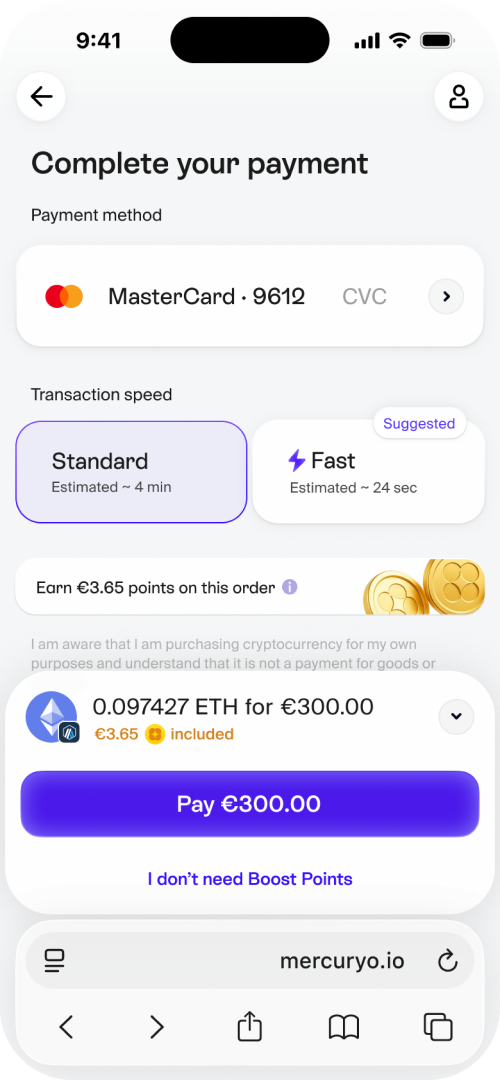
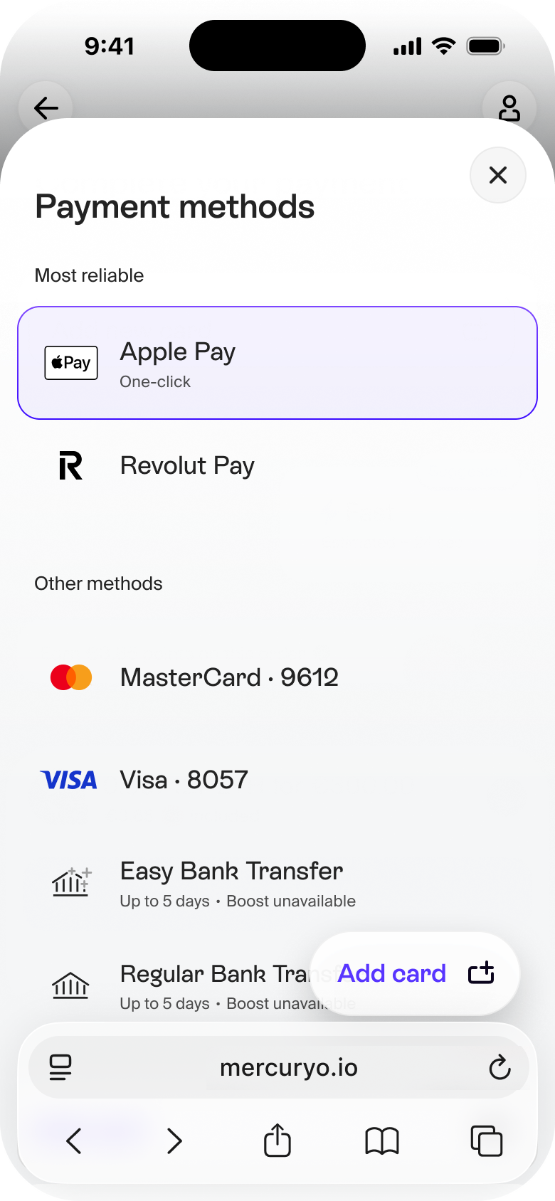
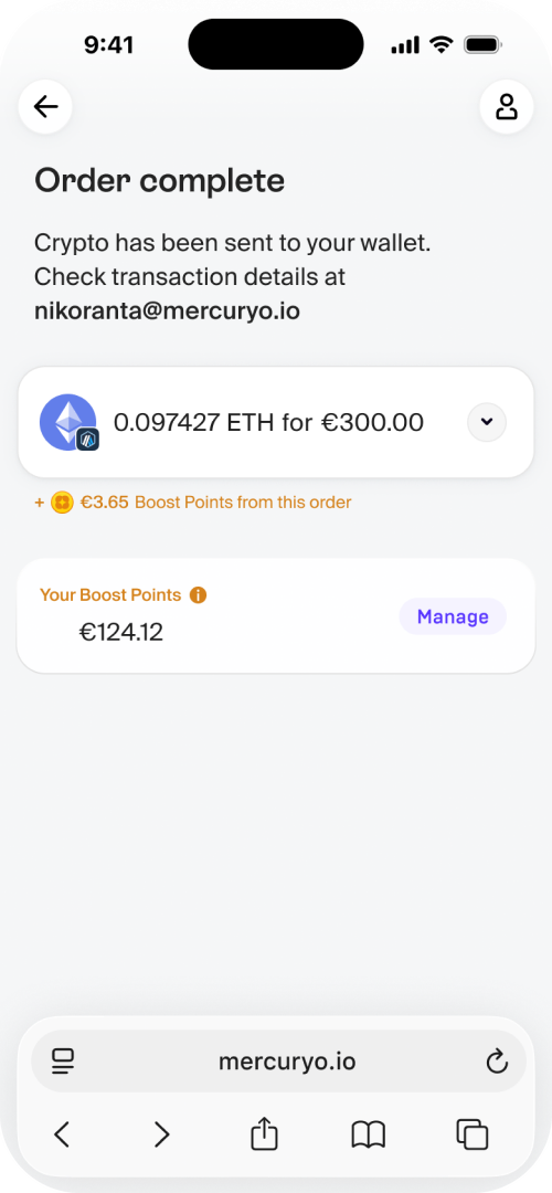
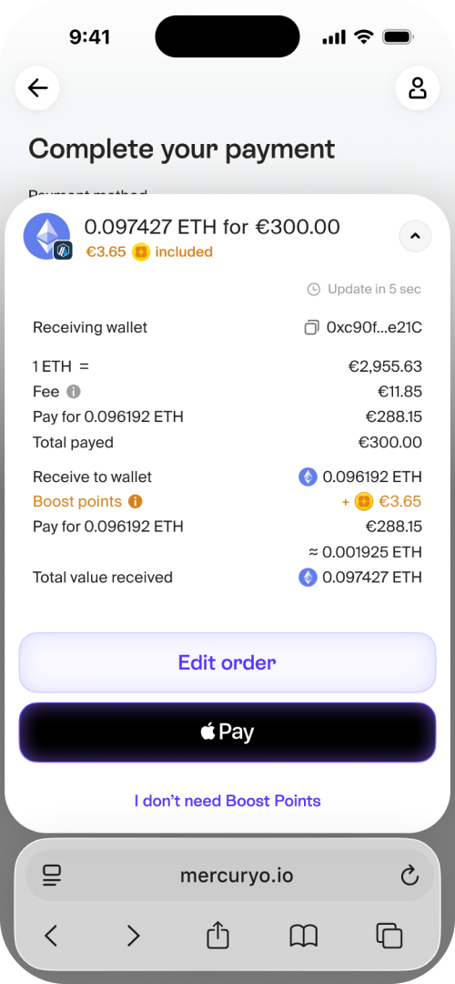
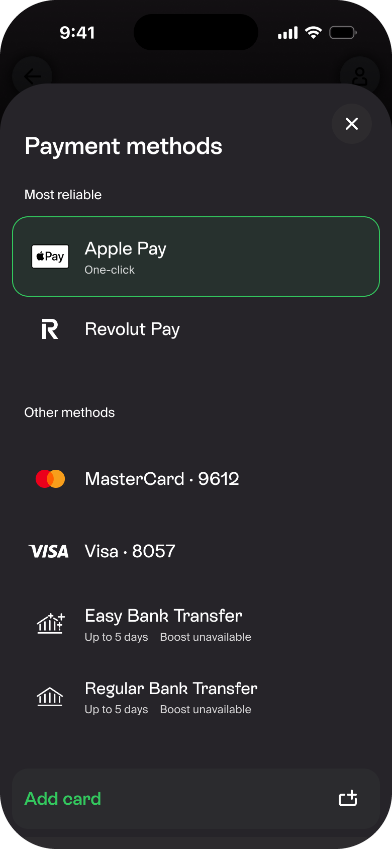
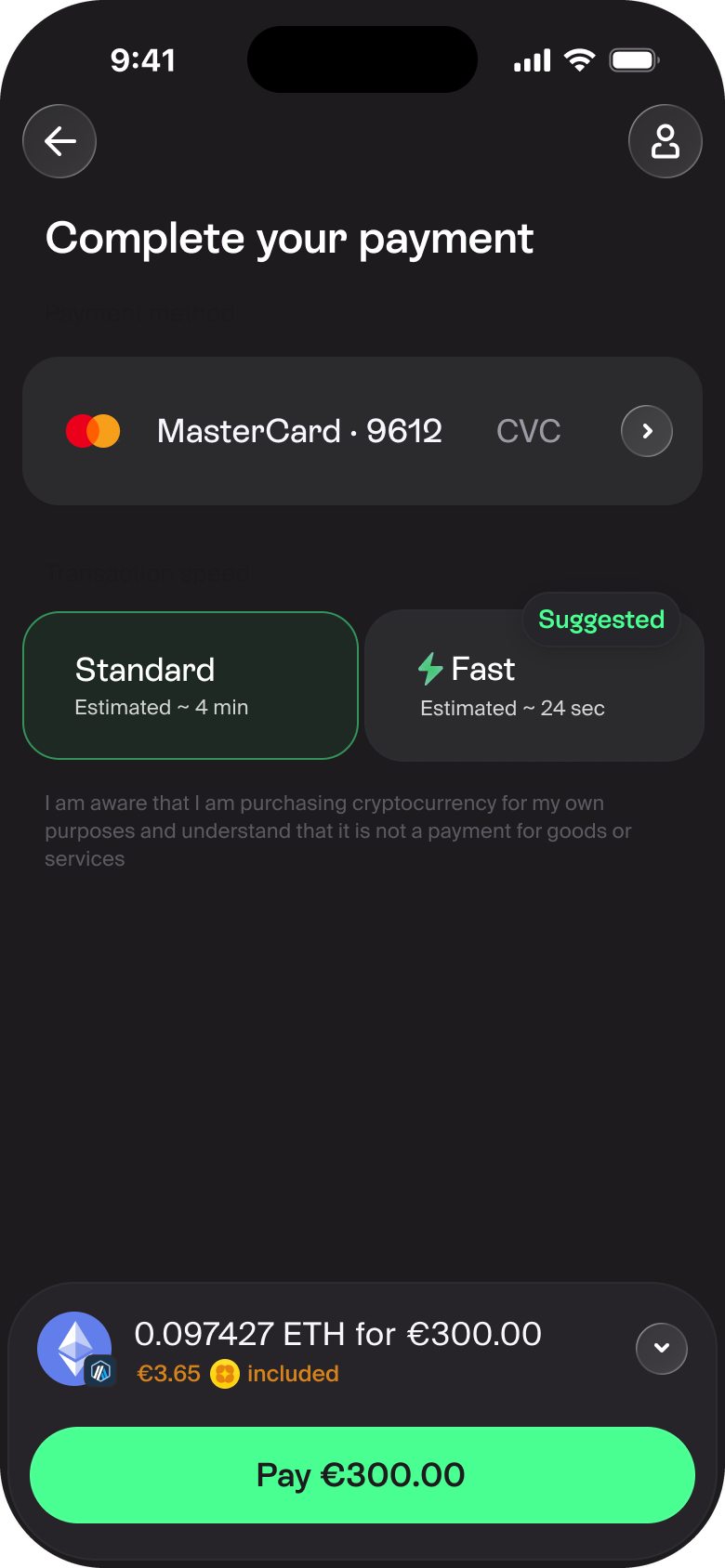
The winning direction resolved into one structural idea: float the things that matter. Payment details and the primary action live in a floating panel while the screen scrolls under it, keeping the key context and the key action in view. The profile floats too, and web-built modals feel native.
The app shipped light-only. The system carries a second layer of tokens, so the dark theme is a mode away — same components, same rules.


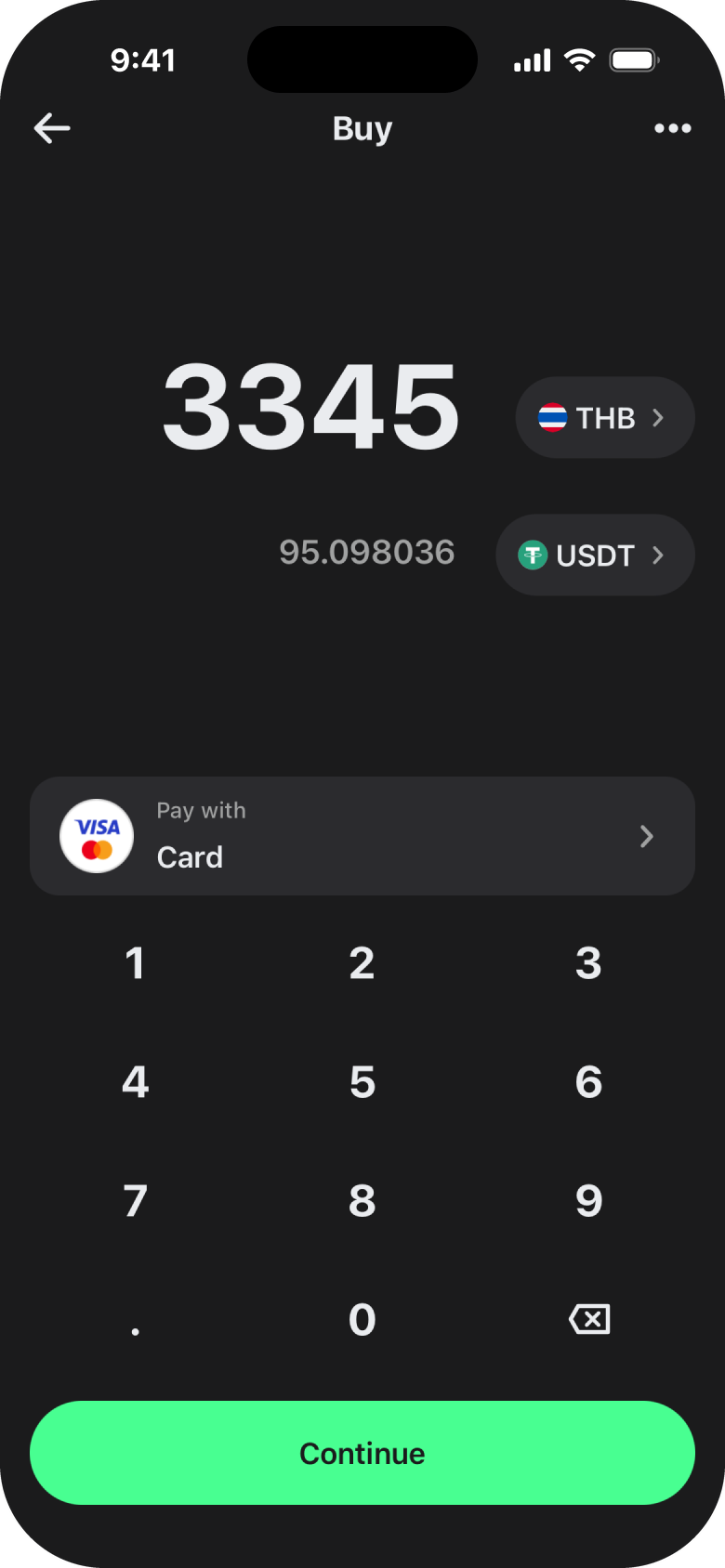
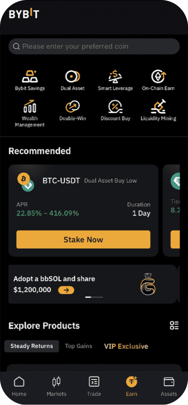
The same payment flow, restyled to each partner's identity — Mercuryo's violet, Trust Wallet's green, Bybit's gold. Tokens swap, the structure holds: one design system that bends to partner needs.


A visual language earns its place by being preferred, by shipping, and by turning many languages into one. This one did.
A visual language has no revenue number. Its honest measures are three.
Preference: do users prefer it, and does it read as the right kind of product? Two tests answered yes.
Shippability: does it reach users? The earlier attempt stalled; this one shipped incrementally, alongside the roadmap.
Coherence: did it reduce the chaos? Many drifting systems became one.
Those are the numbers I'll stand behind.
Once stakeholders signed off, I ported the winning dark concept into a light theme — matching every colour by hand — and brought in a second product designer to detail the system against real screens.
The detailing hardened into a UI kit, and the kit into a full design system: the durable artifact the whole product keeps building on.
In progress...
What made this attempt ship comes down to how it reached production. I ran the visual language in parallel with the product roadmap, applying the emerging concepts to real features as I built them.
By the time the language was chosen — a strategic decision — the key screens were already assembled on the new components and handed to engineering. The language arrived de-risked: proven on real screens and real use cases, riding along with product work.
Mercuryo is now implementing the visual language across its products — the first results are live on my.mercuryo.io. Feel free to try it. Hope you like the style.
Kudos to Dmitry Melov & Aydar Shakirov for their contribution.